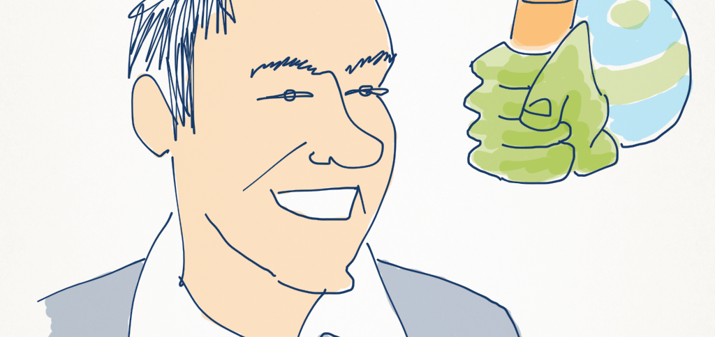
Josh Clark is a designer of mobile apps and websites. He took some time out to talk about what it takes to design a ‘tapworthy’ app.
Why don’t you start by telling our readers a bit about yourself?
Sure. I’m a designer who, for the last five years, has specialised in mobile design and user experience – as much as anything, not just slinging pixels, but how to think mobile; how does our thinking need to change as designers, both as we design not only for desktop computers, but for computers that are meant to be worked by hands and fingers, and carried in your pocket. And there are real changes for both the opportunities that provides – the different things and super powers that phones and tablets bring to the equation when we’re designing for the web or designing native apps – but also the very different considerations for how you should lay out a screen when it’s being designed for touch.
How did you come to be working on this mobile design and strategy stuff?
Matt, I have to admit that I’ve got a little bit of a dirty secret here, which is that I had no interest in mobile at all before the iPhone. I rarely even carried a cellphone and I didn’t really like the phone. And it’s interesting. You see that a lot of people who were involved in mobile before the iPhone who were doing WAP sites and really struggling in the trenches of what now seem like the ‘Dark Days’ or the ‘Middle Ages’ of mobile – a lot of those folks haven’t turned the corner very successfully into this new era.
When I think about why that is – why you haven’t seen that transition happen, why I wasn’t personally very interested in it before – is that before the iPhone and all these smart phones that have followed since, phones were pretending to be computers. You could have a web experience on them but they were really just awful, crappy experiences. And then suddenly with the iPhone, this was a computer that pretended to be a phone! The phone just became an app, and frankly, the least interesting app on the phone. This is the one app that I often wish that I could actually uninstall!
So it’s a real change in the whole metaphor of how this industry has to approach itself… we’re not trying to pretend to be a computer on the phone; we actually have an honest-to-God computer to work with and design for. And it has opened up so much possibility. So when I was watching the video of Steve Jobs introducing the iPhone on that stage, I just really sat up, and thought, “Wow. This is the first mobile phone that I’ve ever wanted.” I think that it has really changed the way that consumers think about software, let alone how designers have to think about it or the opportunities it presents to developers.
What I mean by that is the web started , but I think mobile has really brought a real change in attitude towards software. Software, for so long, was just this stuff that was imposed on us to the grey things that we have to do. But now suddenly, with apps in particular, there’s this real, almost emotional connection to software that can be used for entertainment, and education, and for enlightenment, even, depending on the app. So the software itself becomes an accessory just as much as the device. Showing somebody the apps on your phone somewhat says as much as what you carry in your bag or the bobble heads you keep on your desk.
It’s amazing that you went from having knowledge in just the mobile space to writing a book on a subject. So what is it that makes a ‘Tapworthy’ app?
Ah, that’s a big question. I notice you’re referencing my book, which is called Tapworthy. Really the notion of it is: “How do you make an application worth your tap? In this sea of apps, what is it that will get people’s attention and keep them coming back? I think there are two general aspects that are new to apps that you have to keep in mind. One is frankly just the fact that it’s handheld. It means that you have design the thing in a different way. There are real ergonomics at stake here. You’re not just designing a virtual interfac — you’re almost designing a physical interface. There are industrial design considerations there.
The other bit is just thinking about the mindset that we have when we go into mobile. There’s this dangerous idea about mobile that it’s the light version. And that specifically, it’s kind of a local version. The thinking that “This is the thing that I’m only going to use when I’m out and about, and I’ll use location-based stuff.” So the idea that we’re just going to narrow our app or our website on that single use case.
A lot of people call that the mobile context. It turns out that the mobile context is actually much bigger than that. Mobile isn’t, despite its name, on-the-go or only on-the-go. It’s on the couch and it’s during that three-hour layover where you’ve got plenty of time to spare, so that local context is one really important mindset.
But there are two others. One is micro-tasking: let me do something really quickly. That feeds this I’m in a rush mentality. Or I’m talking to you and I want to dash this lunch appointment that’s in my calendar, and then get back to the important thing, which is talking to you. So there’s that micro-tasking aspect.
But then finally, there’s this thing of I’m bored or I have attention to spare. And that opens up the whole possibility of everything that you would do on the web or on the computer. And these devices are really capable. We have to understand that if you focus strictly on that local use case or on that distracted use case, you are leaving aside millions of users and use cases. And so there’s a tricky thing of adapting to What is the mobile mindset? but also understanding that it’s a lot less narrow than a lot of people assume.
That’s a really interesting way to look at it.
Something that’s really important to understand is that a lot of people are actually also only using their phones. I’m afraid I don’t have the numbers for Australia but here in the US, I think there’s a common assumption that Great, we got it in the developing world. A lot of people only have phones and will only consume information on their phones.In a way they’ve skipped the infrastructure stage – that mobile gets them data and communication without having to build all the infrastructure. So there’s an assumption that in the developing world where there’s that lack of infrastructure and a lack of money, a lot of people will use their phone as their primary device.
But it turns out that it’s really true in the west, too. In the US, it turns out that 28% of people who use their phones to browse the web almost only use their phones to browse the web. Which means that if you’re going to reach those people at all, you have to assume you’re going to reach them through this small screen. For people who maybe don’t have the money or the interest to pay for more than one screen or more than one connection, a lot of those people will invest in their phone.
In Tapworthy, you have a section titled What would Jobs do? which, when I was scanning the table of contents, is the one that jumped out at me. You encourage designers to leverage the strength of Apple’s Human Interface Guidelines, so my question to you is, as a designer, when should I follow those conventions? And when is it okay to think outside the box and invent a whole new interaction which, sometimes, is a way forward?
It’s a great question. And I think if you look back at the short history of third-party apps for iOS and really for any platform – but let’s look at iOS because they provide a really strong example – two things happened there.
One, there was a full year where there were no third-party apps. So everyone who was using an iPhone, all the developers and designers who wanted to design for the iPhone, only had Apple’s apps to look at, right? People were soaked in the Apple worldview that “this is the way the iPhone works.”
Then, third-party apps did come around. Apple, true to form, came out with these really strong interface guidelines like you said. So there was this sense of example. And the code did it as well – the code made it easy to follow their example here. So as people got the hang of it, there was this really strong example to follow. So in the first year, most apps did look like generic iPhone apps. And this is the way of things. And then as people became more confident, we’ve started to see a lot more experimentation of novel interfaces, of new and playful gestures and interactions. And I think that that’s a natural and healthy way to go.
It really means, as in so many other disciplines: you are free to break the rules as long as you know the rules and you understand why you’re breaking them. I think that we’re seeing a natural evolution of that. And when you look at another platform like Windows Phone, also in its early days of third party development, it also has a really strong set of guidelines, a really strong point of view and perspective. And you’re seeing this first wave of apps that look very “Windows Phone.” A very strong, metro influence. That design language will loosen a bit, too.
So in terms of thinking about Wow, when can I do it? I would say, first understand the rules that you’re departing from. And if you’re gonna depart from them, do it because you’ve got a better idea, not just a different idea, but an idea that is better. You baseline should be This is as good as the standard alternative. I’m not doing it just to be different, but I’ve got an alternative that works as well. This is something that Apple could’ve come up with.
That’s really good advice. A lot of the apps that you see that do get a lot of attention for their interface utilise skeuomorphism where they take elements from the real words and take that into the interface. What are your thoughts on taking inspiration from the physical world?
I think it’s important to understand that we’re creating physical interfaces. And one of the challenges, I think, that we have especially as we go into gestural interfaces – interfaces that don’t necessarily have traditional buttons that are labeled – how do we make people comfortable and confident about using these?
And I think one way to do that is to use these skeuomorphic, realistic 3D interfaces that bank on the familiarity of physical objects. And I think that that can be fine. And I think that that can be really good. You have to be careful, though. Because if you’re going to go that route, you have to make sure that the thing actually works like a physical object.
When you look at, for example, the calendar app for the iPad that Apple had, for the first 18 months that the iPad app was out, you had this one daily view that looked like a datebook. But you couldn’t flip the pages! The whole interface looks like a book and invites you to use it like a book – but it worked through more desktop-style buttons, these tiny, little arrow buttons.
So the problem there is when you’re designing a touch interface, there’s a little switch that goes off in our head that says Oh, wait a second. It’s encouraging me to manipulate this physically. And I recognise this as a physical object, so I’m going to try to use it like one. Anytime on a touch interface something looks like a physical object, people are going try to interact with it like one.
So that’s a great cue, that’s a great thing that we can do. We can lean on all these wealth of experience that we have from the physical word to work with these. But you have to embrace your interface.
The risk though, also, is that you can be too literal and lose the digital possibilities. So for example there will be a lot of magazines that, for better or worse, are a PDF… really reminiscent of the physical object. I know how to use it, I just go through in this linear fashion, right? Just swipe, swipe, swipe through the pages. A lot of them, though make the table of contents difficult to find, so you lose this great digital advantage, which is random access to content.
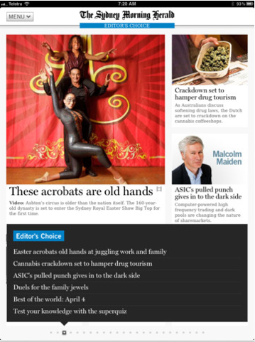
The Sydney Morning Herald actually has a great iPad app… that app has a great middle road, which is that you get the daily addition and it looks like a newspaper. You can browse it like one. But they have these little dots across the bottom – those page indicators to show your progress through the issue. And if you touch one of them, it shows this quick rundown of all the headlines on that page and you can tap to one immediately. So it has this really leisurely paper-like experience you can browse through. But it also takes advantage of this great digital characteristic, which is: random access to content, quickly scanning and being able to jump straight to where you want.
So I think skeuomorphism is fine. I think that in the desktop it has less utility and you can go overboard pretty easily. For example, I’m not a huge fan of the calendar app on OS X since Lion, with its ripped paper on them. We need to realise that we’ve been doing this for centuries in print, and for decades on the desktop, creating these realistic interfaces that create connotations and emotional warmth. And it’s playful. But just understand that when you go to a touch interface, that little bit flips in our head that all of a sudden is like Oh, wait a second. This is now telling me how to use the app or the website. So it’s just a case of understanding that you should use that stuff not for decoration on touch – and whether you do that elsewhere, it’s really a matter of taste. But you have to make it functional on a touch interface because people will interpret it that way.
Yeah I totally agree. It’s very easy to go overboard and then it just becomes a distraction.
Right. But at the same time we’ve got, for example, Windows 8 and Windows Phone both going a whole different route. It’s an aggressively touch-first interface. And it doesn’t use skeuomorphism, it uses these flat tiles. So that’s very much what people are calling a native digital approach. It’s a bit like… ‘We don’t have to pretend to be a physical object. We can just use this new metaphor.’
And I think that that’s fine, too. Understand though that they are also using physicality – that as you swipe through the tiles, it still has the experience of sliding tiles under this piece of glass. So it’s still relies on some familiar aspects of physicality. That’s really the main thing as you design a touch interface, just think, ‘Wow, I got this opportunity to touch my data. What if my data were here on a desk? How would I interact with it physically? Maybe I don’t need for a date range to have two calendar pickers. I can just stretch that date range out, right? What does it mean when you give your data physicality?’
I think that’s the way the real opportunities come from when you’re thinking about designing touch interfaces. I think particularly for tablets, which have the size and frankly have to be used with two hands, means that we have this opportunity to manipulate screens in much more interesting ways than we can with phones. So it’s going to be a fascinating era for us as interface designers to think through how we can stretch and pull and tug at our data with this real sense and illusion of physicality.
I think every designer is excited about the idea of throwing things around, minority report style.
Ha! And that’s sometimes poo-pooed a little bit. For instance,’Who wants to work with your arms way up there?’ But for certain things – for maps in the mall, different kinds of short periods of interaction, that’s a great interaction. That’s great for collaboration. So I think we’ll see in a lot of different context, whether that’s giant screens that stand in front of us or tables … we’re also getting beyond just touch. Touch is the first thing that’s become really mainstream everywhere. You’re seeing touch interfaces everywhere now. It became affordable and technologically understandable a few years ago. The iPhone was one of the big ones to really bring it home in a big way.
But we’ve also got speech, which is just around the corner. Siri, for example. Or the Android speech features. These things work pretty well, but not quite right. Apple calls it “beta” and it feels like it. But it’s really close, right? You can just imagine – in cars, for example – that is going to be a great interface. And we have to think as designers, how do we adapt to that?
Natural gesture like the Kinect: Kinect likewise, it works pretty well. I’m not sure you’d want to run a nuclear power plant with it. But it’s getting there.
And what about the combinations? Because when you put speech, and natural gesture together, you’re Harry Potter! You’re casting spells, this is magic stuff! What a fascinating and exciting time for us to be in this business. We’re hurdling into this period of science fiction and magic where we can create these illusions that just are jaw-dropping. And then two months later we get used to it and it’s ho-hum. But we’re just in the constant period where we’re just minting new magic every day.
I like that! You wrote a book as well titled Best iPhone Apps, which I pretty certain a number of our readers would consider to be a dream job – to compile all of your favorite iPhone apps and have them published in a book. How did that come about and what did you learn from that process?
It was maybe nine months into the App Store being opened. And there was this really hard problem of ‘How are people going to choose an app among the, what was at the time, 25-30,000 apps in the App Store? What are people going to do?’ And an editor at O’Reilly got in touch and said “Hey, let’s do a little catalogue, here.” We understood that it wasn’t necessarily for hardcore geeks, it was going to be something for folks with a relatively short attention span. I was thinking… ‘we could come out with these things every six months or something’. Just a very gift-able, pretty book that doesn’t compare apps, but just says… if you’re looking for an app that does this, this is the one.
Just a side note, by the way, there’s this great website that does the same thing with tech things called TheWireCutter.com. I don’t know about you but if I’m buying electronic components, it’s overwhelming to try to figure that stuff out. And this guy has done the research for you: you’re looking for a TV? This is the one. You’re looking for a smaller TV? This one.
I think it’s a great approach to a guide, there are consumer reports that say ‘Here’s all of them and we rate all of them. But you know what? Just tell me which one to buy.’ So that was what we used with Best iPhone Apps, and it was fun. I certainly didn’t go through all 25 or 30,000 apps that were in the store at that time but probably a good 3 or 4,000. And it was a great preparation for Tapworthy – which is the book that I wrote just a few months later – to really identify the patterns that were working; the patterns that weren’t; what were the components; why did the apps that I chose to be in the Best iPhone Apps book qualify? Was it the interface ideas or the way that they approached mobile that was new?
So that time that I spent completely looking at apps and thinking about why is this one better than that one, when they purport to do the same thing – that just identified a huge number of best practices and design patterns. And I try to keep that up now – keep up that really steady diet of just looking at apps, just to see how they’re done. It something that I think is easy to think of as not the work that we do, or procrastination, because it’s not really creating something. But I think that time you spend playing with other people’s digital creations, thinking about the decisions that they made, why did they do things this way and not that way – it really goes to the core of what we do and staying current. So I think that a big piece of advice I would give to anybody – whether it be designing websites or apps, is just spend a lot of time looking and thinking about the interface choices that people make.
For whatever reason, we are a cynical lot, us tech people. We often look at things and just dismiss them out of hand – ‘oh, that’s a fail’. I think we could be a little bit more magnanimous with a lot of the stuff and try to think: ‘Why did they make the decisions that way? Why isn’t it the way I wanted to be? What were the hurdles?’ Instead of assuming that everyone else is stupid and incompetent – sure, some of us are stupid and incompetent – but more to the case – the real world has challenges. So thinking through why people make their decisions is hugely useful, I think, for your own practice.

Great advice. Why don’t you tell us a little bit about Global Moxie, which is your company.
Global Moxie is my own small design agency. I personally get involved with around three really big needy design projects a year and lead those projects and hire up a small team of awesome ninjas, and we all go to our work and disappear into the night afterward until the next time the world needs us.
I love hiring ninjas!
That’s right! So basically, for the amount of projects and design work that I do, it doesn’t make sense to carry a staff. So I’ve just been really fortunate to come in contact with a lot of really terrific designers, IAs and content strategists, and be able to bring them onto projects as needed. So that’s a big part of what I do. Obviously, in addition to just looking at what other people make, making your own stuff is really important to develop your practice and to keep growing and trying new things.
The rest of my time is really spent doing maybe more short-term consulting – talking to companies over the course of a week, or even during a one-day workshop about what their mobile challenges are, and whether that’s in terms of design or product strategy. I do things frequently called Product Invention Workshops, which is really spending some time crunching and thinking about a company’s digital asset, how it can be used in novel ways in mobile and then coming up with products that either they typically would go off and build on their own. Or occasionally I’ll be involved in one of these three times a year, for me, design projects.
And the rest is about writing and speaking and sharing what I’ve learned along the way.
Nice. Sounds like you get a good amount of variety.
I try to. In a perfect world, it would be seasonal. ‘I’m going to do my consulting for four to five months. Then I’m going to go write about it. And now I’m going to go talk about it. And then after that I’m going to go and do some consulting.’ Life isn’t so neat. It is a good variety and I really love what I do. I’m awful at keeping it all in an appropriate balance.
You’ve managed to line things up so you’re coming out to Australia later these year? Are you looking forward to that?
I’m super excited about it. I’ve been to Australia just once before and I really enjoyed it. So I’m looking forward to visiting again.
And finally I have to ask you before I let you go, what’s all this about being the 11th strongest man in Maine?
I am the 11th strongest man in the state of Maine.
How does that happen?
It was technically proven in a contest of feats of strength and prowess, Matt, I have to tell you. So I was at this country fair with a few other nerds – Ethan Marcotte was there, Jennifer Brooke was there. And we were just a bunch of nerds eating fried food, and a woman came up and said, “Hey, you guys should join this he-man contest!” And we were all very dubious because we are not especially strong human beings. We carry most of our muscle in our skulls.
But you know what, I got talked into it and I thought it would be sort of a lark. And when I got there, it turns out that they were really, really, really strong men who definitely deserve the title of he-man more than I. They were all stretching out and wearing their training clothes, and I showed up in my shorts and flip-flops.
And I did my best and in fact, I came in 11th. The 11th strongest man in Maine in this contest of moving and throwing logs and hauling cinder blocks on a sled. I will confess that there were only 10 other people who entered it! But I still earned the title ‘11th strongest man’
Ha, that sounds like a reasonable achievement! Josh, thank you so much for your time. I really appreciate hearing all of those insights and advice.
You can follow Josh Clark on Twitter at @globalmoxie.