
Achieving a great User Experience (UX) is essential in the digital space world. Good UX design connects with users. Yet, one can encounter dozens of examples of bad UX designs. You probably have encountered a website that frustrates you and makes you want to run away. Mistakes like complicated user flow and poor accessibility erode the company’s credibility. If users find your website or app challenging, they bounce.
To avoid creating a bad UX design, think from the user’s perspective. As a UX designer, you must ensure that they comprehend the psychology of the user and then implement it in the UX design. Why? When the website aligns with the users’ expectations, they feel connected.
Joe Leech said,
“A designer who doesn’t understand human psychologies is going to be no more successful than an architect who doesn’t understand physics.”
Hence, to captivate users, begin by understanding how they think. When you create the design with users in mind, it resonates with them. Your design will boost both users’ satisfaction and your business goals.
And what if you don’t consider the users’ needs? In that case, these issues can occur on your website:
- Slow Load Times
- Poor Information Architecture
- Poor Accessibility
- Graphic Mismanagement
- Complicated User Flow
These factors can frustrate users and tarnish your brand’s reputation. Unsatisfied customers might leave and go to other websites for a better experience. This may increase your website’s bounce rate.
Let’s examine some bad UX design examples, its consequences, and solutions to ensure you don’t make the same mistakes.
Examples of Bad UX Design
Below, we’ve listed some common UX mistakes in well-known apps. Furthermore, we’ve given solutions for these mistakes to help improve them:
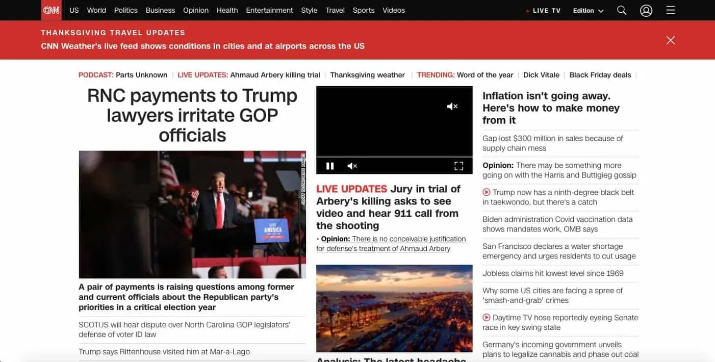
1. CNN

CNN ranks among the top news organizations. It is a 24-hour cable news channel. Its website displays a wide range of content, including text, images, and videos. The website’s slow load time is one of its weaknesses. Speedmonitor.io lists it as one of the internet’s top slowest websites.
Users seek out interfaces that are quick and simple to understand. 25% of internet users will leave any website that takes longer than 4 seconds to load. A website’s conversion rate drops by 1% for every 100 milliseconds it takes to load. It causes frustration in the users and drives them away.
Solution
CNN must improve the load speed by swapping out large images with optimized ones. Regularly testing and enhancing the website’s speed may also improve the user experience.
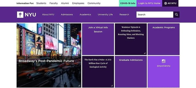
2. NYU

There are three main parts on the NYU website: navbar, body, and footer. It has a grid layout, and all homepage parts are purple. Overusing the purple color makes distinguishing one section from the other challenging.
Even though there are slightly different hues of purple, there is little contrast in it. It results in a confusing navigation experience. Users need clarification about where to click and where not to click on a website since it is purple everywhere. Consequently, the users may end up leaving the website without browsing.
Solution
The website must have more contrasting colors to make it appealing. Using visual hierarchy can improve user experience.
3. Paper Source

Paper Source is a company that deals with paper products. It was founded in 1983 by Susan Lindstrom. For those who love paper, Paper Source also publishes tutorials, tips, and creative ideas on its blog. Yet, it needs an updated website design as its layout appears old-fashioned. Also, the dual CTAs above the logo may need to be clarified for the users. Moreover, the double taskbars can also be confusing for the users.
Solution
The old-fashioned design would prompt users to seek more modern alternatives. Paper Source should develop a modern yet minimal layout to enhance its brand image. It will give more user-friendly vibes and significantly increase the brand value and experience.
4. Facebook

Facebook connects us to people and ideas like no other platform. However, it has some significant flaws in the design. One of the major issues with Facebook is its complex settings. It has distinct types of account setting options. Though it is essential for privacy, its diverse settings make navigation challenging.
Solution
Facebook must keep the categories of account settings minimal to ensure good UX design. It will allow even non-tech users to navigate through settings smoothly.
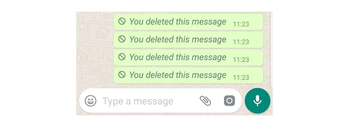
5. Whatsapp

Today, no one can go about the day without using WhatsApp! Despite being the most popular and versatile messaging and communication app, it still needs some usability issues.
What’s your instant action if you accidentally send a message to the wrong number on WhatsApp? You would try to delete it. But when you delete the message using WhatsApp’s “delete for everyone” feature, unfortunately, the receiver is notified with the following:

Solution
WhatsApp must fix this issue and create an option to erase the message. It should not expose the sender.
6. Zoom

Zoom became one of the most famous video conferencing apps in recent years. You can conduct a meeting with over 100 participants on this platform, a feature that brought the application fame. Yet, it has its challenges. The problem with its UX design is that joining a meeting is complex. Even if you have an app, when you click the meeting link, it does not automatically open the app. Instead, it directs you to the browser link. Using it on the browser is extremely confusing. It frustrates the users when they find it difficult to join a call quickly. Even the navigation and a few features are tricky to locate and use.
Solution
Zoom can simplify this by asking users whether to use an app or browser when clicking the meeting link. Moreover, the interface can be more straightforward so that users can easily navigate. With regular feedback and usability tests, it must make calling hassle-free.
7. YouTube

YouTube is a top music streaming platform with around 25% market share. However, it fails to create and manage playlists within a single window. As a result, users have to open multiple tabs. They manually open and close videos, straining the device. Besides, too many ads in the video frustrate the users. The ads appear before, during, and after the main video. There are also non-skippable ads that users are bound to watch.
Solution
A sidebar search tool would improve the users’ experience with music streaming. It would enable the user to search for the next song while the current video plays. Adding a ‘Remove from Queue’ button would make managing the playlist convenient. Moreover, YouTube must reduce the number of ads that appear in the video. Users want an uninterrupted viewing experience; too many ads create a distraction and frustrate the users.
8. Snapchat

Snapchat is an instant messaging and social networking app. It allows users to share pictures and videos with its unique filters. Yet, it is losing its users because of several issues. Its confusing navigation and inconsistent accessibility drive the users away. Users unwillingly discover stories that do not align with their interests.
On the camera screen, there are three icon buttons. The two are pretty similar, causing user confusion. Snapchat does not allow users to choose a specific category of stories to view. It poses a problem for users who want to avoid seeing a particular story.
Solution
An interface that users can navigate easily could improve Snapchat’s accessibility and user-friendliness.
Conclusion
UX design can make or break your business. The examples illustrated in this blog post show the repercussions of a bad UX design. To be a good UX designer, you must refine your UX design and overall website performance based on usability tests from time to time. Moreover, you must pay attention to the evolving preferences of the audience to meet user needs and satisfaction. This will help you avoid bad UX practices and create optimal user experiences.
To learn more about UX design, check out the thoughtfully curated list of courses by IxDF. Kickstart your journey and enroll in our beginner course. So, what’s stopping you? Start your journey in UX design with IxDF now!
Learn More about Bad UX
Read the articles Bad UX Exposed: A Comprehensive Guide to Avoiding Pitfalls and Bad Design vs. Good Design: 5 Examples We can Learn From for a comprehensive understanding of bad UX.
Jakob Nielson gives 4 great examples of bad UX design in his article Four Bad Designs. Take a look!
Watch this video from the Nielsen Norman Group to learn how to manage bad UX requests.
Learn how to improve your UX management within your company for better ROI in the IxDF course UX Management: Strategy and Tactics.
Feature Image by Freepik


