Nowadays, we no longer have time to spend hours in a store and want to reach information in a second. Because of these factors, websites and online stores are hugely popular, and UX designers have more and more work to make these sites successful. Buy in an instant and access any information instantly. But, by sticking out from the crowd, how can you make the online business profitable as a UX designer? UX optimization is the key, and it’s simpler than you think. Let’s look at optimizing your site’s user experience using an analytics tool.
UX Analysis
The goal of user-centered design is to meet the users’ needs.
Data is used to guide design decisions. Data can help you map out your personas, user flows, interfaces and other elements in your UX design work.
But what metrics should you be considering?
- Website metrics
- Device metrics
- Conversion related metrics
- User metrics
- Competitors
- SEO metrics
Let’s look at it all briefly.
Monitoring website metrics and device metrics is vital to see how much traffic your webshop receives, what device your webpage visits, and what elements generate the most leads. Find out if you need to optimize for mobile or desktops. You can also find out which items and subpages need to be improved.
This is closely related to the conversion-related metrics that denote actual user interactions. For example, you can find out which is your most popular product and how many people have subscribed to your newsletter. If you have few subscriptions, you may have to optimize your CTA for newsletter sign-ups.
User data refers primarily to demographic data. How old, what gender, where do people live, or even what interests do your typical users have? You’ll need this information to tailor your website to your visitors.
But how does SEO get here? It has an interesting but prominent role here as well. Consider one of the most significant on-site SEO metrics: the loading time. If your webshop loads slowly, you will have a high dropout rate, significantly degrading the user experience.
Hopefully, if you’ve gotten this far by reading the article, you’re sure to think about how much work you will have to do. But how about we say that a tool automatically collects most of the data listed above for you? Enter heatmaps. Here’s a closer look at these tools and how you can use them in UX optimization.
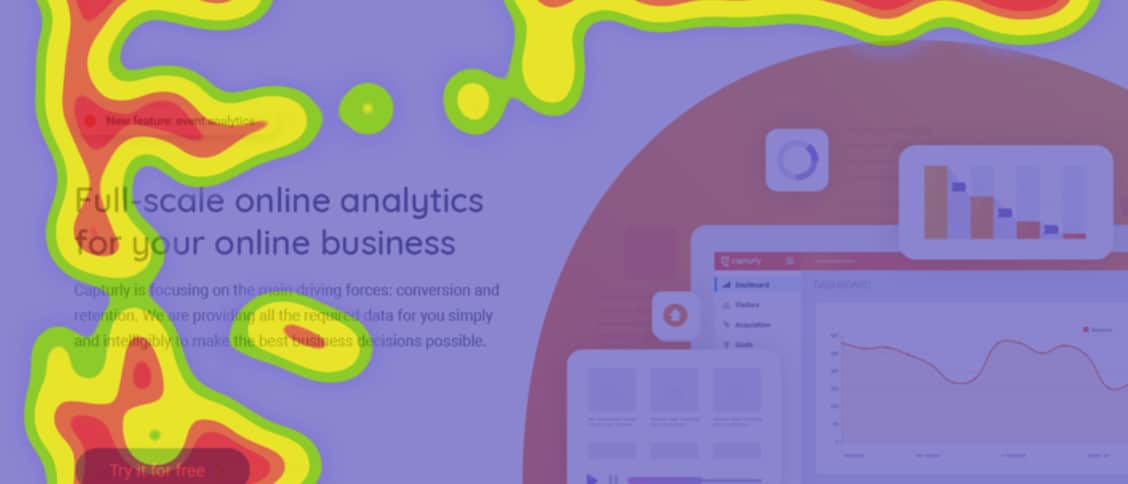
Heatmaps
Heatmaps are more of an analytical tool for measuring the efficiency of your website. It allows you to track the number of visitors to each subpage, the performance of your products, the source of your visitors, and even the performance of your buttons and CTAs.
A heatmap gives you a complete view of how visitors engage with your website and the compelling parts of your site. As a result, you can improve the user experience with the help of heatmaps.
Different forms of heatmaps include:
- Click heatmaps
- Segment heatmaps
- Scroll heatmaps
Each of the tools will help you track various metrics and prove valuable for UX optimization.
Click Heatmaps

Click heatmaps track of how many times each button is pressed. Warm colors are used to highlight areas with the most clicks, whereas cold colors highlight areas with the fewest clicks.
With this knowledge, you can determine which CTAs and button types are most effective on your website. If you want to make your website more user-friendly, it is valuable information.
Click heatmaps are also used to determine where to optimize. We also encourage you to review each of your subpages and see which subpages are rarely visited by your users.
You may want to make UX upgrades on these subpages to increase their popularity and thus your conversion rate.
But what does it looks like in practice?
Assume that the analysis suggests that the orange buttons and the “Let’s do it” CTA wording are the most successful on your website. You can consider using that color and specific language more often to improve readability and enhance conversions.
Your website will be significantly more transparent if you employ CTAs and text that heatmaps reveal to be effective. Signing up for a newsletter or purchasing a product doesn’t have to take a long time for your visitors anymore.
Segment heatmaps
Segment heatmaps provide a much more complex analysis than click heatmaps. It not only informs you which region of your website was the most popular, but it also tells you where that specific click came from. The software maintains track of the visitor’s origins and assesses the data accordingly.
The visitor may have arrived at your page after clicking on a link in one of your social media ads, they may have arrived at your website after clicking on your PPC ad, or they just come organically through website search. With segment heatmaps, you can see this.
When it comes to optimizing the UX, you can observe which platform brings in the most visitors and how they interact with your site. As a result, you can tailor your website to each segment. You can also find out the demographics of your visitors.
Scroll heatmaps
The function of these heatmaps is to determine how many visitors are scrolling down your page.

Scroll heatmaps are mostly found on content-heavy interfaces, where it’s used to figure out how long articles are read on average. It is important data because you’ll be able to tell which parts of the article you should place a link to, and you can determine where you should write important information.
With this information in mind, you can place links to your product and indicate the most helpful information in the most popular places. This will make your blog posts much more valuable to your visitors, which will, in turn, enhance the user experience.
Conclusion
As you can see, there are more connections between web analytics and UX than you might think. We recommend that you use heatmaps to optimize the user experience. You can use all the methods listed above together. You can combine other methods, such as split testing (a.k.a. A/B testing), to further leverage data in your design decisions.