In the final instalment of our three part series, we’re going to examine another of the important tenets of UX design, delight. In Part One we discussed usefulness and dug into an interesting case study from Buffer. In Part Two we examined the all important usability.
Let’s get into it.
Delight
In a post for Treehouse Blog, Aarron Walter compared web design to psychologist Abraham Maslow’s famous Hierarchy of Needs. While the validity of Maslow’s model has come into question in recent times, Walter’s comparison is an interesting one.
The bottom of the pyramid – the fundamentals of human life such as food and shelter – was represented by functionality and usability. The top – more intangible factors like esteem and actualization – was represented by delightful design.
There is no question that delight pales into insignificance when compared to usability, which in turn can’t hold a candle to usefulness, but if you’re talking about great UX design, you need all three.
The Power of Delight
Delight (and in turn, desirability) is the x-factor that keeps people coming back. Stefan Klocek calls it a “passive magic”, when everything feels completely intuitive and effortless. As the most abstract of the three elements that we’ve examined, delight is be the hardest to apply, but the rewards make figuring out how well worth it.
As Don Norman points out, we humans are not the logical creatures we like to think we are. Studies have shown that emotional responses are one of the most important determining factors in how we make decisions — often surpassing logic. This is likely due to the fact that our ancestors often needed to make split-second life-or-death decisions.
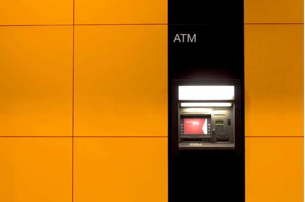
Perhaps this explains why users perceive more pleasing products as more usable, as is demonstrated in this study by Masaaki Kurosu and Kaori Kashimura. Researchers tested two Automatic Teller Machines (ATMs) that functioned in an identical fashion, but looked noticeably different. Testers cited the more attractive ATM as more functional, proving that a delightful design can, in a way, improve usability.
When people are enjoying themselves, they’re more relaxed. When the brain is relaxed, it functions more effectively, which means that learning new concepts, recalling past data, and fine motor skills occur more fluidly.
Elements of Delight
Explaining why delight is important is the easy part – making it happen is not so easy! Dr. Charles B. Kreitzberg recommends engaging the user with stimulating visuals. Certainly aesthetics have a lot to do with desirability, though they shouldn’t be the only consideration.
As explained in Interaction Design Best Practices, small gifts and surprises will also engage your users. A reward-based system can help generate trust and build a relationship. At the same time, small discoverables like a quirky error message or a surprise animation (that communicates meaning) can also keep your users interested.
Desirability can be tested right alongside of usability, with a few select questions during the post-test interview. Microsoft even have a downloadable Desirability Toolkit, with information and examples to help you get started.
Duolingo: A case study in pulling it all together
The language learning site Duolingo applies all three of the our UX facets in an exemplary way.
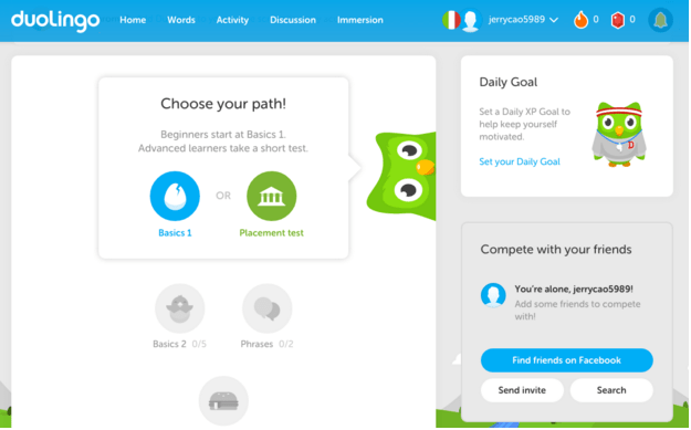
First up, the idea is useful. The desire to learn another language is a common one, yet only a fraction of people actually make the effort. A free site utilising gamification methods for teaching is a fun alternative to more traditional language-learning methods.
Usability wise, Duolingo delivers what it promises — an efficient method of learning another language. The use of language games distracts the user from the arduousness of rote learning, and features like timed quizzes and progression checks help move the user along their journey seamlessly.
Lastly, the site is enjoyable (which, in this particular case, is synonymous with usable). Even outside of the learning elements, Duolingo goes above and beyond to provide a satisfying experience. An array of colors and a cartoonish environment — complete with owl mascot — make visiting the site pleasing and enjoyable.
In conclusion
By drawing on all three of the UX design facets, Duolingo, Treehouse and Buffer (to name just a few) earn the advantage over their competitors by giving their users something more.
It all starts with an idea, a useful service that’s lacking in your users’ lives. Add to that an interface that’s as effective as it is understandable, making the product easily usable. Last comes the icing on the cake, those little extra features that lend a magic to the product, making it delightful.


Thank you for a good three part serie. I have been working in the UX field the past 10 years and I am still amazed how good we are NOT agreeing on the definition of things. I agree with everything you write, don´t get me wrong. The problem is that we are referring to definitions from gurus like Jacob Nielsen, when I think we should be rallying around the definition from the ISO standard 9241 which defines usability as:
The effectiveness, efficiency and satisfaction with which specified users achieve specified goals in particular environments.
where
effectiveness: the accuracy and completeness with which specified users can achieve specified goals in particular environments (Translates into usefulness-ish)
efficiency: the resources expended in relation to the accuracy and completeness of goals achieved
satisfaction: the comfort and acceptability of the work system to its users and other people affected by its use
So, in conclusion the definition of usability encompasses usefulness. If we could all agree on the same definition it would be so much easier to communicate to everyone and help mature our field which we desperately need. Thanks for a great blog :-)