Design is a pretty subjective thing and you’ll hear differing opinions from one person to the next. There are the three essential elements for great UX design, as I see it. These elements can be used to guide every UX project you undertake, and they’re not hard to remember.
I’m talking about usefulness, usability, and delight.
In this series of 3 articles we’ll examine these facets, and how they are applied to real life products in case studies from Buffer, UXPin and Duolingo.
Let’s get started.
Usefulness
The first and most important requirement: your product must be useful. It doesn’t matter how usable or desirable it is if it doesn’t serve some purpose in your user’s life. Some studies suggest that usefulness is 1.5 times as important as usability.
So, how exactly do we define usefulness?
Painkillers & Vitamins
According to Jon Burgstone and Bill Murphy, Jr. in an article for Fast Company, customers buy products for two reasons:
- To ease pain
- To provide pleasure
Interestingly, customers will more readily invest in a product which alleviates pain over one that gives them pleasure. If you offer a service that no one else provides — or features lacking in the competition — customers will appreciate it more than if your product merely entertains. Ideally though, it will do both.
Designing a useful product relies on your understanding of the problems that your users face. The quickest route to that understanding is usability research and testing. Qualitative research such as user interviews, surveys, or diary studies allow users to explain what they need (or don’t like) in their own words. Quantitative research, such as analytics or A/B testing, will concretely demonstrate where users are having difficulties and what their preferences are.
Testing for Relevancy With an MVP
At what point should you start to test your assumptions? The answer lies in the MVP (minimum viable product).
By starting small, gathering user feedback, and iterating incrementally, you ensure the product is always useful (and therefore relevant).
You can build an affordable MVP in several ways
- Create a landing page – Set up a landing page for the product concept that you wish to test, explaining to potential customers that they will get an email when it’s ready. Run paid Adwords campaigns to drive traffic to the page, and then check how many visits and emails you capture.
- Plain manual labor – Nick Swinmurn, co-founder of Zappos, actually fronted the online retail giant before any infrastructure existed. He listed shoes for sale, then fulfilled them by buying the shoes locally and shipping them out. It required his full-time dedication, but was a cheap and low-tech way of testing his idea.
- Start a fundraising campaign – You can sell a product before it exists. If you get enough funding on a site like Kickstarter or Indiegogo, it’s a strong signal that your product is relevant to people’s lives. As you build the product, keep in touch with your supporters for feedback and ideas.
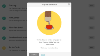
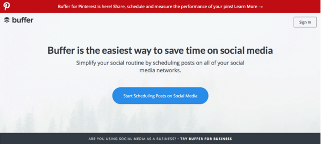
Buffer: A case study in Usefulness
Buffer is a great example of a startup that used an MVP to test for (and successfully prove) relevancy. They went from an idea to a profitable product in 7 weeks. Joel Gascoigne started with a concept for a social media scheduling app.
Following the principles of Eric Ries’s lean startup, Joel’s first step was an extremely minimal release to test user interest: a landing page with a call-to-action that explained what the app did (under the pretence that it already existed). If users clicked the call-to-action, they were taken to an apologetic page explaining that the “finishing touches” were still being applied.
Joel then personally contacted those “earlyvangelists”, asking for feedback and ideas for shaping the product. The response was so positive that Buffer was born – it’s usefulness proven before a line of code was written.
And useful it is — as of June 2015, the company brings in $6.4M per year (and growing).
Next week we’ll examine another important facet of UX design – usability. We’ll talk about why it’s so important and work through the method that UXPin use to test for it.