
I’m often asked the question: “is this best practice?”
Not to be pedantic, but what is UX best practice anyway? What does this term mean? Does the phrase refer to a set of techniques deemed to be the most effective? Does “best practice” suggest that, because someone else does something, and they’re successful, you should too?
The answer to both questions is yes—especially the former. However, should you be undertaking best practice UX design and principles within your organisation?
To answer that question, let me share with you some comparable interfaces and user experiences that, while tested thoroughly, deliver different verdicts on what best practice means:
- Best practice states that between 12 – 20 products are optimum to achieve the best user experience. So why do Etsy.com showcase 45? Amazon.com stick with 16 products per page, and they’re clearly doing something right.
- Why do Very.co.uk showcase product reviews but Selfridges.co.uk not? Best practice would dictate that product reviews increase conversion rates, so what’s going on?
- Is there a reason why on Zappos.com you need to actually click the top navigation to display product categories, whilst Walmart.com shows the categories when the user’s cursor hovers over the menu item?
What’s going on here? Shouldn’t we all be adhering to best practices? Clearly there’s more to it than that.
For all those business owners and managers that demand for their website to behave “more like Amazon” or “more like AO.com” or “to completely adhere to best practice” we need to ask the question: is it the right approach for our users?
What might be deemed as best practice in one industry or for one website, may not be best practice for another.
Let’s explore this idea a little further.
Users don’t always do what they say they will do
Whenever I survey my users, I always try and validate the results with further research. This could take the form of some additional insights to explain the results, or an experiment that reinforces and explains the learnings.
The team at Etsy.com have been generous in publishing their findings of late, and a couple of examples highlight this point well.
When running some usability tests, the team at Etsy found that, when comparison shopping, users often opened items in new tabs”. Based on this finding, they ran some experiments, including an A/B test to a subset of users for whom products opened up in a new tab. The result of the test? 70% more people gave up and left the site after having their product page open in a new tab.
The second example from Etsy is the famous infinite scroll experiment. The team undertook research to identify two insights:
- Users want more results per page
- Users want faster results
The assumption was therefore that users wanted both of these requirements, so they team implemented a feature that delivered more results, faster—an infinite scroll of products. In theory, this should have been a great solution to these two underlying user requirements. The team knew that this is what users wanted, and the user need was backed up by research. Surely this exciting new feature was embraced by the subset of users involved in the test?
Hardly.
- Visitors seeing infinite scroll clicked fewer results than the control group
- Visitors seeing infinite scroll saved fewer items as favourites
- Visitors seeing infinite scroll purchased fewer items from search (well, users stopped using the search to find those items)
Basically, the experiment demonstrated that implementing infinite scroll across the entire site would be a giant failure. Dan McKinley explains the details of this experiment in a great presentation that is well worth watching. In summary, a change that the team assumed would be best practice, and was backed up by user research, did not translate into an improved user experience.
“My point is not that infinite scroll is stupid. It may be great on your website. But we should have done a better job of understanding the people using our website” – Dan McKinley, Principal Engineer at Etsy
Users are fickle about design changes
Making an improvement to your site for all the right reasons might be considered best practice, but it might fail for the purpose of being different. It’s as simple as that.
I recently performed some research to answer the question of whether prettier, more professional-looking sites increase conversion rates. The results were rather varied—prettier websites don’t necessarily directly increase conversion rates, but aesthetics can and do influence this metric.
My research showcased websites that had been redesigned, following what could be considered best practices, and subsequently failed. Marks and Spencer, for example, suffered a 8.1% drop in sales upon launching their new website.
Why can’t best practice approaches be relied upon? Because users don’t like change, and are often very fickle about design changes in general. Take this (rather hilarious) thread from Booking.com that shows how volatile users are when something changes. Here are some examples from this thread.
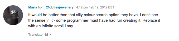
Figure 1. Example of a user on Booking.com talking about the removal of the infinite scroll feature
Design trends are not necessarily best practice
We need to consider the difference between what is best practice and what is a design trend. For example, the hamburger menu is a ubiquitous UI device that has been implemented on millions of mobile websites and even desktop websites. Yet it’s been proven by Booking.com that changing the hamburger menu to the word “Menu” had no statistical bearing on an improved user experience or even an impact on user behaviour.
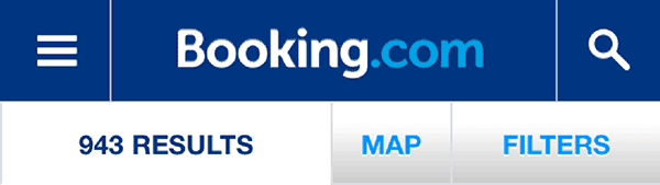

Figure 2. An example of some of the test variants from Booking.com when testing the hamburger menu.
But wait! When we type the phrase “hamburger menu” into Google.com all you’ll get is negative connotations towards the little fella. Why? Take for example the team from Exisweb.co.uk, who tested this and found that the word Menu, using exactly the same test, was clicked on 20% more by unique visitors than the variant hamburger menu.
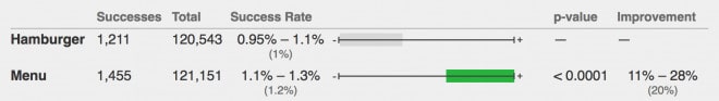
Figure 3. The results of the experiment undertaken by Exisweb.co.uk
Why did these two tests produce such different results? Michel Ferreira explains it best by stating that “What works for Booking.com may not work for you and your users. This is the reason we A/B test in the first place, because the findings of others, be they expert opinion, data from other websites, or hypotheses dreamt up in the pub while eating a hamburger, are all unproven until they’ve been tested against our customers, on our platform.”
You need to test with your own users
I can’t really advocate Michel’s words much more – he’s 100% right. What might work in one industry, might not work in another. What might work on one site, might not work on another. What might work with some users, might not work with other users.
I’ve listed a handful of examples that demonstrate this. So while it’s important to be across “best practice” approaches, following them blindly is no guarantee of success.

Kids aren’t as tech savvy as everyone thinks, so YES on testing. No Best Practices? See W3C Web Accessibility for Business Case for Your Org http://www.w3.org/WAI/bcase/Overview
Hey one better! Involving Users in Evaluating Web Accessibility
I think you’re right, there is a conflict in calling something “best practice” while you can find many exceptions to the rule. In complex systems you usually can only have good practices and no real best practices. No holy grail to be found
Great post. Same goes for Optimization too. There isn’t “best practice” just “common practice” (both to be ignored) but as suggested you make your own “best practice” from learning and speaking to your users.