Disclosure: The author received a review copy of this book, and this review contains affiliate links.
UI Is Communication: How to Design Intuitive, User Centered Interfaces by Focusing on Effective Communication is a book about user interface design, but describing it as such doesn’t really do it justice.
The user interface of a product is only one part of the overall experience for someone, but it’s the most obvious, visible part. There’s a reason so many companies advertise for “UI/UX Designer”, and that’s because the two are so commonly confused, yet so intricately intertwined.
Everett McKay gets this, and his book is in fact about UX design, with a focus on the UI part of it.
I decided to create a visual summary of the whole book:
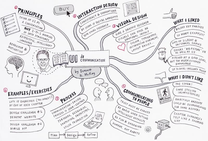
The book is divided into six sections:
- Communication Design Principles
- Interaction Design
- Visual Design
- Communicating To People
- A Communication-Driven Design Process
- UI Design Examples
What I liked:
- Examples. The sheer volume of examples in this book is what sets it apart from others. I don’t know exactly how many screenshots are included, but the bulk of the content centres around examples, drawn from many well-known desktop, web and mobile user interfaces, both good and bad.
- Bolded keywords. Seriously, why doesn’t every instructional book do this? The important takeaways in each paragraph are set in bold type, and the rest of the paragraphs are in regular text. This means that you can skim through to grab the core essence of a chapter, but delve into more detail when it suits you. It’s a simple idea, and it works extremely well.
- Comics. McKay litters his text with occasional comic strips from the much-loved Dilbert to the classic OK/Cancel web comic by Kevin Cheng and Tom Chi. There’s nothing like a bit of humour to mix things up and keep the reader entertained.
- Not just UI. As I mentioned above, if you’re looking for a book about how to craft photorealistic skeuomorphic designs that are going to attract votes on dribbble, this isn’t it. The context of what you’re designing is crucial in shaping a user interface, and an entire chapter is devoted to how to apply a user-centred design process using standard UX techniques. It doesn’t go into a lot of depth, by necessity, but it gives good overall coverage.
- Level. I thought this book was pitched at a good level. There isn’t too much assumed knowledge here, other than general computer/mobile literacy. This makes it potentially useful for visual designers, marketing teams, project managers and other peripheral roles who may be required to get involved in UI design—as a one-off or with the view to make a career change.
- Up to date. It was also good to see that the book was as up-to-date as possible for a body of work that isn’t online and able to be easily updated. Mobile conventions are explored in depth, with screenshots from a range of platforms (although the book was released before iOS7, so there are no examples of Apple’s polarising mobile operating system).
What I didn’t like:
- The cover. This sounds superficial and unfair (publishers often make the decision about book covers, not the author) but I’m going to say it anyway: I think the cover of this book is awful and doesn’t do it justice. The different-sized typefaces, the colours, everything about it. Which doesn’t really affect the content of the book, but what can I say? Details matter, and this one bothers me. I get the pedestrian crossing analogy, but what’s up with all those different-sized typefaces?
- Styling inconsistencies. Throughout the book, most screenshots are accompanied by an icon that indicates whether this example “Communicates well” or “Communicates poorly”. Which is great, except when you stumble upon that has neither, and the reader is forced to interpret whether this screenshot is a good or bad example. Not that requiring the reader to do some work is a bad thing, but inconsistencies like this irk me.
- Breadth. At over 350 pages, this isn’t a short read—even reading the bolded keywords, it will take a while to work through if you really want to digest its contents. While this is good for completeness, it could be overwhelming for some readers. This may be an unfair criticism, as the only options I can think to cut out of a book like this are the examples (the best part of the book) or the chapter on process (which provides much needed context).
- The exercises. This also seems like an unfair criticism, but hey—I’m scraping the barrel here! Every chapter lists a ton of exercises. However, I question how many readers will really work through all of these without the accountability to actually undertake them. That said, the two step-by-step “design challenges” in the final chapter are excellent, and show real insight into why one would make certain design decisions.
- Chapter summaries. While a good idea in theory, each chapter summary reads a bit like a shopping list, prefaced with the words “If you only remember 13 things, remember these:” Personally speaking, being faced with a list of 13 things to remember at the end of each chapter felt intimidating, and turns this stuff into a checklist. I firmly believe that the best way to learn UX is to do it; memorising a bunch of checklists won’t change that.
Overall, UI Is Communication is a worthy addition to any designer’s bookshelf, if only for the ton of examples that it contains. While the examples aren’t easily located once you’ve closed the book (it’s not structured as a reference book) this is something that could be easily fixed with a handful of post-it notes (or the search function if you buy the Kindle edition). Highly recommended.


Good point on the cover. Another thing is that the cover is too similar to Dan Saffer’s Designing for Interaction.