We’ve discussed on this website before the importance of following a UX process in order to achieve a consistent outcome that delights our users and delivers them a memorable experience. But what does that process actually look like?
The answer to this question is, of course, it depends—at least when you get into the nitty gritty. However, on the surface every UX process consists of the same high-level phases:
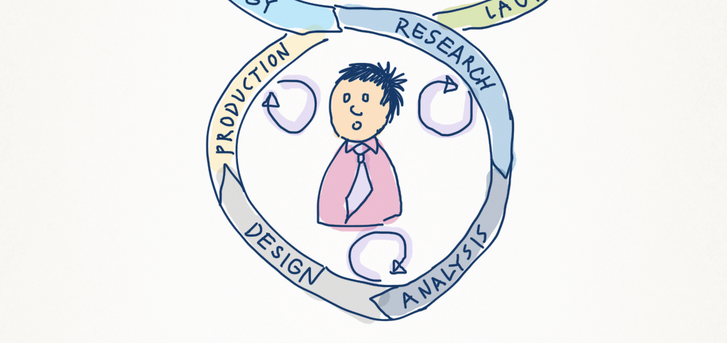
Strategy → Research → Analysis → Design → Production
Agencies may choose different labels for these phases, or they may make a bigger deal of the concept/ideation that occurs somewhere between Analysis and Design, but in general every UX process can be represented as above.
What really differentiates user-centered design from a more traditional waterfall model of software design is the user feedback loop, which informs each phase of the project.
This feedback loop is established through the use of a range of techniques that have become the staple for UX Designers. There are a ton of them, and knowing when to use which techniques during which phase of a project comes with experience. Personally, I find experimenting with new techniques and tweaking old favourites is part of the fun of being a UX Designer.
Introducing the UX Mastery Techniques Bank
We think we’ve captured a good number of UX Techniques on the UX Mastery Techniques Bank, which we’ve added to the website’s primary navigation menu for easy reference. This is a page that we’ve been wanting to pull together for a while. We’ve currently listed over 20, and we’ll be adding more over time. Each entry includes a description of the technique, the stage of a project it should be applied, and some brief information on how to apply it.
- Visit the UX Mastery Techniques Bank.
You can sort techniques by different columns, or use the handy Filter function to narrow down to what you’re looking for. And we welcome submissions—if there’s a technique that you think should be added, we’d love to hear from you!
A UX Process For Success
To complement the Techniques Bank, we’ve also added a new UX Process page, which lays out the user-centred approach that we recommend and use on software projects.
Each phase contains links to techniques that are relevant to each phase of the process. In the future we intend to make the integration between the UX Process page and the Techniques Bank more seamless, but for now we hope you find them useful!
- Check out our UX Process Overview.
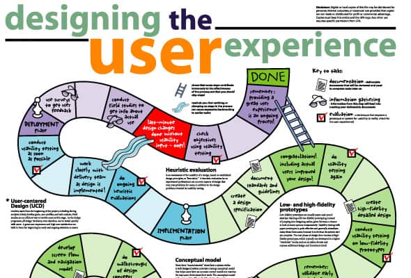
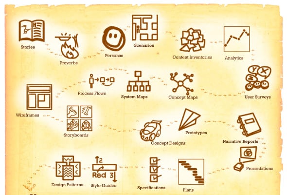
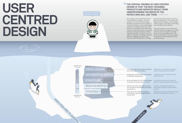
A UX Process Diagram … Or Three
Finally, there have been a number of attempts over the years to capture this iterative model in graphic format. Below is a collection of our favourite infographics for communicating the UX process.
What do you think of our UX Process page and Techniques Bank? Let us know in the comments.


I love your take on UCD, namely describing it as a “user feedback loop, which informs each phase of the project”. This should make the process clearer for stakeholders / business people. I will try and apply this explanation in the future!
There are different versions of the wheel and most of them are pretty similar. The version I personally like is the one that includes ‘measure/optimise’ as a separate stage after launch. It’s important to depict it as a part of the process because it helps us demonstrate the value of our work by demonstrating the often missing ROI.
Thanks,
Vero
Glad to hear, Veronika!
Very true that the evaluation and measurability component is key. I’m a big fan of Jeff Sauro‘s work.
The process is great and I have seen companies follow different variations. But I still see an issue remain: these processes don’t evoke enough “passionate empathy” for the user.
I have tried a few non-conventional ways like these to make it work: http://blogs.imediaconnection.com/blog/2013/02/14/michael-centered-design/
Do you know of others?
Thanks!
Thanks for your comment Harini. It’s not really captured in the process, but personas and scenarios are an attempt to elicit much of what you’re describing in that article. I agree though that getting them adopted across multiple parts of the business is always a challenge.
Also, I’m not sure if you saw this but I wrote a couple of articles recently on empathy and how to be more empathetic as a UX designer. I hope you find them useful too!
A really well informed article and I found the Techniques Bank and Process Overview particularly helpful. Excellent resources – Thanks for sharing.
Thanks Gemma. Glad you found them useful!
I am new to the world of UX/UI Design. The company I work for insists on giving preliminary demos for conceptual designs in hi-fidelity. Something I have been protesting greatly, to deaf ears. I am making an attempt to establish protocols and process for wireframes since non exist at my company. Is it customary to send hi-fidelity HTML files to developers? It seems counter-intuitive if the wireframe file is a viewable link, why would an accomplished developer need (example: Axure RP Pro) the HTML files? Aren’t these proprietary files loaded with junk code similar to what MS Word HTML files would produce, basically unusable? Please enlighten me if I am wrong or help provide me with ‘ammunition’ to back up my argument.
Basically User Centered Design process for develop web application in mobile devices. You can contact Usercible for more Information.