You’ve done your user research, triangulated data from various sources, pondered on what it all means, and are eager to present your findings to stakeholders.
So what do you do? Load up Powerpoint or Keynote and start creating slides filled with bullet points?
Wrong.
Don’t get me wrong—I love a good presentation. When a speaker knows his or her stuff, and tells a story confidently, with purpose, it can be a riveting experience. He or she may even use beautiful slides that contain lush, inspiring imagery to back up key points without relying too heavily on them—there’s a reason that TED talks are so popular.
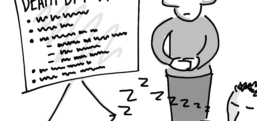
However, problem presentations occur when a presentation becomes all about the slides. You know the ones—the speaker is reading through each of the 27 tiny bullet points verbatim while half the audience squirms uneasily in their seat and glances at their watch every minute that ticks by. The other half of the audience is asleep.
This needn’t be you. Your findings are too important to be delivered in such a ho-hum fashion. Communicate them with style, using one of the following alternatives.
1. Infographic
A well-designed graphic that captures your most important points in visual form not only looks cool, it invites viewers to pay attention and dive deeper into your data. Email it around before your presentation, and include a few A3 printouts at your status meeting, and you’ll have stakeholders poring over your findings instead of checking email on their phone.
If creating an infographic feels too intimidating, you could engage a designer from somewhere like visual.ly to do it for you. Or if budgets are tight, consider using an online tool like infogr.am to generate one. A templated approach won’t be as effective at capturing your points as a well-designed, purpose-built image—but at least it’s not a Powerpoint deck.
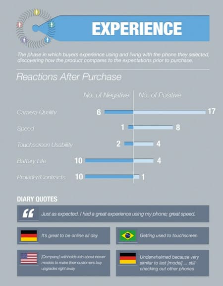
Note: a customer experience map is a similar concept—an illustrated view of the journey your customers take when they interact with your organisation.
2. Poster
A big-ass illustrated poster can capture the journey you’ve taken, highlight the findings you want to draw attention to, and make for a pretty centrepiece that everyone stands around and gazes at. It’s hard not to grab people’s attention when you’re 2 metres wide and 1 metre high.
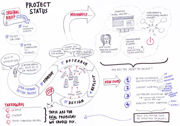
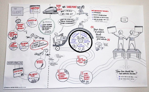
Again, you could engage a designer or artist to help you create a poster like this. However, you may want to try your hand at creating your own—basic shapes and simple colours are all that’s needed here! With a basic visual vocabulary, you can sketch just about any object to the degree that it is recognisable.
3. Video
Sure, producing a professional video is probably overkill (although, if you have the time and resources…) However, there is one video format that is relatively inexpensive and quick to produce: a whiteboard animation.
Whiteboard animations are popular because they engage the verbal and visual channels of the brain, making for compelling viewing. And while professionally produced whiteboard animations can be expensive, creating your own budget whiteboard animation needn’t be. I’ll go into more detail about how I created the video below in a later post (I used a $100 IPEVO Ziggy HD camera and ScreenFlow).
Failing that, there are even tools such as Sparkol Videoscribe, which allow you to create the entire whiteboard animation effect without even having a camera or being able to draw. Just upload imagery (or use images from the Sparkol library), and the tool will superimpose a hand as it draws it out for you. It won’t ever look as authentic as an actual video of someone drawing, but at a fraction of the cost, it’s an amazing tool.
4. Comic
Kevin Cheng’s book See What I Mean: How to Use Comics to Communicate Ideas covers the when, how and why of using comics in the business world.
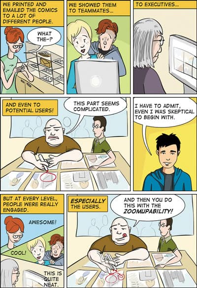
It’s a great read. Here’s the one-paragraph summary of the book: comics are an engaging and powerful medium that can be used to validate product ideas, get user feedback, get stakeholder buy-in, or market an idea. They don’t need to look polished—the aim of the game is communication, not art. So use simple shapes (stick figures are fine!), or trace photographs. Whip them up with pen and paper, or make use of online tools and templates.
5. Prezi
Finally, if the above options seem too hard, expensive, or time-consuming, you may want to consider using Prezi, a presentation tool that encourages you to think beyond simple slide decks. A browser-based presentation tool, Prezi allows you to zoom in and out of a world of text and images, so that your message is delivered in a unique and compelling format.
And there you have it: five ways to deliver your data, research findings, or project status while grabbing the attention of your audience.
I’d love to hear other ideas, if you have ’em?