This is an excerpt from A Practical Guide to Information Architecture, 2nd Edition by Donna Spencer, published by UX Mastery.
So, you’re over the main hump of your Information Architecture (IA) design process. You’re happy with the IA you’ve come up with, it fits your content, and should work well for the users.
Before you continue, it’s a great idea to test that assumption. Instead of just thinking and hoping it will work for the users, make sure it actually will.
This is called usability testing. It basically involves putting a draft of something in front of people, asking them to use it to do things they’d normally do, and checking it works for them. When you perform a usability test on something before you start to build it, you can find out what works, what doesn’t work, and what you need to fix. It lets you see things that aren’t going to work and make changes before it’s too late.
Download your copy of the complete ebook now from the UX Mastery store. Available in mobi, ePub and PDF formats.
Of course, usability testing can be done for anything. Although it’s used a lot for software and websites, I’ve heard of retail outlets setting up test stores specifically to check changes to store layout.
For your project, you probably won’t be doing usability testing on anything quite so large. You’ll want to test your draft IA – your groupings and labelling. Eventually these will form the main way people find information or do tasks, so it’s important to get them right, and to know they’re right.
Usability testing at this point won’t check everything you need to check for your final project. You’ll want to do it again more thoroughly when you’ve designed the navigation, page layouts and content. However, the more things you try to test at once, the harder it is to figure out what aspect wasn’t working – was the label obscure, or was the page so busy that people couldn’t see the navigation bar at all? Usability testing just your IA lets you know that your groups and labels are working well. The other reason for testing your IA is that navigation and content have to work with it, so it’s best to find any mistakes before you start working on these.
Usability testing isn’t about checking whether the people can use your website. It is about checking that your website lets them do what they need to do. It’s a subtle but important difference, and one to keep in mind when you’re testing. You are testing your work, not people’s abilities.
What you Want to Learn
Before you start testing your IA, think about what you want to get out of your test. This will help you decide how to run it and who to involve.
The main thing you’ll be trying to learn is that your groups are sensible and your labels are good. You may want to check that your overall approach is okay (e.g. if you’ve used an audience-based classification scheme, that people expect to see your information in that way and understand the audience groups). Or you may not want to test the IA as a whole, but instead dive deep and just check a part of the IA that was hard to design or where stakeholders couldn’t agree on the approach.
When to Test
One of the biggest advantages of the approach I’m about to describe is that it’s very easy to do. It doesn’t take a lot of preparation and you get results quickly. Depending on your situation, you could set up a test one morning and have results that afternoon. It really is that easy to quickly test your IA. It’s great to test quickly, make some changes and test again. So you really can test as soon as you have a draft IA you’re happy with.
If you didn’t get a chance to do good user research earlier in your project (and I know this happens for all sorts of reasons), you could take this opportunity to test your IA and gather some extra research at the same time. Even if you undertook some research early on, chances are some things came up in between that you wish you knew more about, or assumptions that you’d like to follow up. Combine an IA test with some simple research to help you make better decisions later in the project.
You could time your test with something else. (It takes so little time that it’s easy to slot in with other activities.) If you’re going to be communicating with your audience in some other way – perhaps a stakeholder or staff meeting to gather requirements for another part of the site – you could include a simple test of the IA alongside this.
How it Works
This type of testing is quite simple. You’re going to ask people how they would do a particular task or look for particular information using your new IA.
For example, if I wanted to test the IA of my conference website, I could ask people to find out some key things like how much it costs, what events are on particular days, and what they’ll get out of the conference. I’m not really asking them to find the answers, as the content won’t be available yet, but asking them where they would look for the information. I show them the IA step-by-step and ask them to indicate where they’d look – it’s that easy.
This testing method works best for a hierarchy pattern (see chapter 16), simple database structures and combination hierarchy/databases (particularly for checking the top couple of levels). If you’ve used the subsites structure, you may want to test from the top levels, or test one or more of the subsites. It’s also great for testing the focused entry points structure, as you can see which way different people approach information.
It’s unlikely to work for most wiki structures – they don’t really have an IA to test. You can test these later when you have some content ready (see chapter 24 for more about this).
It can work well for the top couple of levels of a catalog, but not so much for the deeper levels – especially ones that contain a lot of products.
Preparation
Before you start, you need three things:
1. A Draft IA
The first thing you’ll need is your draft IA.
It’s okay if your IA is still in draft form. This is a perfect way to check what parts of the IA work and what parts don’t. You don’t have to test just one draft IA – you could try out different versions or different approaches.
It’s also okay for your draft IA to list things in more than one place if you’re unsure where you’ll put them. This helps people feel like they’ve found the ‘right answer’, and gives you good information about the paths people will follow.
2. Scenarios
The second thing you’ll need is a set of tasks or a list of things you know people may need to look for. In usability testing we call these scenarios, and they represent what people will do and look for during the test.
When you’re writing these out, make sure they use the terminology people use and provide some sort of background or context to make sense of the task. In particular, you should avoid using the same terms as you have in your IA. If you do, it just becomes a treasure hunt for the exact word in your scenario.
For example:
- If you were designing a furniture website don’t say “You need a new bookcase”, because people will start looking explicitly for bookcases. Say “You’ve just moved house and have books in boxes everywhere” instead, which gets them thinking about what they’d do about that problem.
- If you have an intranet, don’t say “Find the maternity leave policy”. Instead, say something like “You’ve just found out you’re going to have a new baby. What are you entitled to?”.
- On your accounting software, don’t say “Raise a receivable invoice”. Try something like “You just delivered a report to your client and it’s time to ask them for money”.
Using these more realistic scenarios helps ensure people think about the task they may need to do, rather than just hunting for the exact word you’re giving them.
There’s no right number of scenarios to use. You want enough to cover a good proportion of your IA (or the part you are most interested in exploring) and a good proportion of the tasks people will do (so you can test that the main tasks are easy to complete).
As people go through the scenarios they’ll see parts of the IA, and remember where they saw things. This is okay, as people do learn and remember in real life. But after a while people start to focus more on remembering where they saw something than thinking about where they would look for it.
I’ve found the best approach to balancing these two issues is to have enough scenarios to cover your content and normal tasks, and enough participants so they don’t complete every scenario – they just do enough to keep the activity fresh.
It’s also good to randomise your scenarios (if you write them out on index cards as I describe below, just shuffle them) so each person does them in a different order. This will make sure your test isn’t biased by the order.
3. Participants
The third thing you’ll need is a group of people who can give a small amount of time to be involved. As we discussed in chapter 6, the participants should be people who will be using your information.
The most important thing to note for this type of usability testing is that it only takes a small amount of time and commitment. Even a couple of minutes of input from people will give you some very valuable data. So the way you arrange your participants will depend a lot on your project situation. For example, when I do intranet work, I do face-to-face tests and basically arrange to see people at their desks. For website work, I’ll set up an online test and invite people via email or via the website in question. If you can keep it low effort for people, it will be much easier to get them involved.
For more information about getting people involved, see the section on recruiting participants in chapter 6.
Method
The two main ways of running this type of usability test are face-to-face or online (yes, you can do both). The advantage of running face-to-face testing is you can talk to people. Just like other user research activities, you can ask people why they made particular decisions and what terms meant for them. This type of feedback help you understand why your IA is working (or not working) instead of just letting you know it is working.
Of course, it isn’t always easy working face-to-face, which is where online testing can be particularly useful. The main advantage of online testing is you can involve people you wouldn’t otherwise be able to meet face-to-face. And you can often involve more people than you would ever reach face-to-face, giving you a lot of useful information. Each method will involve different preparation.
On paper
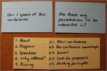
Figure 19 – 1. Scenario cards and hierarchy cards
If you decide on face-to-face testing, you’ll need to prepare your IA and your scenarios. My favourite way of doing this is with a set of index cards.
For the IA:
- Write the top level categories on an index card. If you have more categories than will fit on one card, just continue on another. Write large enough that you can read it at arm’s length. Number each category 1, 2, 3, 4, 5, etc.
- For each top level category, write down the second level categories in the same way. Again, if they don’t fit on one card, just continue on another. It can be handy to use a different coloured card (so you can handle them more easily) but it’s by no means essential. Again number these, this time using the number that represents the category above, followed by a number for the current level (e.g. 1.1, 1.2, 1.3).
- Continue for all categories and all levels.
- For the scenarios, write each scenario on one card (it can be handy to use a different coloured card for these too). I also usually label these as A-Z in the corner of the card. (The numbering and lettering system helps with record keeping and analysis.)
Come up with a way to explain the exercise. This helps you introduce the activity efficiently and helps people understand what you’re about to ask. I usually say something like:
“Thanks for agreeing to help us out today. We’ve been working on improving [whatever your site is] and would like to check that what we’ve come up with is sensible for the people who will have to use it.
I’m going to ask you to tell me where you would look for particular information. On this set of cards I have a list of things people do with this [site]. I’m going to show you one of these, and then show you a list of words that may end up being navigation on the [site]. I’ll ask you to tell me where you would look first then show you another level and again ask you to tell me where you’d look. If it doesn’t look right we’ll go back, but we won’t do more than two choices – after all, it’s not a scavenger hunt. Don’t worry if this sounds strange – once we’ve done one, you’ll see what I mean. And if there are tasks on those cards (the scenarios) you wouldn’t do, or that don’t make sense, just skip them.”
Bundle up your cards (plus some blanks and a marker) and you’re ready to go.
Running the Test
When you’re with a participant, you pretty much run through the test the same way you described in your introduction. So first show them a scenario (or read it out if you like), then show them the top level card. Ask them to choose a group. For that group, show them the next level card, and so on until there is nowhere further to go.
If they choose a group and feel as if they’ve made the wrong choice (usually this will happen as they don’t see anything that helps at the next level), go back one level and ask them to choose again. But just as you outlined in the introduction, only do this twice. After all, you want to know where they would look, not get them to hunt down the ‘answer’ to the scenario.
Run through the scenarios you have planned for this participant. If you feel like they are trying to remember where they saw answers instead of thinking about what they’re looking for, that’s a good time to wrap up.
If your participant needed to go backwards at any step, you may like to ask them what happened. Ask if they remember why they chose the particular group and what they thought would be in it. Be very careful not to make them think they’ve made a ‘mistake’ – remember, you’re checking how good the IA is, not how good the participant is. But by asking you’ll learn very useful information about what people think groups are about and how they expected to look for information.
When you’re finished, thank the participant for their help and let them know what happens next.
When I’m using this method to test an IA, I sometimes notice a consistent problem in the IA – usually a label that just doesn’t make sense. That’s why I carry spare index cards and a marker. Rather than continue testing something I know isn’t working, I’ll change the label (by writing a new card) and continue testing to see if the new label works any better.
Recording Results
As you work, record the participant’s answers (this is why we put numbers and letters on the index cards). I like to have someone with me taking notes, as it can be tricky juggling cards and writing down selections (the test moves pretty quickly). All you need to do is write down the path for each scenario.
For example:
- A: 1, 1.2, 1.2.1 (no), 1.2, 1.2.6 (happy)
- B: 7, 7.6, 7.6.5
A helper can also write down the comments people make as they do the test, which are usually both interesting and useful.
After the test, I usually record the results in a big spreadsheet. I put the scenarios across the top, and the IA down the sides. Then I simply go back through all the results and tally where people looked for each scenario. Because I let people look in two places, I usually mark first choices with a big X and second choices with a small x.
It’s a simple process, but it very quickly shows you patterns. For some scenarios, you may find there was a consistent approach. For some, there may be less consistency. Sometimes you’ll find consistent answers that were quite different to what you thought would be the ‘right’ one.
Online
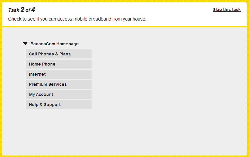
Preparation using an online tool will vary, depending on the tool. At the time of writing I know of two online tools that focus specifically on IA testing:
- TreeJack: From Optimal Workshop (http://www.optimalworkshop.com/treejack.htm)
- C-inspector (http://www.c-inspector.com/)
The first two let you test the IA as a hierarchical tree. I usually create an IA before I know anything about navigation (something we discuss in chapter 23) so the tree approach works well for me, but it would be easy to mock-up a navigation approach and test with a bit more context.
All follow the same idea as the face-to-face test. You upload a hierarchy (your IA) and a set of scenarios. You write an introduction test and send it out via email or include a link to it on your website.
Figure 19—1. Treejack (https://optimalworkshop.com/treejack.htm)
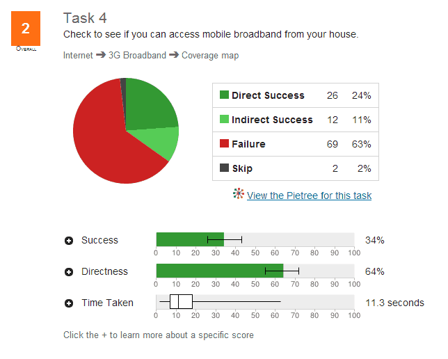
Figure 19—2. The results from a Treejack test
Interpreting Results
It’s usually pretty easy to interpret the results of this activity. The spreadsheet I described above, or the outputs from the tools, show a fairly clear picture of what works and what didn’t. When interpreting the results, think not only about what happened but why it happened.
First, think about whether the overall approach worked well. Did the test show you’ve chosen a good basic approach to your IA (particularly if you’ve chosen something like an audience or task-based classification scheme)?
Identify the scenarios where people looked in the same place you thought the content would be. You can probably be confident this will be a good location for that content.
For the parts that worked well, think about what made them work well and check that they worked well because the IA is suitable. You need to be a bit cynical here and make sure the scenarios didn’t work well because you used leading language and people word matched, or because they always did that scenario 5th and had learned the IA.
When the results weren’t what you expected, think about what happened:
- Did everyone think the information would be in a different place to where you thought you’d put it? If so, consider putting the information there. You may need to tweak the IA a little to fit it.
- Were some of your labels just not clear enough, or did people interpret them in a way different to how you intended? You may need to revisit the labels, the placement of content within them, or the categories themselves.
When you’ve finished analysing what worked and what didn’t, go back to the process we discussed in the last chapter. Tweak the IA (or toss it out entirely and take a new approach) and test it again. Keep doing this until you’re happy you have something that’s going to work.
Download your copy of the complete ebook “A Practical Guide to Information Architecture: 2nd Edition” now from the UX Mastery store. Available in mobi, ePub and PDF formats.

