We were delighted to be given the opportunity to deliver our presentation Design With Soul: Battling The Ecommerce Blues at the UX Australia conference a couple of weeks ago.
If you missed it, here’s a video of our complete presentation (38 minutes; you may want to turn on captions as the sound is soft in parts).
As you can see, we had a lot of fun with it, and the crowd seemed to enjoy it too.
Here’s an overview for those of you who are curious but don’t have time to sit through the whole thing (I recommend you at least watch up until Aretha enters the room, from a pure entertainment perspective).
1. UX Mastery Community Projects
As well as creating as much free content as we can for this blog, Luke and I have been engaged in a community project over the past year—redesigning the online shop for the Mathematical Association of Victoria. We’ve been volunteering our expertise in exchange for permission from the MAV to use the project as a case study that our readers will be able to learn from. For those who have asked, the MAV Shop is not live yet (coming soon) and neither is the case study content (coming … some time).
We were delighted that Simon Pryor, the CEO of the MAV, joined us on stage to give his take on the project (undeterred by our unconventional approach to public speaking).
2. What is the killer UX technique?
We have two motivations for this community project. One is to deliver the MAV an amazing online shop. The secondary purpose of the project is to create a comprehensive case study for people to learn from, and as a result we’ve applied almost every UX technique that we know to the project, even though it was overkill.
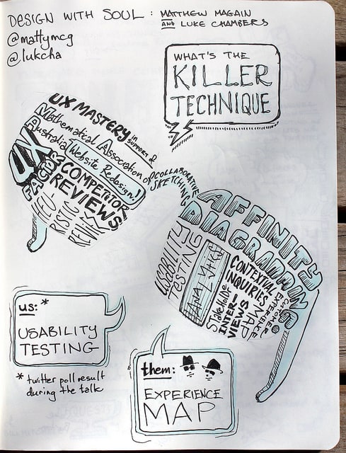
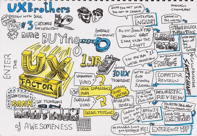
We realised that doing so put us in a unique position to answer the question, “Which is the best UX technique?” We evaluated over 30 techniques using our Matrix of Awesomeness, and came up with a winner—think of it as a talent show for UX Techniques: The UX Factor.
3. Everything in life can be related to a quote from The Blues Brothers
Rather than just announcing our vote for the best technique, we opted to make it difficult for ourselves by having audience members select a technique from a briefcase, and then took turns to try and draw parallels between that technique and a famous quote from thee classic musical comedy film, The Blues Brothers. Some long bows were drawn.

4. What did the audience vote for?
We used a Twitter-based polling service that allowed audience members to vote for the technique that they thought was the best of 10 displayed on screen. “User testing” came out on top, with 31% of the vote.
5. What did we select as our killer technique?
Our vote for best technique went to the Customer Experience Map. This is a visualisation of a customer’s journey through the entire lifecycle of them interacting with an organisation. We found it ticked a bunch of boxes—getting user buy-in, exposing opportunities to add delight, communicating user goals, and more. We concede that it’s cheating a bit, because it’s impossible to create a customer experience map without applying all of the techniques that produce data to influence the visualisation, but hey—it’s our presentation.
6. Reflections, challenges & learnings
Take this notion of “the best UX technique” with a pinch of salt. However, we strongly recommend you try your hand at creating a customer experience map on your next project. The team at Adaptive Path have compiled a fantastic resource, mappingexperiences.com, which includes a free downloadable guide to how they create customer experience maps, and is definitely worth checking out.
Thanks to everyone who attended this talk, and who said nice things to us after it was over. And a huge shout-out to Adam “Aretha Franklin” Schilling for being such a good sport and helping give our talk that something special.
A note to conference organisers: Luke “Personas” Chambers and Matt “Analytics” Magain are both open to the concept of putting the band back together and taking the UX Brothers on the road. Contact us if you’re interested.
Sketchnotes from this session
(Image credit for banner on front page: Ruth Ellison)

