Craft engaging experiences with the Storytelling Canvas
Great literature works for a reason.
Whenever the idea of storytelling comes up in the context of web design, there is a low-level snickering in the room. “Goodnight, Moon is not serious business,” designers and stakeholders think. “We’re talking about websites and apps that drive our business, not distract people.”
Whether we’re aware of it, we are surrounded by stories. We recount events to our friends and read about them on our phones. Everything from the news to personal conversations all flow from a beginning, middle, to the end. The subjects involve people, what they experienced, and how they dealt with it.
So, if this format is so engaging, I wanted to break down how it works and apply it as an approach to web design. As business leaders know, an engaged customer is more likely to be a loyal customer. We’re in a better position to secure loyalty if we engage in an efficient and meaningful way.
Enter: The Storytelling Canvas
The Storytelling Canvas is an approach I’ve created to help bring a team together to create purposeful design decisions for content websites. This approach will work for apps as well, but there is usually more narrative in a content site, so we’ll stick in that arena for this article. I’ll use the term customer when referring to the user, and business when referring to the organisation.
Even though artefacts like personas, information architectures, sitemaps, and card sorting, are helpful, they don’t necessarily result in content that answers the audience’s questions. It’s also easy to get lost in the act of creating these deliverable’s instead of addressing the critical needs. Unnecessary documentation for a project wastes time and offers no value.
This canvas helps you keep your team focused on the real problems to solve throughout the project and allows them to be innovative within those bounds.
Great stories have five common elements
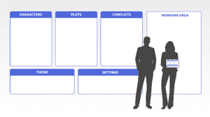
When you break down a story, you have these common elements: Theme, Setting, Character, Plot, and Conflict. How those elements play out results in the experience.
When we’re discussing a digital application, these five elements translate to core fundamentals of customer and business
Theme = Brand
This is the unique value that sets this business, product, or service apart from competitors. This includes the brand pillars as well as the visual identity.
Setting = Technology & Location
This defines where your customers are both physically and with which devices.
Character = Personas
These are the people interacting with your site.
Plot = Journeys
These are the individual tasks or journeys a customer undertakes with your site.
Conflict = Moments that Matter
In every journey, there is a critical moment which will drive a customer away or toward deeper loyalty.
Set up & basic usage
I am an advocate for using a wall for creative work. Bringing thinking out in the open is a critical step with a team. Everyone has access to the canvas as it develops and matures. It’s also invaluable for stakeholders to see your work and thought process. If you are solo, you can ease conversations and approvals by setting up a miniature version of this on your own wall.
Whenever you have an idea, put it on the canvas in the appropriate section. If there are multiple people on the team, you can give them ownership of part of the canvas. In the early stages, these sections can be created simultaneously.
A note on research: it’s a common practice to understand your customer through many different forms of research. Surveys, interviews, call-centre records, and direct observation are just a few of the techniques available to you. I’m assuming that you gain a good, realistic view of your customers as you begin to flesh out the canvas.
Identify the Theme
If you have company brand guidelines, that’s a great place to start. If not, some of the basic tenants of the brand and visual direction of the site can go here.
Guiding principles, colours, typography, voice, and anything else you want to be considered appropriate for your site should go here. This doesn’t limit you to adding new things later, or even making refining cuts down the road. It enables you to declare what the theme is or is not, and by doing so gives you a healthy creative constraint.
Identify the Setting
Mobile: check. Desktop: check. Riding in a cab at night: hmmmm.
Identifying the technology is easy, and it’s likely to be similar choices for most projects. However, identifying the physical situation your customers are in is an informative guiding principle. Here are a few prompts to consider:
- Is a person sitting or moving?
- Will they be glancing for a moment or focusing for a long period of time?
- Are they outside in the weather or inside at their desk?
- What type of device is it?
It’s important to be specific yet not comprehensive. While in a perfect world the final site would satisfy every device in every condition, choose the most critical ones.
Identify the Characters
If you’re familiar with creating personas as biographical sketches, let me encourage you to break out of that approach. Ironically, when we invent a backstory around a persona we can think too narrowly about what they need. We are tempted to solve for the very specific cases, yet in reality people are much more nuanced. We also spend a lot of time creating this detail instead of ensuring we’re looking at the broader, more common needs.
Instead, create behavioural personas. These are sketches of the state of a person’s behaviour. For example, a 20-year old and a 60-year old person both can be a “New Customer.” Their tastes may be different because of their stage in life, but they will all have similar needs when it comes to interacting with your content such as signing up for an account or checking out for the first time.
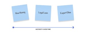
By segmenting the characters this way you identify both a maturity path over time. This has an added benefit of creating specific gateways for people to engage with your site directly. Every “New Customer” has the potential to become a “Loyal Customer” and no longer has the need to be on-boarded.
We like to give these Characters names that stick in our minds. So, we might call the two above “New Nancy,” and “Loyal Leon.”
Identify the Plots
These are the journeys customers take within your site. There is always the greater customer journey of how they arrived on your site, but the canvas only looks at tasks within your site.
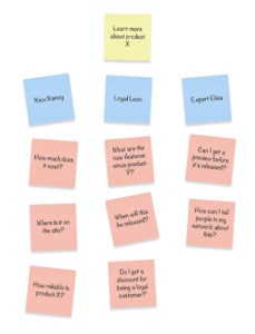
These should be phrased around an activity with an outcome-oriented feel. We want these to read from the customer’s perspective instead of as business goals. So, well-written plots would be “Learn more about product X,” or “Order a sample,” instead of, “Increase leads through the contact form.”
Think of these journeys as the intent a customer has in mind when coming to the site as well as what the business would want them to accomplish. You may generate dozens of plots; however it is good reduce them to the most critical to focus on . You can do this through customer research as well as prioritising them with your stakeholder.
We aren’t interested in the details of how they accomplish the journey yet.
Identify the Conflicts
Lights, camera, action!
Conflicts are the highest moment of tension for customers, and for the success of your site.
Now we move to our working area of the canvas.
For every plot, put a character under it. Now ask the question the character would ask when confronted with this plot. A “New Customer” placed in the plot of “Learn more about product X” will ask a number of things, including, “How much does it cost?” “Where is it on the site?”
Immediately, you will notice the questions the characters are asking for a single plot are different. If they aren’t different, then either your personas are not unique enough, or you only need to solve for the one conflict and you will get both resolved.
You may have these conflicts as part of earlier customer research. That’s great. The more direct feedback you can get, the stronger your solution. But don’t discount the value in thinking ahead of the need as well. Identifying conflicts from internal people who deal with customers is also a great way to quickly ground yourself in the customer’s needs.
Designing an experience by resolving conflicts
Now we get to start exploring possibilities for our new experience.
For every character-plot-conflict pair, create ways to resolve that conflict. For example, if New Nancy is in a plot of “Learn about product X” and one of her critical conflicts is “How reliable is product X?” you might come up with these resolutions:
- Show photos of the product after 5-years of use
- Show customer testimonials
- Demonstrate the quality of the product materials
- Give a 1-year guarantee
- And so on…
You may come up with several viable ideas but may need to pick only one to move forward with. You might see there are ways to combine a couple of individual ideas into one elegant idea (such as showing customer testimonials which include photos of their product).
As you solve for each character-plot-conflict, you may find that the resolution of one set applies equally as well to another set (or more). These become strong candidates to move forward since they may solve even more universal needs you can’t anticipate at this time.
Tying it all together
One output of the Storytelling Canvas is a site architecture, or experience map. Or you might jump right in with designing the visual experience with content and layout. Whatever you might call it, you want to bring together the common conflict resolutions into a logical and approachable navigation scheme.
You may find that beyond a site structure, some of your resolutions speak to one specific portion of a screen. This informs the Content Strategy which in turn can provide a distinct purpose for every page or snippet of content.
In the end we can only hope that Shakespeare might endorse our approach, “All the world’s a stage, And all the men and women merely players; They have their exits and their entrances, And one man in his time plays many parts.”
Stories are the fabric of our lives. It’s about time we leverage their power as a business tool and make a meaningful connection with our customers.


