In this second instalment of our three part series, we’re going to examine another of the important tenets of UX design, usability. In part one we discussed usefulness [link] and dug into an interesting case study from Buffer.
So let’s dig in.
Usability
So you have a product that solves someone’s problem? Take a moment to pat yourself on the back, but make it quick — there’s still a lot of work ahead of you. As the saying goes, build the right thing, then build the thing right.
Usability defines how well a product performs the purpose for which it is intended. It refers to the quality of a person’s experience when using a product, and encompasses a variety of elements, from function to learning curve, to overall complexity.

The Nielsen Norman Group defines five core components to usability:
- Learnability — The ease with which the user can figure out how to use the product for the first time.
- Efficiency — The ease with which users can accomplish tasks.
- Memorability — How well a user can recall the system after a period without using it.
- Errors — The amount and severity of errors both from the system and the user.
- Satisfaction — The pleasure a user gets from using the product.
With the exception of satisfaction (which is in a class all of its own), these factors are pretty mechanical. Usability is the nitty-gritty of design, where you roll up your sleeves and smooth everything out.
As with usefulness, you shouldn’t go in blindly to create a product that you think your users will like. Your design’s usability should be determined through more reliable and structured methods, involving the users themselves.
Here is the method that UXPin finds the most effective:
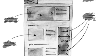
- Wireframe. This is the preliminary stage of the design, where you solidify the structure, layout, and information architecture. It’s important to set aside time for these details before moving on to graphic and interface decisions.
The wireframe acts as a skeleton and helps with addressing efficiency as you prioritise what goes where. Some designers go even more basic, sketching and fleshing out ideas even before the wireframing stage.
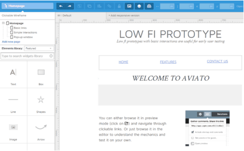
- Prototype and test. Build a workable prototype, then test it with an absolute minimum of 5 users. Even with a rough prototype you should be able to test for most usability factors – all except satisfaction.

When testing, elicit both quantitative and qualitative feedback. Observing how users complete tasks and how long it takes will cover the quantitative side of things — count the number of clicks or pages visited. As users run through your app, encourage them to think aloud and record their qualitative feedback.
- Continue prototyping until ready. The rapid prototyping cycle is design, test, elicit and implement feedback, then start the cycle over. You’ll want to repeat the testing stage over and over again until your product is getting reliably excellent feedback. Build and test progressively better and/or more elaborate prototypes until you have something that resembles your final product.
Following this process should support you to build a reliably usable product, which means you’re ready to tackle the third facet of great UX design – delight. We’ll tackle that one next week in the last of our three part series.


