
I failed in using wireframes; that’s why I say that they are bad. I know so many beginners and intermediate UX designers use wireframes in the early phases of the design process, especially in research and usability testing. I used to use them this way, but let me tell you why I don’t use them in that way anymore.
What Is a Wireframe?
Before digging deep into this subject, let me try to simplify what a wireframe is. A wireframe is a skeleton for the digital product design. You can imagine it to be the blueprint for any product. It consists of lines and shapes, and each represents some element/hierarchy/structure.
The main three elements of a wireframe are:
1. The Line

This element could represent a frame, a border, or a separator.
2. The Image
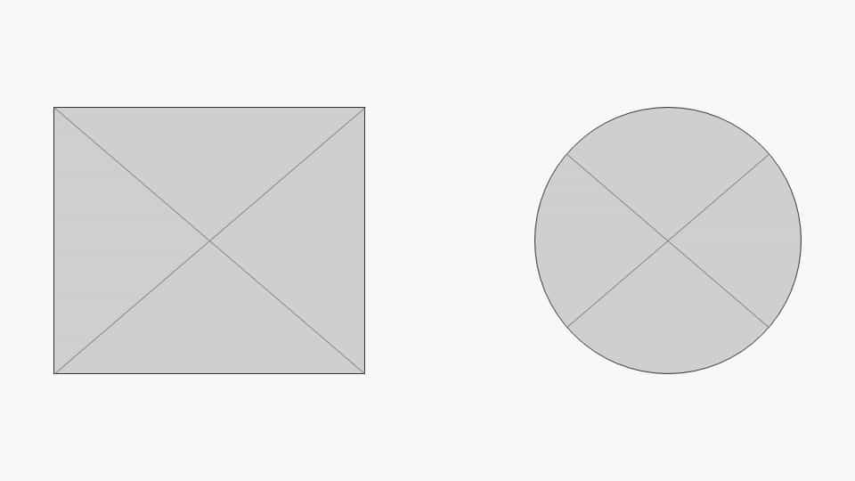
This element could represent either an image, or an icon, or any graphics.
3. The Solid

This element represents either a block or a line of text.
Using all these elements in a design can produce something like this:
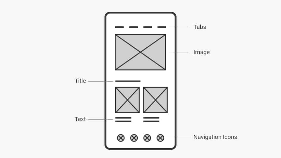
Now remove these hints from the design and give them to a user asking them to use it. Can you imagine that?
Why Are Wireframes Bad?
I remember one time I was working on a mobile app product for weekly/monthly healthy food ordering subscriptions. The app allowed a user to subscribe and get healthy meals delivered daily. It allowed the user to choose the daily meals and the delivery time. And it also provided health tips and some workout exercises to keep living a healthy life. Here’s a concept that we tried testing out.

When I tested this concept as a wireframe with the first group of users, I asked each one this question “Suppose your daily meals will be delivered daily at 2 PM and you want to change this time to be at 3 PM, how can you do this?”
I was shocked by the result. 4 out of 5 users tapped on icon no.2, which was supposed to be for the health tips, while just one user tapped on icon no. 1, which was for the menu and settings. This meant that 80% of users expected to change delivery times using the middle button at the bottom. However, I didn’t rely on that result.
To make this clear enough, I created a simple test and iterated the same scenario after applying the UI and providing a finished prototype to another group of users. This time, 5 out of 5 users didn’t like the changing delivery time feature to be placed in position no. 2. The common reason was that they wouldn’t need to perform that daily, and instead, they might need the health tips to be placed at this position since they might need to use this feature more than once a day.
Wireframes come in two forms, digital and paper sketches. The main reason why wireframes were invented was that they were cheap and fast to create, but this doesn’t come free. There’s a hidden cost to that.
1. Cost of Educating
Although wireframes are fast to create and they seem to be a time-saver, they take up too much time in educating, especially in user testing. The time you save in producing them, you pay the double in educating users about them.
2. Misunderstood
What’s the difference between these two elements? Are they both images? Are they both icons? Are they clickable? What should they represent? Too many questions to process in the user’s head may lead to either making wrong decisions or driving them away from the central value.
3. Miss the Whole Experience
Making the user assume that a specific element may serve a particular purpose will not lead to correct research results. When you test with many users, the findings will not be accurate because each one will interpret the shapes in their own way, which will lead you to correct their understanding and guide them back to the right path, which is wrong in research and testing. You should not lead the user.
Feeling and living the whole experience is way better. Making the user live within a semi-real product, feel the interactions, sense the animations, and deal with colors and typography will lead to better and more accurate results.
So, Are Wireframes Useless?
Wireframes are plain, too neutral to be usable by actual users, but this doesn’t mean they are useless. Here is how and when to use wireframes:
1. Guiding You in Your Process.
Design wireframes for yourself to make it easy for you to structure the product you are designing. By creating wireframes, you pour all the imaginations in your head on a canvas or paper faster, organize your thoughts, clearly see where you are heading, and most importantly, iterate more quickly. Know where to place the right elements in the right place, either here or there.
2. Brainstorming and Generating Ideas With Your Peers.
Product owners, UI designers, UX designers, product managers, and developers—all of them can understand wireframes well; they may even add to it, generate ideas, and make a clear direction for the best structure.
3. Flow Design
Because wireframes are plain, you can use them as flow demonstrations with techies and developers. In this way, it will work better than the traditional user flow’s symbols and shapes.
4. Business Owners (Carefully)
Business owners are like users: they can easily misunderstand the wireframe and are time-consuming to educate. But the difference here is that the business owner is just one person, the time cost won’t be as much as educating many users, and in the end, they’re the business owner—you have to keep them involved and in the loop throughout the design process.
Conclusion
Actual users are ordinary human beings. They are not as deep into the technology or the product as you. You must do your best to talk to them in their language, not yours, so it’s better to do your research and usability testing using realistic prototypes instead of wireframes.
Lastly, creating and using wireframes is beneficial if created for people like you within your production environment.