San Francisco is design. Seemingly everything about the city—from the simple elegance of Coit Tower looking down on the city to the distant beauty of the Golden Gate Bridge—is a masterclass in beauty and form.
It’s no surprise then that Smashing Magazine chose one of the city’s most beautiful and noted locales, the Palace of Fine Arts, to hold one of its conferences this year.
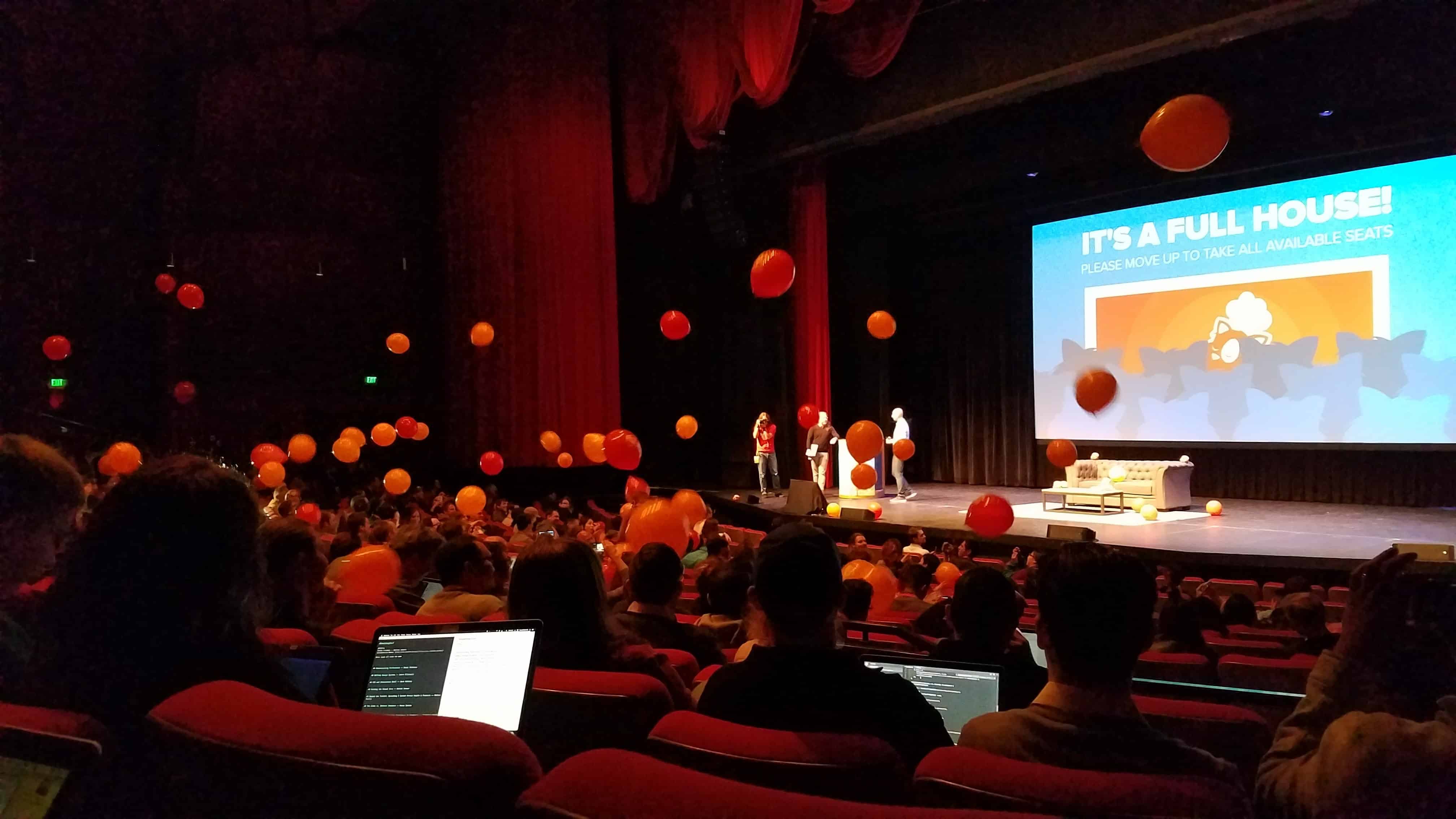
Smashing Conference San Francisco 2017 was full of amazing speakers and concepts that could benefit all UX designers. Here are five of the key trends from the conference.
Accessibility is key
It’s easy to think about web accessibility in terms of the blind, deaf, or quadriplegic, and to write them off as representing a small minority of web users. After all, the industry as a whole has done so for years, arguing that designing to their needs was not a reasonable use of valuable development time.
But what about those who are recovering from eye surgery? Or the construction workers who can’t hear audio over the noise of the job site? What about the new mother using an app with one hand and holding a baby in the other?
The reality is that virtually all web users have experienced some sort of accessibility issue, regardless of whether or not their impairment was temporary or permanent.
The conference covered a wide range of topics, and accessibility was a topic of discussion for all. It’s clear that many of the industry’s top professionals have a renewed focus on developing sites, apps, and experiences that meet the needs and capabilities of all individuals, regardless of their limitations.
For many UX professionals, learning to design with an eye for accessibility will be a new skill that can no longer be ignored.
Design systems and pattern libraries are getting easier and more common
Even in the world of user experience, not everyone has had the chance to work on a true design system or pattern library. The reason? They require a significant amount of effort, maintenance and documentation to setup. As many UX designers have experienced, it’s often hard to quantify the value of a design project based on the project’s expected return on investment. The nature of setting up a design system only makes the task of quantifying its value more difficult.
But where there is differentiation based on using design systems, there’s often a big gap between the haves and the have-nots. Larger companies such as Google and AirBnB (to name a few of the front-runners) now use them as a matter of course, and see them as a strategic advantage over competitors.
The rest of the web is catching on. Tools like Fractal and Astrum have sprouted up to allow even the smallest projects to adopt and efficiently use a pattern library or design system. UX professionals will be tasked with deciding both if a design system would be useful for a particular project, and then implementing that system if the benefits are there.
CSS Grid will make executing layouts easier
I’m convinced that some of the more experienced web designers still wake up some nights in a cold sweat, desperately gasping for breath as the old demons of their first table-based or float-based layouts mock them from dreamland.
Fortunately, Flexbox changed the game when it came to designing a more grid-based layout, and now CSS Grid looks to change things once again. CSS Grid allows designers to create layouts in rows in columns without having a content structure, which means that designs that once brought tears to developers’ eyes won’t be nearly as difficult to implement.
CSS Grid has gained support from all modern browsers except for Microsoft Edge, though Edge has announced that they will be supporting it soon. With widespread support, look for CSS Grid-based designs to quickly become the norm.
Part of being a great UX designer is understanding the relative difficulty of implementing our designs. CSS Grid means a greater ease in implementation for developers, greater freedom for designers, and less time the two groups spend negotiating layouts.
That’s a win for everyone.
Optimistic Design is on the rise
In everyday life, we expect most of the tools we use to interact with our world will be successful the vast majority of the time. When we flip a light switch, we expect it will turn on. When we turn the knob to the sink, we expect water will start running. We only need to know about the very rare failures when they occur; we don’t need to expect the possibility of failure every time.
So why should the web be any different?
Optimistic Design is the concept that we can plan for our site to be successful in its “everyday” tasks. Errors are handled on the server rather than on the page, allowing us to move the user through the UI faster. Errors only return if they present themselves. The perceived upgrade in speed and responsiveness is a huge win for both users looking for speedy services and businesses looking to increase conversions.
Learning to implement Optimistic Design and defining best practices is a discipline that more designers will begin to tinker with over the course of the coming year.
There’s no excuse to stop learning
The one thing that Smashing 2017 San Francisco was absolutely full of was amazing speakers who had dedicated their lives to mastering a craft. Speakers focused on data visualisations, interactive emails, typography design, and so much more, all with the aim of making the web a better place for everyone.
All of these brilliant designers and developers clearly have one thing in common: they never stop learning.
The web is full of opportunities to make a name for ourselves in our own niche. The very nature of the internet is progressive and fluid. We’re all learning as we go, and nobody ever knows everything.
Keep learning, keep improving, and keep making the web a better place.
For more insights from Smashing Conference, head to the forums to see Doug’s live coverage.