You may have noticed the rise of UX conferences throughout South East Asia recently. There is an exciting mix of big names and local talent presenting at UX Indonesia, UX Philippines, UX Hong Kong and UX Singapore this month.
It does beg the question—are Asian designers starting to embrace Western design principles, or are these principles universal and the Asian design aesthetic is maturing? There certainly seems to be a real drive in Asia toward clean, simple and usable design and away from the stereotypical Asian digital aesthetic of busy and jumbled—and there is a corresponding hunger to learn more about UX design.
Since the early 2000s, the Asian web design aesthetic has been comprised of jarring colours and high information density. Of course, not all companies subscribe to this idea—consider this site from Bic Camera, a large electronics chain store in Japan:

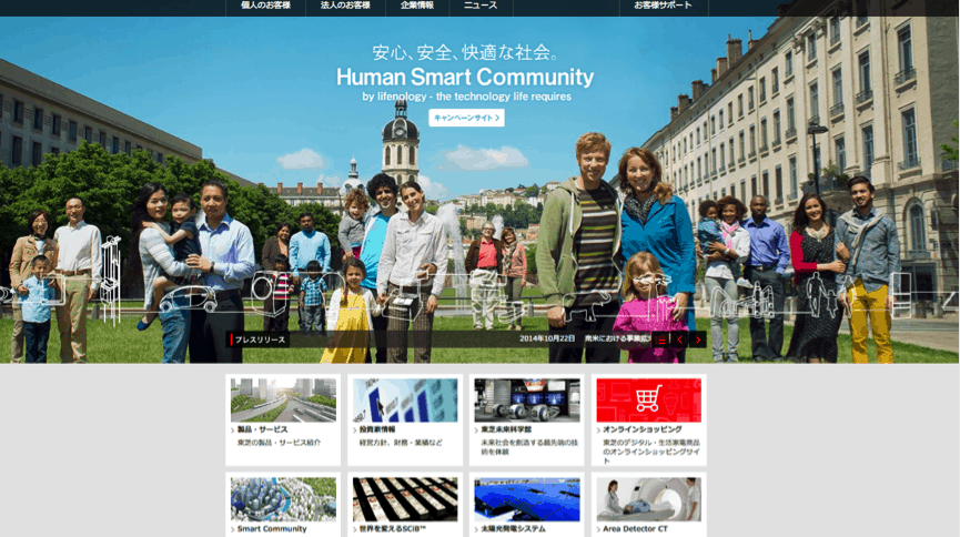
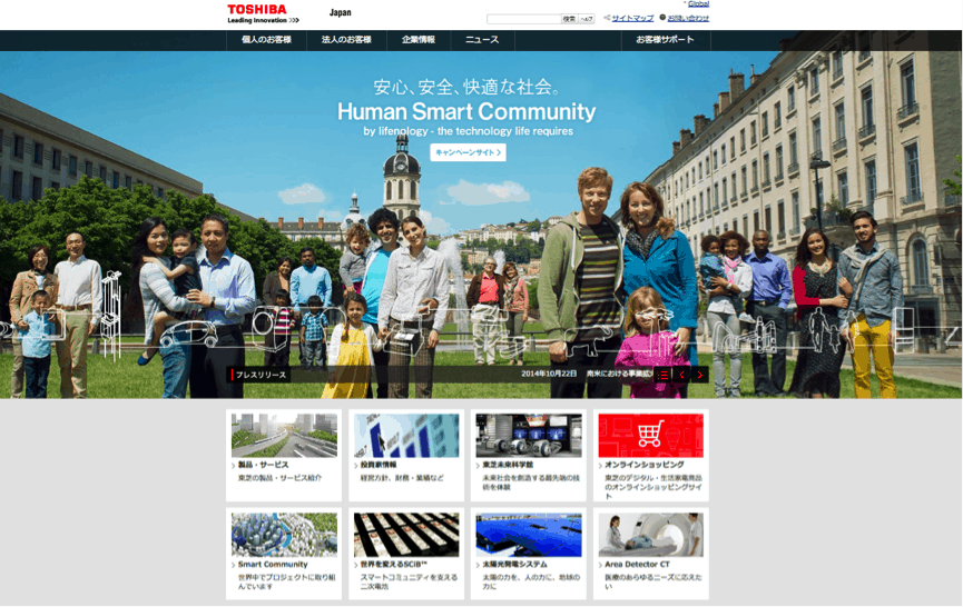
And compare it to Toshiba’s site, which is much simpler, responsive and clearly had thought put into the IA, the imagery and calls to action:
Randomwire has written about why Japanese websites are so “different”, suggesting that technical, cultural and linguistic differences all contribute to this loud design approach.
It could be argued that this design aesthetic is in itself a brand, of course. Users know what to expect when they jump on to these sites, and for Asian audiences such an aesthetic may be comfortable—something they have been used to navigating for many years.
But that is slowly changing. With an increasing demand amongst users everywhere for accessible and usable sites, more Asian designers are (finally) understanding that good, uncluttered design is important for efficient (and delightful) products and sites.
Ultimately it’s about commerce. With interest in user-centred design gaining momentum globally, it has become imperative for companies that wish to succeed in the global market to approach their websites with solid design principles in mind. It’s therefore understandable that companies who operate solely within Asia (such as Bic Camera) and don’t have a global presence might be slower in coming to the UX party.
I’d be interested to hear your take on this—leave me a comment below.
Incidentally, if you’re in Australasia, you might consider attending one of these conferences:
- UX Australia Redux (Sydney): Wednesday 5 November
- UX Indonesia (6 November, 2014) Matt is a speaker for this event, presenting both a seminar on “What the @#$% is UX?” and a workshop on “Sketching Experiences”.
- UX Philippines (15 November, 2014)
- UX Hong Kong (6-7 March, 2015)

Kimberley,
Nice post. The Japanese e-commerce sites have always amazed me, too. They seem so cluttered and overwhelming at first glance.
But I’m not sure that indicates a previous lack of UX maturity. The two examples you’ve given clearly contrast in aesthetic, but the Toshiba site is very much about positioning their brand while the Bic Camera site is purely e-commerce. Kind of an apples and oranges comparison.
Going back to my time in Tokyo in the late 90’s to late 00’s, the agency I worked for did a lot of work for Sony and Sharp and those sites were definitely inline with the Toshiba example above. For example, take a look at the Sharp site designs in 2005 @ http://www.defide-ix.com/index.html?deviceStatus=true#category5_1
I’d love to think that the e-commerce sites like Bic Camera are way behind in UX (ahg, hurts my eyes) , but I’m pretty sure that I’m not the user they’d be centering their design around so my aesthetic preference probably doesn’t count for much :)
I’d love to know if/what user research and design testing they do (anyone out there with the inside story?) but I find it hard to believe that they’d invest nothing into optimising the design of their online shopping channel. So, if they do, and if the results have led them to more conversions with those cluttered, overwhelming designs, perhaps they’ve known a thing or two about UX all along and simply referred to it as design. If they don’t, someone is going to make a killing optimising their conversion rates in the next few years ;)
Great to see all the UX events springing up across the region though. I’m really hoping to get to UXHK next March!
Hello Kimberley,
Great post and a very interesting read. However, I just wanted to bring up a point regarding:
“But that is slowly changing. With an increasing demand amongst users everywhere for accessible and usable sites, more Asian designers are (finally) understanding that good, uncluttered design is important for efficient (and delightful) products and sites”
As you mentioned, “Ultimately it’s about commerce”, and this is what is most important for Japanese users and companies, and ultimately, their web designers.
It’s not so much that Japanese designers don’t know / don’t appreciate simple, clean and usable web design; but it’s more of, “the user’s needs and expectations being more important than having a simple and clean design”.
In Japan, users appreciate the clean styling of e.g. Apple website, however, for most instances and situations, Japanese users prefer to have busy, information packed sites simply because culturally, that’s what Japanese users have always been used to. Anything less (simple, clean) may conversely be considered “less usable”, too empty, or even “non-Japanese”. For example, Japanese users and companies are very, very risk averse. All information must be shown, easily found, incase anything bad should happen. Help numbers must be clearly displayed, parent companies are often mentioned in order to prevent any anxiety; and so sites often display much more information simply because users want or expect it.
So, as much as users and web designers know and understand what clean, simple and good design is. The situation for now and maybe the next 5 years or more will continue to be “Yes, that site looks lovely and simple, but I’ll still buy my goods from the busy looking site because I can find exactly what I want, in a way that’s displayed how I want.”
Please feel free to contact me too if you want to discuss further :)
Would be interesting to do a benchmarking on this. Happy new year, Kimberley!