This article was adapted from Ben Tollady and Ben Rowe‘s talk at UX Australia, “Can you wireframe ‘delightful’?”
Delight is a word that we are hearing more of to describe pleasurable moments in our digital and offline products; those microinteractions that can make an experience just that little bit more fun.
We’ve been researching what others had to say on the topic of delight in an attempt to answer the question, “Is there a formula for delight?”
Our Journey to “Delight”enment
In his article, Some things can’t be wireframed, Intercom’s Des Traynor talks about delight and playful design. He suggests that wireframes actually discourage emotive design and that they’re only good for working out hierarchy and structure.

One example he uses is Keezy, a simple, but delightful sound-sampling app for the iPhone that is fun and and tactile to play with. But if the product designer had used wireframes to devise Keezy, the app may not have been as fun as a result.
The article concludes by saying that, across UX design as a whole, designing for delight is difficult, risky and messy, and that there is no real trick to it.
Is Delight a Buzzword?
Why should we even care about this thing called Delight? Is delight just a meaningless buzzword? Do we really need to bother with “delighting” our customers? Isn’t it enough to be simple, usable and useful?
There’s no question that “delight” has become an overused term, but delight is the magic that makes your users fall in love with your product, so it can’t be overlooked.
Delight Isn’t Everything
But before we can add delight, we need to get the fundamentals of our products right.
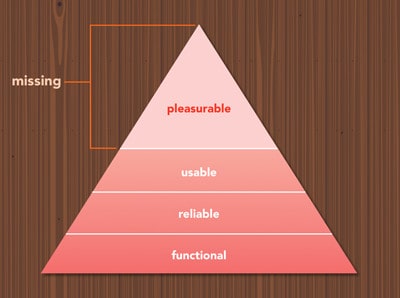
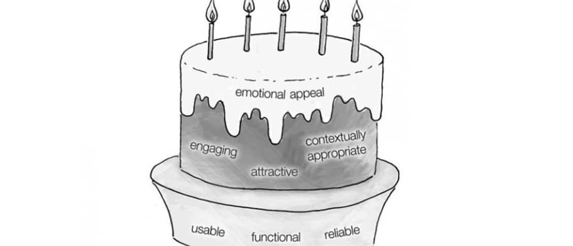
Aarron Walter from Mailchimp writes about the hierarchy of User Needs in his book Designing for Emotion. It’s similar to Maslow’s Hierarchy of Needs, but rather than describing our physiological, safety, love and belonging, esteem, and self actualisation needs, he describes our needs as users.
At their foundation, our digital products must be functional—they have to work to solve a problem. They also need to be reliable—they need to be up and running at all times. And they need to be usable—easy to learn, easy to use, and easy to remember.
Finally, they need to be pleasurable. This is where delight sits.
Maslow pointed out that we can’t satisfy the needs of higher levels until we get the foundations of the hierachy right. That’s true of our products as well. When it comes to adding pleasure or delight to our websites or apps, it’s crucial to be usable, functional and reliable first.
Minimum Delightful Product
Delight isn’t something that we can just tack on, or worry about later. It has to be baked in from the onset.
We hear a lot about minimum viable product, but I think the conversation should be around minimum delightful product. Viable is important, but if we’re going to market with something that’s not delightful, no one will get excited about it.
Thankfully, there are plenty of ways to add delight to our products, even if we are just at MVP stage.
Surface UX Delight
We use the term ‘Surface delight’ to refer to the things that are often very obvious and visceral in order to convey delight.
Surface delight is useful in attracting new customers. Surface delight draws strong attention to our products by creating that strong first impression. It can make our products more memorable and more shareable. Surface delight can be achieved fairly easily. Some examples include:
1. Beautiful User Interfaces
Not only is a high-quality and beautiful user interface an obvious way to add delight, it also has a huge impact on increasing the perceived value of a product. Airbnb‘s latest re-design is a strong reminder of this.
2. Microcopy
Great microcopy, such as a label on a form field or a pithy piece of instructional text, can help a user along on their journey. Used with the right tone of voice it can help to make an experience human and break down the barriers that exist between person and computer. Mailchimp is a great example of an app that has used microcopy cleverly and humorously.
3. Animation
Captivating animations, like those used to create parallax scrolling effects, can add surprise and delight.
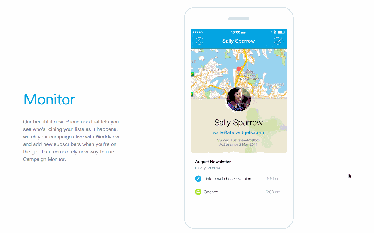
Parrallax scrolling and animation has blossomed since it first appeared a few years ago, as displayed in this marketing site for Campaign Monitor’s mobile app, Monitor. The technique is used here to great effect as an educational tool. It teaches you how the app works before downloading it in a much more interactive way than just a video.
4. Tactile Transitions and Interactions
The earlier Keezy example is a great example of delightfulness through carefully considered transitions.
5. Sound
Sound is a contentious example, however done well, injects delight into a product.
For example, the latest Wunderlist To-Do app plays a twinkling bell sound when you tick off a completed task, making the achievement feel that little bit better.
These examples show that Surface delight can be very effective, but the problem is that the novelty factor of surface delight fades over time. What was new and exciting yesterday easily becomes commonplace today.
It seems that you need to go to a deeper level to truly delight your user for the long term.
Deeper UX Delight and Flow

While the surface delight examples are visceral and highly visible, delight is often about the complete opposite.
A delightful user experience is often about invisibility. Getting out of the user’s way. We all know that something that “just works” can be extremely delightful.
Deeper delight is also about getting users into a state of flow to achieve that feeling of being completely absorbed in what you are doing and where nothing else seems to matter.
From a UX standpoint, if we create products that are completely frictionless, and encourage users to get into that flow state, we’re creating happy, productive users and a deeper level of delight.
A great example of flow at play in a digital product is iA Writer, a simple writing app, without any of the bloat or the complexity that tools like Microsoft Word have. Instead of getting caught up in using the software, you get lost in your own writing instead. You forget that you’re even using an application, and you move into a state of flow.
Flow contributes to a more sustained delight. Which ultimately means more loyal users.
Reduce the Pain
Keeping users in flow is about minimising pain points, frustration and anxiety that users may experience throughout their journey.
Giles Colborne speaks of the idea of focussing on these pain points by identifying moments of anxiety and using them as an opportunity to delight. If these pain points can be resolved effortlessly, we can delight our customers by exceeding their expectations.
For example, the moment of fear when we trip over our power cords, is quickly turned into a moment of relief, and ultimately delight, when we realise that our power cords are magnetic, and our laptops haven’t, in fact, come crushing to the ground.
Different Levels of Delight
We’re not the first to have considered that design and delight may happen on different levels.
Don Norman wrote about 3 levels of design in his book, Emotional Design:
1. Visceral—from the initial impact to its appearance.
2. Behavioural—the total experience of using a product and how it performs.
3. Reflective—how the product makes you feel.
We’ve already touched on the first two, but what’s particularly interesting here is the idea of this third level—the reflective layer. This isn’t about the product at all, but more what the product evokes in the user.
Dana Chisnell also wrote about 3 levels of design and delight in Deconstructing Delight:
1. Pleasure
2. Flow
3. Meaning
Again, it is the third level that is unique here. Meaning refers more to the company’s brand and is about being authentic, with the company’s values aligned to it’s customers values.
Deeper delight = Helping users kick ass
Delight isn’t about your product at all, it’s actually about your user. Delight is in how you can help them become better at the thing they’re trying to achieve.
Samuel Hulick summed this up by saying, “People don’t buy products; they buy better versions of themselves.” The more we can help users become that better version, the greater chance we have of delighting them.
So we’re not actually in the product business as at all. We’re in the business of helping people kick ass.
Kathy Sierra talks about the Kick Ass Curve, a chart that demonstrates the importance of User Awesomeness.
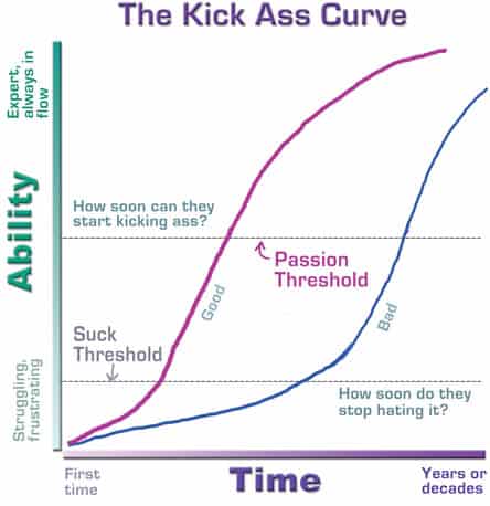
In essence, we need to help our users get to awesome as quickly as possible. We need to move our users beyond the “Suck Threshold”, and past being frustrated novices, and towards the “Passion threshold”, where they become become passionate experts.
Tools like on boarding are therefore crucial to a delightful user experience. They can help our users become passionate experts more quickly.
It’s Not Gamification
It’s worth noting that we shouldn’t confuse true delight with gamification.
Earning that extra Foursquare badge wasn’t ever about User awesomeness. It was only a mechanic to encourage us to come back to use Foursquare again.
But if your app is helping users improve their skills, their health, and their lives, then that’s delight right there.
Online tools like Treehouse, that enable people to become better web developers. and the rise in wearable tech, like fitbit that help people become more active are just two examples of delightful products.
Is There a Silver Bullet?
So, back to our big question: Is there actually a formula to adding delight? Is there a recipe that you can follow?
Well, not quite. Delight isn’t just a simple, single, one-dimensional thing. It’s much more complex, with many aspects and varying levels of delight that form a delightful experience.
Designing delight is part art and part science. The science is made up of the same UX skills and techniques that we already use as UX designers. We need to do regular research into who our customers are, what’s important to them, and what progress looks like in their life, not just what they do on their screen.
The art is the trickier part though. Empathy is key, but it is also about knowing when and where to apply just the right amount of delight, and at what level.
And whilst there is no magic formula for delight, perhaps some of the tools and techniques that we’ve described here can go some way to helping you achieve it.


I loved the thought that went into this, and enjoyed the presentation version too. Nice work, lads!
I’m Brazilian and I only find good information about UX in American sites like yours. But I must say that this article was far the best one I’ve read until now!
Thanks for the excellent job!
This article was a great! The part about deeper delight was spot on. Keep up the great work!
Good information. Lucky me I discovered your website by accident
(stumbleupon). I have book marked it for later!
Nice article.
Shame that the shortest part of it was #4 –Which is about what made Keezy a worthy example of delight…Would’ve been nice to have some suggested further reading from you on Tactile Transitions and Interactions.