I haven’t written about sketchnoting much since my article Sketchnoting 101: How To Create Awesome Visual Notes, which is kind of silly of me given it’s one of the most popular articles on our site.
Part of my hesitation to do so (read excuses, excuses!) is because this is a site about user experience design, and I’ve never been quite sure where sketchnoting fits under the UX umbrella. I don’t use it as part of my design process, and it’s not a technique I would necessarily recommend trying on a project (some clients may react strangely to you drawing doodles while they explain their business to you).
However, it’s clearly a topic that many UX designers are interested in. This site’s readership aside, browse through some of the most prolific sketchnoters and you’ll see that the number of UX Designers who are active in sharing their sketchnotes is disproportionately high—Mike Rohde, Eva-Lotta Lamm, Francis Rowland, Boon Yew Chew, Veronica Erb, and others.
The reason I believe sketchnoting and UX Design are such happy bedfellows is because they require similar skills: listening, processing, and sketching.
-
 Listening: While listening to a conference presentation is limited to capturing information, when someone is described as “a good listener” the compliment usually extends beyond that. Consider a friend opening up about a major life experience that has affected them on an emotional level—being a good listener includes using non-verbal communication to provide assurance, so that the person talking feels comfortable to share their story. User interviews often require the same level of understanding and attention, even if the subject matter is not as difficult for them to talk about. Same goes for interviews with stakeholders, test participants, and conversations with your project team.
  Processing: Good user research is wasted if you’re unable to make sense of it all. The ability to synthesise data, interpret findings, and make sense of it all is what leads to informed design decisions rather than design that is based on gut feel. Whether you’re spotting patterns in user behaviour, identifying trends in web analytics or connecting the dots between reference points of triangulated data, the ability to process varied messages in differing formats is a crucial skill as a UX designer.
 Sketching: Jared Spool lists sketching as one of 5 indispensable skills for UX mastery, and I agree wholeheartedly. Whenever I get stuck, I sketch. And then when I feel like I’ve reached the most amazingly elegant solution ever, I sketch some more and either find another way to improve it or validate that I’m on to a winner because nothing else comes close. When you’re confident with a pen or pencil or whiteboard marker, you can bash out a ton of ideas. It’s also useful in a group setting—for example, you can take control of a meeting that is heading nowhere and bring a common level of understanding to the conversation.
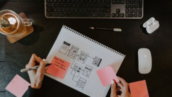
Note that jumping into a tool like Balsamiq Mockups that produces wireframes that look like sketches doesn’t constitute sketching. Don’t get me wrong, Balsamiq is a great tool (as are others), but it doesn’t hold a candle to a piece of paper when it comes to letting your ideas run free (pun intended).
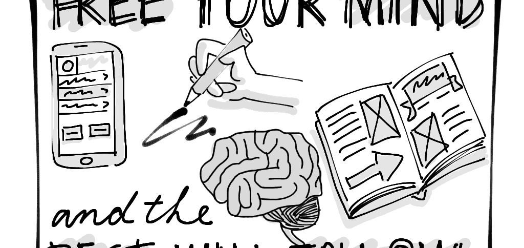
So when you’re next sitting in a conference presentation, or team meeting, or even just on a park bench by yourself, reach for your pen and notepad and take some sketchnotes. Explore different typefaces, practice aligning items on the page, invent some new connectors, arrows or containers, and try drawing some images of objects that are beyond your comfort zone (hint: don’t start with faces or human figures—work up to those!).
All this sketching is the equivalent of doing mental push-ups—it’s good practice for your job. And the process of sketching may even deliver you a new idea as a bonus.





Love this post as it truly defines how to decipher and interpret data at a next to nothing cost. Great skill to develop and continue for any discipline. Thanks Matt.
Thanks, Duke!
I love the sketchnoting! I watched your youtube video and was drawn in just by following the drawing – it needs talent I guess…
Thanks Nathalie! Your sketchnotes needn’t be artistic to be useful to you. Visual notes are fun to create, help your retention, and you’re more likely to refer to them afterwards. Give it a try!
Sketching can also be a great way to note take during UX research.
Sketches really bring the user stories to life – a fantastic way to socialise the content of interviews.
http://www.userexperience.co.nz/2012/11/sketching-customer-journeys/
…another context where I’ve found sketching (as opposed to polished infographics) to be great is in sharing research findings with groups, visualising processes, relationships, themes etc.
Some examples here:
http://www.userexperience.co.nz/2011/10/visualising-ux-research/
Time to sharpen the sharpie!
Nick
Great points that sketchnotes may have a place in communicating design to clients and stakeholders. Thanks for sharing your articles Nick, good stuff!