I’ve been very fortunate to be able to attend more conferences than usual this year.
Last week Luke and I attended the annual web conference in Australia, Web Directions South 2012 (if you’re a regular reader, you’ll know that I was more than just a little excited about it). And keeping with tradition, I was very diligent in sketchnoting every session I attended.
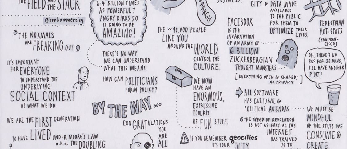
And so, without further ado, here are my sketchnotes for Web Directions South 2012:


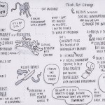








As you can see, I applied less polish after the fact than the last set, partly because adding a highlight colour took so long, but also because I think I actually prefer how they look in black and white, with that grey “this was created on real paper, with a real pen” aesthetic.
I’m not sure if it’s reflected in these sketches, but the conference really was amazing (we’ll be posting some of the things we took away in a later post). Some of the presentations were nothing short of inspirational, both from the content delivered and the polish and charisma used to deliver them. If you have never attended Web Directions South before and are interested in design and technology, I urge you to get along next year. There are conferences in several continents throughout the year.
Are you interested in how to create your own sketchnotes? Check out Sketchnoting 101: How To Create Awesome Visual Notes.



Hi Matt!
These are amazing! Beautiful work. They’ve actually helped to refresh my memory on some of the main points of the talks. So thanks!
Also thanks for the book – it’s great!
Thanks so much, Beth, much appreciated. Glad you like the book too! :D
Hi Matt! Great to meet you at the conference last week. Fantastic sketchnotes! They bring back so many great thought-trails, and are much nicer to look at than my scrawled notes :D
Thanks Masni, glad you find them helpful!
Can’t help but echo what Beth and Masni have said – Really captured the essence of each talk, fantastic work!
Cheers John!