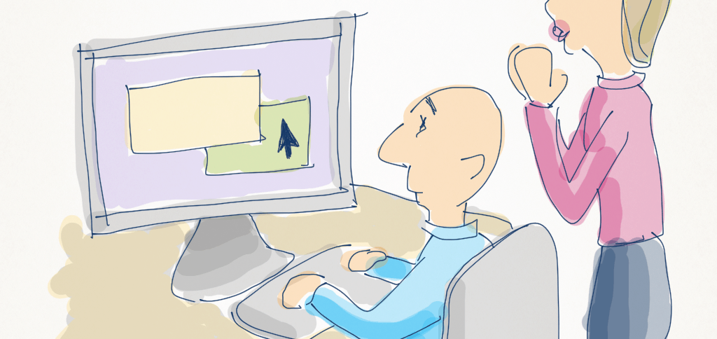
Becoming a confident, competent UX designer isn’t something that can be taught in 10 minutes. However, conducting a user test is. And user testing is a technique that always delivers useful information about how usable a web or mobile app is (or isn’t).
The best part? Anyone can conduct a user test, without any experience at all. Here’s an example from a real project that proves it.
An employee at one of my consulting clients—let’s call her Sarah—called me up recently, asking for help.
An agency is building us an app, and they’ve given us a prototype to test for usability. I have three days, starting today. Can you help?”
Now normally I’d volunteer to conduct the user testing for the client. But in this instance I had immediate obligations to other clients, so wasn’t able to help. Instead, I told her I would pen some instructions, and sent the following email (details changed to protect client confidentiality).
What happened as a result of her reading this one email was amazing. I wanted to share it with you:
From: Matthew Magain
To: Sarah Doyle
Subject: Re: testing the app
Hi Sarah
Thanks for your message. It’s great that you guys have got the opportunity to do some usability testing of the app that DigitalAgencyCo are building. Obviously if I had a little more notice I could probably come in and give you guys a hand, but I can’t really juggle things at this late notice.
The good news though is that usability testing is not super difficult. Not to go putting myself out of a job or anything, but the ability to conduct a user testing sessions is something that is easily learned, and it’s also a handy skill to have under your belt!
If you’ve got three days, here’s what I’d recommend you do:
First, go watch this video by user testing guru Steve Krug. It’s only 24 minutes, but worth sitting through. It’s an example usability test—something that you can certainly run yourself.
You’ll notice a few things:
- Steve puts the participant at ease by stressing that they’re testing the software, not her.
- He sets the scene with a couple of questions relating to the tasks ahead (you might ask them when they last bought the product you’re selling, whether the transaction occurred online, and what they remember of the experience)
- He does this without having the website pre-loaded, to avoid distracting them. You might load the BigCompany home page at the start, for instance.
- He assigns the participant a couple of tasks (you might do the same—say, one to choose a specific model, and a second task to buy a different product that meets certain criteria (sorry, just making this up as I don’t know the specific inventory)
- He facilitates, but doesn’t actually guide or show the user what to do.
- He encourages the participant to think out loud, in order to “get inside their head”. This provides you with qualitative data to help you understand why a user is behaving the way they do. This is important—without this narrative, you’rejust guessing why they do something.
- He asks What are you thinking? a lot. It’s a useful prompt to get someone who forgets that they are supposed to be thinking out loud.
Once you’ve digested all that, you’re ready to plan your own usability test sessions! Here’s what I’d do.
1. Line up at least 6 participants for a 30 minute session, over a couple of days. Ideally you’d run more than this, but you’ll be pushing it given the time you have available. These participants should be from the target group that you think will be using the app, and cover a range of demographics within that group. For instance, if your marketing data tells you that your target customers are between 18 and 35, male and female, then get 3 x males aged roughly 18, 24, and 35, and 3 x females with the same age spread. Oh, ideally they should be people who are actually in the market for buying a mobile phone (or, next best, have recently bought one).
The beauty of working at BigCompany is that you probably have candidates that fit these criteria working in the office, and are willing to help out. I know you haven’t been at BigCompany for too long, so ask someone who has (I recommend reaching out to Kevin Dooly, who originally hired me a few years ago—he has been there for 13 years, is super helpful and knows everyone—tell him I sent you!). I would suggest that you line up a few fallback options, as in general people are flaky and you’ll probably have a couple pull out due to last minute meetings and what have you.
You might want to also do a practice session (e.g. with your boss as the participant) in advance, to rehearse.
2. Schedule these participants in for a 30 minute session. You can use the template email I’ve copied below if you like. Allow for at least 30 minutes between sessions, to give yourself a break and to gather your notes. If your three days of testing start tomorrow, see if you can line one or two up for tomorrow afternoon, and the rest on Monday and Tuesday. I recommend calling them first, to line it up, before emailing them the invitation.
3. Place the computer running the app in a room where you can close the door.
4. Recording a video of the screen while the participants use it is definitely recommended. There are two reasons why this is a good idea, and depending on how important they are will influence whether you bother to do so or not. The first reason is because it means the pressure is off you to take notes-the participant’s actions and the app’s responses are all there should you need to refer to them. The second reason is political—if you were to have hurdles convincing someone from DigitalAgencyCo or from upper management about your recommendations, this can be a useful tool (by saying, hey look, it’s not my opinion, it’s a random user’s!).
If you don’t envisage there being any political reasons to record the screen (or it’s just too difficult to organise a video camera pointing at the screen) then I would recommend you at least record the audio of each session (either with your phone or your computer). It means you’ll still have to take notes if you notice the user hitting difficulties with specific parts of the app, but you’ll still have material to listen to afterwards when looking for common problems.
5. In advance, plan a couple of tasks for the candidates to perform. Write these tasks down on a card that you will give to them. These tasks should be written as scenarios that the reader can read themselves, or you read out to them.
6. Print out a permissions slip (to get the participants OK to record them) and a script to read for each session (I’ve attached templates that I use when I conduct usability testing sessions, which you’re welcome to use or modify).
7. Run the sessions. It can be useful to have a second observer in the room with you for some of the sessions. They should take their own notes. Sometimes they’ll notice something that you don’t!
8. Review your notes and recordings from all of the sessions. You’ll hopefully notice some recurring themes. e.g. if 4 out of the 6 people got stuck with one aspect of one of the tasks, then that’s definitely something you should get the DigitalAgencyCo guys to address. You should prioritise the list of recommended changes based on how much it impacted the user’s ability to complete the task. So if it was only a minor annoyance and didn’t really get in the way, it may not be as big a deal as something that was a showstopper. Common sense, right? :) This list is what you give back to DigitalAgencyCo as a to-do for them to tackle.
That’s about it!
I’ll be in the office on Tuesday for another project. I can’t stick around, but I’m happy to chat about the usability tests you’ve done by then (if you’re able to schedule them at such late notice).
Hope this is all helpful—feel free to email or call if you have any questions.
Cheers
Matt
Attached:
When I visited the client the following Tuesday, Sarah was sitting at her desk, looking relaxed. What I’d suggested to her was an ambitious timeframe, so I wondered whether she’d abandoned my advice. I asked how it went.
“Oh, I’m all finished. The sessions went well, and I’m just writing up my findings now. It was kind of fun!”
Awesome stuff. Not only had I empowered her to schedule, conduct, and report on the user testing sessions by herself, she had enjoyed it and is now likely to become an evangelist for involving users in projects at her company. Sure, there were a heap of assumptions made about the target demographic, the participants were staff members with a possibly skewed attitude towards the company and its app, and ideally the project would be structured differently in order to get user involvement throughout every stage and instil a more user-centric culture into the organisation.
However, given the timeframes—what a great outcome! I think this was a perfect example of making the most of a time-poor, small-budget approach to UX. It also demonstrates that there’s really no excuse not to do at least some basic user testing of your websites and apps.
Want to learn more about user testing? I can strongly recommend Steve Krug’s books as essential reading: Don’t Make Me Think and Rocket Surgery Made Easy. They’re both short, easy, fun reads!


Thank you very much this was very helpful
Thanks you so much for sharing!
Great read, thank you for sharing!
Hi Matthew,
I stumbled upon your site and 5min into browsing around and a few dozen downloads later, I’m in awe about how generous you are with your tips and all the great resources. Thank you so much for the great job and for sharing your knowledge and experience. Really good stuff!
Cheers
Daniel
I think this information might be somewhat valuable to beginners in the UX field. However, why is it so badly “designed”, or I should say not designed at all? Things all over the page, little cartoons sprinkled everywhere (what for?), popup box annoying the user, very hard to read this material. Speaking of User Experience, this is not a good example. Too bad, because the actual content seems interesting. My advise: get a good designer to redo the site.
Great stuff. Just what I needed.
Hello to every one, because I am actually keen of reading this website’s post to be updated
daily. It consists of good stuff.
This was great! UX for the win!!
Mathew, well written. User testing provide you with so much feedback. And the best thing about it is, it is coming directly from your future buyers. Thank you.
Matthew, thank you for taking the time to share.
Thank you very much for this article and the resources you shared, very helpful!