The second annual Swipe conference for iOS and Mac designers is on in Sydney this week. We chat with Jake MacMullin, one of the conference organisers and presenters, to discuss the topic of mobile accessibility, and how Apple’s devices make apps easier to use for people with a disability.
Tell our readers a bit about yourself.
I’m an iOS and mobile specialist. I’ve worked as a developer and done bits and pieces of user experience and interaction design. Most recently I was working at the ABC, where I developed the iPhone and iPad versions of iView. Since then I’ve moved on and I’m working in a freelance capacity and really focusing in the mobile space at the moment.
Can you tell us a bit more about the iView project?
I actually approached the ABC – it was a couple of years ago now. This was when the iPad was first released in the US. I remember reading some news stories about someone from the ABC who had actually traveled to the US to be first in line to buy one of the iPads. And at that time I was working for the BBC, so I got in touch.
I was really interested to hear what the ABC had planned for this new platform. One thing lead to another and we got talking and I decided to join them to start working on the iView app for the iPad, which was released in December of 2010, I think.
It was really, really well-received. It actually went to number one in the app store on the day of launch, so it was such an exciting project to be part of.
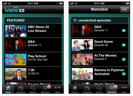
I’m not surprised. I’m a big fan and I wasn’t aware that you were involved in that, so kudos!
Thanks. I’m a huge fan of their service as well, which is why it was such a joy to work on the app. There’s nothing better than developing an app that meets your own needs, and I love watching ABC content on whatever device I can watch it on. Being able to work on the iOS client has been great.
You’re speaking at the Swipe Conference in a few weeks about accessibility. Can you talk to me about what accessibility means to you?
Basically I think accessibility is about providing an equivalent experience for users of your app, irrespective of whether they have got impaired vision, or impaired hearing, or impaired motor skills. It’s really about sort of trying to use alternative means of input and output, to provide as equivalent an experience as possible.
You know, I use the word experience there, because it’s not just about providing access to the content. If possible I think we should be aiming to also providing an equivalent experience in the use of the app, so a lot of thought is given these days to making apps that are easy to use; that are in fact a joy to use. If possible I think that same sort of thought needs to be given to people who want to use different ways of interacting with your app, but hopefully to achieve the same sort of experience.
I think I remember hearing once accessibility being defined as “usability for disabled people.”
Yeah, I think that’s as good a definition as any!
There are obviously different kinds of accessibility hurdles due to the fact that there are so many kinds of physical challenges that people face. We’ve got blindness and partial vision, and deafness and mobility issues, and cognitive hurdles. Can you explain for us how iOS addresses some of these common hurdles that people with one or more of these conditions might have?
iOS the operating system has continued to evolve and continues to add features designed to help with accessibility. There’s a lot that the operating system does for you, and that developers need to be aware of but don’t need to really do anything to take advantage of.
For example, to help with vision impairment, there’s a Zoom Mode, so you can configure your operating system such a double tap with three fingers on the screen triggers Zoom Mode. Then as you slide your three fingers up the screen it zooms in, and as you slide three fingers down it zooms out. That just magnifies everything on the screen. This allows people with impaired vision to have a look at a part of the screen in – to zoom in so it fills all the available space.
There are also things like High Contrast Mode which inverts the colour display, and I understand that helps people with some conditions to be able to read the text more clearly.
There’s a Large Font Mode, which will increase the font size of some text in some apps. This doesn’t affect all applications across the whole device, but certain applications like Messages or Email. Some of the most pertinent text in those applications can be increased if you switch to enable Large Font Mode.
Finally for vision impairment there’s Voice Over, which I think we’ll quickly go into a bit more detail later on.
When the iPhone first came out, it was the first touch platform I’d experienced, and I remember thinking, “The future is here!” Because I was working in web accessibility, I also remember thinking, “Oh no, there’s no obvious way that blind people can get any kind of tactile feedback,” like those little knobs on keys that indicate what is where. Were my concerns valid, or is it a better experience for blind users these days using something like iOS?
I think your concerns were certainly valid, because one of the main ways in which vision impaired people do interact with computers is by being able to know the keyboard layout. And as you suggested, the F and the J key have these little nodules on them that let you sense when your fingers are above them without actually having to look at it.
You can rely on the fact that all the other keys on the keyboard are in the same position relative to those two anchor points – the G key is always immediately to the right of the F, and the H key is always immediately to the left of the J key. You know you can rely on that. And one of the things about iOS when it came out was that it was that it didn’t have a physical keyboard and hence was completely configurable. It’s basically a featureless slate of glass onto which we as developers get to lay out our apps.
So when you launch the calculator up, for example, you’re not interacting with a computing device that is running a calculator program. Basically you’re interacting with a calculator and the keys sort of fill the screen and they’re all laid out as you might expect on a calculator.
That means you can’t make assumptions about keys being in the same position all the time because you don’t really know what’s on the screen at any point in time, and the user interface completely reconfigures itself based on what app you’re using. So at first glance it might seem completely unusable to someone who can’t see exactly what’s going on the screen, but Apple actually, were aware of this from the get-go and have always had great accessibility features and have continued to improve them.
Voice Over is the screen reader in iOS, and it actually does a fantastic job of providing that alternative means of input and output to people who are visually impaired. So it can read to you what’s on the screen, and then you can use different gestures to control the input so you don’t need to know exactly where the keys are.
I’m aware that screen readers for desktop machines have traditionally been quite expensive so it’s terrific to have that feature built in to the device.
It really is. But one of the things with Voice Over is that it’s one of the few accessibility features on iOS that does require the cooperation of developers. Whereas for the other things like Zoom and High Contrast and the Large Font Mode, users can just turn them on in the system settings and the device will do all of those things. But Voice Over, once it’s enabled, requires that apps be developed with kind of some thought given to how the screen reader’s going to interact with the app.
How can I tell if I’ve created an accessible mobile app? Are there any tools or resources out there that you’d recommend people be aware of?
I guess the best way is to actually find someone with impaired vision to test your app for you. I think that’s certainly the best way to find out if your app is accessible to people, and also whether the conventions used in your apps spoken user interface match those of the platform.
For those of us familiar with visible user interfaces, we come to expect certain things. There are certain kinds of conventions that are used across apps – tab bars, navigation bars, and table views. We get used to apps behaving in a particular way, and even when developers come out with a novel user interaction, other apps will often pick it up and you get a sense when something works in one particular way in one app, you can expect that other apps might provide similar interactions.
I think it’s important to keep that in mind as well for spoken interfaces with Voice Over. For myself, as someone who speaks and isn’t visually impaired, I can do an approximation of what it might be like to use an app by turning Voice Over on and trying to navigate my app with my eyes closed, and seeing if I can get to all the different parts of the app, and access all the information.
Now I haven’t spent years using Voice Over as the main way of interacting with devices, so I’m not entirely familiar with the conventions. If I could recommend anything it would be that people find someone who could test it.
Obviously that might not always be possible, so I guess the next best thing is to turn Voice Over on, on the device. In system settings, you can actually configure a triple tap of the Home button on your device to toggle Voice Over on and off. I’ve always got that setting on, so if I want to quickly test out how someone else’s app behaves with Voice Over, or how one of mine behaves, I can just triple click my Home button and turn it on for a while and use it and then turn it off.
The only caveat there is if you’re testing your own user interfaces, obviously you made decisions about what would appear in which part of the app and how it’s laid out, so you might know where elements are before you’re actually trying to find them as a user.
If you don’t have a vision impaired user who can help you test, give your app to someone who hasn’t seen the interface before and ask them to try to use it with Voice Over, without looking, and see how it goes.
Finally, the iOS simulator does in fact include an accessibility inspector. So if you’re a developer you can tick a box to have that appear on-screen while you’re running your app in the simulator. What that will do is show you whether each of your user interface controls has the appropriate metadata, so the screen reader can read out something when the user selects that control.
I’d wager that the majority of iOS apps out there aren’t even giving accessibility a second thought or are even aware of the fact that they should be thinking about this stuff. And there’s probably even a portion of them who may be aware of it but consciously decide to ignore it either seems to hard or they’re kind of rationalising it as the 80/20 rule—it’s a minority of users, so they’re only impacting a certain number of people. What would you say to folks who take that approach?
I think you’re probably right. It probably is a bit of a mixed bag at the moments. There are certainly some pretty high-profile apps whose visible user interfaces have been carefully crafted and had so much attention to detail but when you turn Voice Over on and you run your finger across, Voice Over reads out, “Button. Button. Button.” Obviously those are three different buttons, one of which might delete your content, while one of them might save your content.
You have to wonder, “Well how can people who laboured so lovingly over their user interface have completely ignored this aspect of it?” Especially when it’s actually so easy to do the little bit of work so that Voice Over can read out something more meaningful. The APIs are really quite simple – it’s just a matter of setting an accessibility label for the user interface elements in your app, and that’s just a string of text that Voice Over will read out when that element is selected. By setting that one big of string – just one label for each element – that’s kind of the minimum you need to do to get Voice Over to provide a basic version of your interface.
I guess the main thing I would say to people is to do the basic version, and then once you’ve done that it’s worth probably spending the extra time to think about how can you provide the sort of equivalent experience using your app – the sort of shortcuts and ease of use, and even delight that you have thought of so much about in your visible research base. Can you do anything in the spoken interface to make sure that it’s just as enjoyable to use? Often a little bit of thought often goes a long way.
Thinking about creating a delightful “accessibility mode” makes me think of having Snoop Dogg narrate the button lists on the page.
That would be cool!
Wouldn’t it just? So what about accessibility in browsing the web from an iPhone? Is there anything that developers and designers can do to make a website more accessible to visitors who are viewing it on an iOS device?
There’s nothing really specific to an iOS device that I’m aware of. A caveat here, that most of my experience with accessibility has been in the native apps. But the Voice Over screen reader is available within the Safari app as well. As long as you’re adhering to best practice with your web content, and that’s really making sure it adheres to the Web Content Accessibility Guidelines, probably version two at the moment. If your content adheres to all of those guidelines then Voice Over should do a really good job of providing access to it.
You mentioned delight and usability before – I’ve had conversations with colleagues about how a lot of web apps or mobile apps are useable but don’t necessarily bring delight. Then there is the other end of the spectrum, where the app is delightful but entirely unusable. Do you have any advice for designers and developers that are creating mobile apps who want to bring delight and keep it accessible?
I guess one way to bring delight to users is to use custom gestures in your user interface – in particular, pinch gestures. For example there’s an app called Clear on the iPhone, where you pinch your fingers apart to sort of pull items in your to-do list apart. Once you’ve pulled them sufficiently far apart to expose a gap between them, a new element pops into that gap. Likewise, the opposite happens when you pinch them shut, it collapses the to-do list and takes you up a level in the information hierarchy. That is a real joy to use because of that interaction and the sound effects and things that go with it.
In terms of accessibility, I haven’t actually tried to use it in Voice Over turned on so I don’t know how it is on that front. We’ve also got to consider that there could be users who have impaired motor skills and they mightn’t be so easily able to make those pinch gestures. So it could be that the whole concept for your app is so heavily based on particular gestures, and there isn’t really a good alternative.
There is a feature in iOS for people with impaired motor skills that will allow you to use external hardware to bring up a menu that then lets you perform any of the built in gestures like rotate or pinch, or double tap. So even people who have very little motor skills and perhaps can only operate a single joystick device can actually trigger the rotate gesture or the pinch gesture.
It still requires a fair bit of messing around to summon that menu, and then to choose the gesture you want to execute, and then select it. So often the thought that’s gone into making those delightful interfaces is about how can you make it so easy to get to your content – perhaps by providing an alternative way of accessing items in your list or inserting new items into your list through single taps, as opposed to complex gestures.
I heard an interview on the podcast Iterate with the designers who worked on Clear, where they discussed the fact that they did just that. For every interaction, there’s a ‘delight’ way of doing, and there’s also a simpler single ‘tap’ way, so you can still navigate the interface with using a single finger without having to do all of the pinch gestures.
What can attendees to Swipe Conference 2012 expect from your session?
I’m going to outline the accessibility features in iOS, so some of those that I’ve discussed here, and go into a little more detail about some of the others as well. I’ll briefly cover a little bit about the application program interface that developers can use to make sure their apps are accessible.
As I mentioned, that’s actually quite simple, so I won’t dwell too much on it. I’ll talk more about the design process and the design considerations that you need to give to the spoken interface. I’ll be talking about the work we did to make sure that the iPhone version of iView is as accessible as it can be, and talk through some of the design decisions that we made in order to make sure that Voice Over works really well with that. Finally, there will be an opportunity to ask questions.
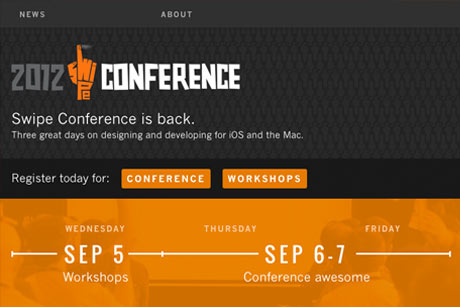
Swipe Conference is a two-day conference about designing and developing for iOS and the Mac. It’s on at the Hoyts Entertainment Quarter in Sydney from 6 – 7 September, 2012, and features a ton of local and international presenters. There’s also a day of workshops on 5 September.


