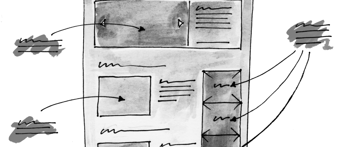
Whether you’re a Web-designer, a UX designer, or a graphic designer, using an online tool for wireframing and mocking-up concepts can provide a useful and experimental playground.
Wireframes are bare-bones sketches of the intended layout for your design. They’re quick to produce, which also means you can discard them if they’re not working well; you can experiment with as many ideas as needed to come up with one that best solves the problem. They’re visual, so they’re a good way to share early thinking about your design vision with your team, clients and stakeholders. And they’re testable, meaning you can validate ideas, check user flows and finesse the user experience using interactive, clickable wireframes.
Sometimes it’s tempting to cave in to pressure and jump directly to high-fidelity designs, skipping wireframes and going directly to the visual idea that may be gelling in your mind. Yes, it’s possible to create a successful solution this way, but you’re much more likely to get to the right solution for your design problem, and in a quicker time, using an iterative process beginning with a low-fidelity version such as a sketch or wireframe.
Using an iterative process involving user feedback, and investing your design time well, is an important skill for a user experience designer. At NinjaMock, we firmly believe wireframing can help you create the best possible user experience. Here are ten reasons why:
1. Maintain flexibility while ideas are maturing
Wireframes allow you to explore concepts without investing too much time in unproven ideas. This results is a healthier ideation process for you and your team, with iterations and spinoff ideas helping mature your thinking until you’re close to a workable solution.
2. Find the major problems before you’ve invested hours in a design
Sketching a ‘good enough’ wireframe will allow you to validate major assumptions about structure and flow of your website or app. You’ll be able to spot any potential design issues before you spend hours creating and polishing the final design.
3. Set structure and hierarchy first
The blocky, sketchy nature of wireframes makes it easier to establish a hierarchy of information in your design. Fewer elements mean you can see the building blocks of the design and position them without having to accommodate fine details.
4. Keep your stakeholders looking where you need them to
The same blocky, sketchy nature also helps simplify communication between you and your client. If the thinking is broad-stroke ideas about structure, content, features and user flows, a wireframe will stop them from questioning choices about branding, colour, specific words or imagery when they should be focussed on the fundamentals.
5. Focus on functionality
Early in your design process ideas fly thick and fast, and it may feel like stakeholders (or even other team members) are creating friction by suggesting unrelated ideas or working in alternate directions. Wireframes can help avoid this by bringing everyone back to a concrete process focused on functionality.
6. Provide incremental value
Good ideas sketched as wireframes form stepping stones towards your final design solution. A wireframe approved by your client or stakeholders acts as a visual blueprint, as an agreed reference for where the main elements are going to be positioned in the final design, and how the high-level mechanics of interactions and screen flow will work. Future refinement of the idea can proceed without being undermined by too many fundamental changes, letting you increase the fidelity of the design as you move into subsequent iterations.
7. Save time (and money)
It’s easy to spend several days worth of time creating a detailed design. If this is done too early in the process, much of the pixel-perfect positioning may have been wasted effort—new considerations, stakeholder feedback or changes in direction may all require big changes to the design.
8. Iterate, iterate, iterate
Overall design time can be reduced by working iteratively, staying flexible when needed, and working towards detail only as you increase in confidence of an approach.
9. Validate your ideas early
Many online wireframing tools such as NinjaMock, Balsamiq Cloud, Mockflow, Lucidchart, and others enable you to create clickable wireframes that mimic the basic interactions and flows of your final solution. You can use these prototypes in usability testing to get early feedback on your designs, and fold the insights back into your work.
10. They’re fun!
Wireframes are often the first time you get to meet your designs and watch them come alive. Some would say this is one of the most important reasons! Personally I find this very satisfying, and a lot of fun.
I hope these points are useful, and that they’ve convinced you to be brave (like a ninja!) and start your next project with a wireframe!
This sponsored post by NinjaMock supports the ongoing work of UX Mastery.


