Last week I went to the Web Directions South conference in Sydney, and as usual I took some sketchnotes from the sessions I attended.
Here’s my summary of the entire conference in a fun 5-minute video.
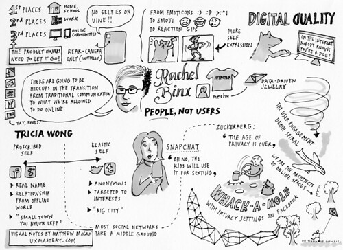
The first speaker was Rachel Binx, who makes really cool jewellery, and does a lotta thinking about online identity. She talked about Tricia Wong’s proscribed self and elastic self, and used examples like Snapchat and Facebook to illustrate the discrepancy between how we express ourselves online and offline . I liked her description of changing privacy settings as playing Whack-a-mole. She touched on the user engagement death spiral and digital duality, and how product owners just need to let it go. All up it was a pretty good start to the conference!
Next up we had David Demaree from Typekit, talking about the weight of the web. I learned that the printing industry was actually funded by the church, and this term “the photographic turn.” David then talked about how web pages have dimensions and weight that can be measured, and referenced the special Vogue September issue. David’s tips for us to get better at this stuff were to use scalable graphics, responsive design, adaptive content and iterative workflows.
Next was a case study from Rod Farmer about the new Ten Play website. Rod showed us how user generated content is often more popular than expensive, network commissioned shows like Homeland, and brought home the fact that the worlds of TV and web are colliding. He listed some considerations for how to think about engaging a TV audience online. And of course, like every project they had stupid timelines, competing user and business objectives. They used some trusted UX techniques and it sounds like they did a pretty good job of repositioning the Ten brand online, so nice work.
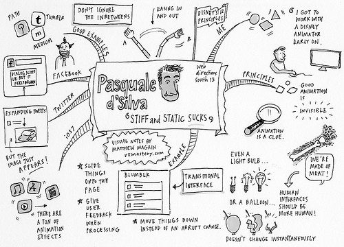
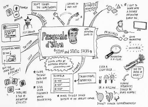
The next talk was my favourite talk of the conference, from Pasquale D’Silva, all about animation. It sounds like Pasquale found his calling early in life, when he watched a ton of cartoons and got to work with a Disney animator, where he learned some of the principles of animation. He showed us how animation can make our interfaces more human, by showing a sample web app he called Blumblr. He also took iOS7, Twitter and Facebook to task by calling out some UI faux pais, and how he would go about fixing them. Pasquale’s parting message was “don’t ignore the in-betweens” and go learn Adobe After Effects, which is what I’m going to do!
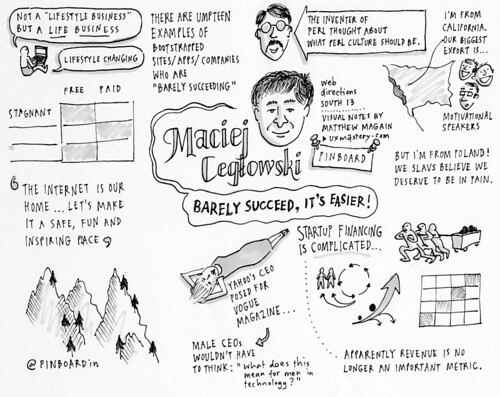
Then we had Maciej Ceglowski—I hope I got that right, Maciej! Maciej made Pinboard, and basically spent the entire talk lampooning the Silicon Valley startup world. His hero is not Anthony Robbins or Tim Ferris but the guy who invented the Perl programming language. He showed us just how unnecessary complicated the startup financing world is, and was pretty hilarious in how he urged everyone to remember that a simple service that you charge money for can be not a lifestyle business, but a life business that’s lifestyle changing. It was pretty inspiring, actually. Thanks Maciej.
And then we had Relly Annett-Baker, everyone’s favourite potty-mouthed content strategist. Relly managed to pull together a spooky ramshackle haunted house, internet fridges, Lego, and Playmobil and mix it all together to come up with some really solid advice for how to go about creating content so that it’s future proofed for parking meters and hot plates and goodness knows whatever else. I think she managed to keep her f-bombs to under 7, which is probably a record, so way to go Relly, and thanks for all of the excellent tips!
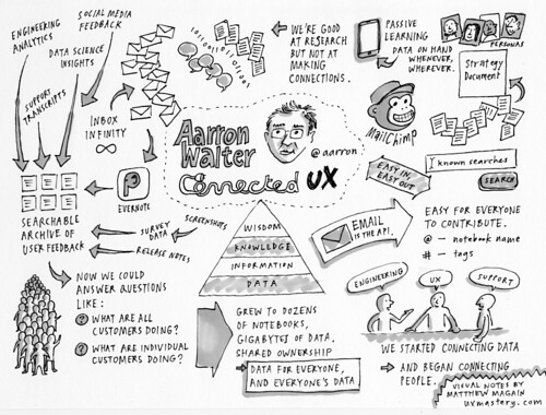
Next up was Aarron Walter, talking about Connected UX. Aarron basically spelled out the process that they use at MailChimp for capturing user feedback via emails and support tickets and social media and analytics, and getting the whole team to tag everything in Evernote, which is then OCR’d and searchable. This turned out to be pretty powerful because it meant that the whole organisation could start to make connections between disparate data that would normally live in silos, and as a result of that, better connections between departments that wouldn’t normally go out of their way to share insights.
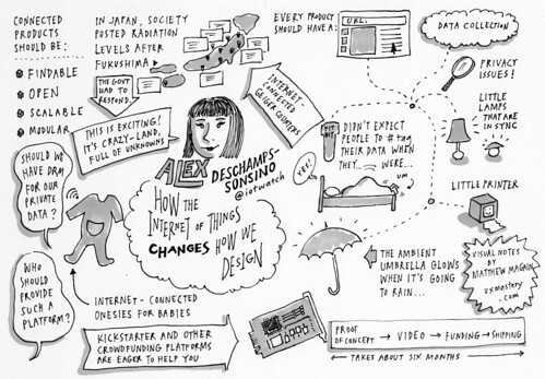
Alex Deschamps-Sonsino was next. She went all “internet of things” on us, and reflected on a bunch of Kickstarter projects that she’d been involved in or knew people behind. She talked about the FitBit, the Little Printer, connected lamps, the ambient umbrella, and how the people of Japan were buying Geiger counters to map radiation levels after the Fukushima meltdown. Alex finished with a call to action to think beyond the web, and make the most of crowdfunding platforms to go create something that’s crazy, connected, and has a URL.
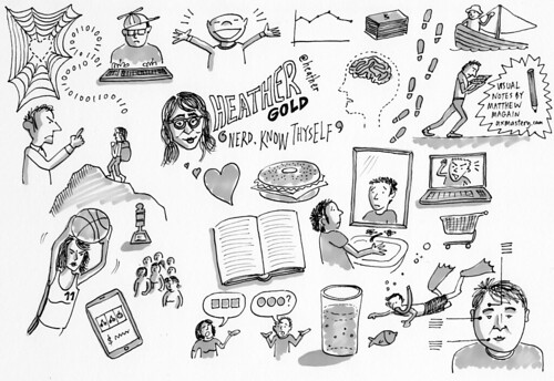
And finally, the closing keynote of the conference came from Heather Gold, and it was more of an interactive, unstructured conversation with the audience, so I didn’t try and apply any structure to my sketch. I just drew some random imagery as it was discussed: the fact that technology is actually not a distraction—nerds have been distracted by books for years. How she used to be a really competitive basketball player and hurt someone’s feelings, and fessed up to that and learned from it. She got a few folks from the audience to talk about what they did and the people challenges they faced.
So that’s my 5-minute summary of the Web Directions South conference for 2013. I didn’t make it to every session, but I hope you like this summary. If you like this then be sure to head over to our site and sign up for our email newsletter.







Great sketch!!! It’s much easier to get the general idea than reading through a bunch of words!!!
Thanks James, glad you liked it.