It all started innocently enough.
We were in our weekly meeting late last month, when I sensibly suggested that Matt and Luke might like to fight to the death. Anyone who knows anything about Matt and Luke will know that they are both fiercely competitive, and I’d be lying if I didn’t go into this with my eyes wide open. Needless to say, they took the bait.
And so it began.
We decided that the only fair way to publicly prove once and for all who is the master of UX Mastery was to stage a debate, and what better platform on which to do it than our new community forums? So as not to be held accountable for any potential ill feeling from the loser, I let them choose the topic. It was to be ‘Which comes first: usability or delight?’ Reworded so as to be debatable, the final motion was:
‘We should design for usability, then add delight.’
Luke was the affirmative team and Matt the defensive. The heckling started immediately, along with my almost tangible relief at working remotely from another country. Luke’s opening statement was masterful. In one sweeping blow he defined his argument, introduced a strong analogy (albeit about baking), provided solid evidence (26 links in one post!) and called Matt names.
The basis of the affirmative argument was that for four important reasons, delight must be considered with deference to usability.
- Delight is best used with subtlety
- Delight cannot be used as the primary foundation for a product
- Usability is as fundamental for UXers as spelling is for writers
- Delight by itself does not make up for poor usability
It was at this point that I decided to turn the heat up with a bit of stirring while Matt prepared his opening statement. And what an opening statement it was! Kicking off with some not-so-subtle putdowns, he went on to label Luke a rookie and called him on his attempt to bamboozle the audience with the aforementioned array of links.
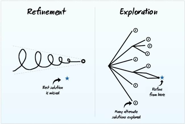
That said, his argument was nothing if not solid. In what Luke labelled ‘an educational rambling’ Matt picked up on the baking analogy and pointed out that humans are emotionally driven animals and it takes more than a cherry on a cake to make us want to eat cake. Introducing some examples of personal delight, he reminded us that delight is a core element to strive for when designing and used the following diagram to illustrate his point.
In a downright dismissal of the opposition’s star example, Matt said:
“This is a poor example that assumes that a delight-first approach would compromise on usability. It shouldn’t. We’re not arguing that usability should be compromised. We’re arguing that it should be considered after delight. The other way round limits the possibilities.”
A very important point, and perhaps key to his argument, in my opinion.
Wrapping up with a bad pun, Matt throws open to Luke for rebuttal.
And rebut he does. Throwing a quote back in Matt’s face with the claim that it will undermine his entire argument, he then proceeds to pick said argument apart, bit by bit. It’s a bloody display, fitting for a fight to the death, with a very clever reference to the input of a community member, in what I assume is an attempt to buy his vote. Luke’s rebuttal is a meticulously crafted piece of work, again broken down into key points, perhaps the most notable being that “delight is an over-delivery on expectations”.
At this point Matt, always the gentleman, jumps in and corrects a typo for Luke, before attempting to cut him down.
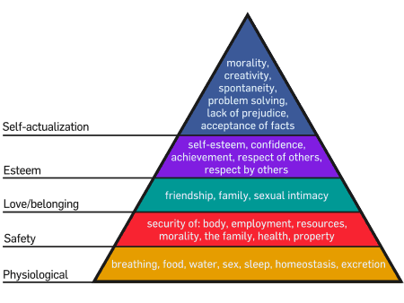
Reminding us that “delight is not a feature, it’s an emotion”, Matt goes on to introduce us to some basic psychology, namely Maslow’s hierarchy of needs. Relevant? You be the judge…

It is at this point that I think he makes a mistake. Things start off well, with the death of the baking metaphor, but then he goes on to say:
If Apple had approached the portable music player industry with a “usable first” mindset, they probably would have invented a portable CD player that had a more intuitive series of buttons. Sure, it would probably have been a great CD player. It would have looked great. And it would have been perfectly useable. But they wouldn’t have invented an iPod.
I jump in and throw cold water by pointing out that just because something didn’t exist before doesn’t mean that its first incarnation wasn’t designed primarily with usability in mind. Perhaps not smart to take sides against your boss, but life’s too short for wasting time sitting around on fences.
In an attempt to wrap things up before there is any more bloodshed, I call for closing statements.
Luke comes out fighting and reminds us that if a UX discussion goes on long enough sooner or later someone will compare something to Apple and ultimately lose credibility. Harsh but fair?
Matt sums up with an absolute stroke of genius (which is reminiscent of a game of last hit) in the form of this quote:
An arrogant man will still feel immortal, even on his death bed.” —Unknown
In summary, the affirmative team believes that user needs are synonymous with usability, which helps us discover and innovate to design for a delightful experience. The negative team suggests that to design for usability before delight stanches the flow of creativity and therefore constrains design prematurely.
Now it’s time to crown the winner and that’s where you come in. We’re running a poll so that you can vote for the argument that you believe is most convincing. We’d also love to hear your comments regarding the argument from either side, so feel free to jump in, either here or in the forum thread.
You can read the debate in its entirety here and you can place your vote for the winner here.


This is a great discussion. Thanks for posting. I am probably leaning towards Usability first, since that seems “hard enough” to do. Here is the question I have – can you design something that people really delight in, that is NOT usable. I am not coming up with any examples of this. If something is not usable, how can you really delight in it? I suppose you could have a beautiful car that drives really poorly – but I wouldn’t be “Delighted” by that, would you?
It’s an excellent question, Kevin – from the ‘affirmative’ perspective in the debate I argued exactly that: a delightful design assumes that usability issues that would get in the way have been resolved.
Depending on the application, and the context of the user, I can imagine gimmicky situations where a user would find interactive pleasure while exploring an interface with usability issues, but they’d quickly tire of the playful nature if they needed to achieve an explicit goal. Another example may be a visually appealing design that nails a metaphor, or a context, with humour or wit, but functionally is unusable.
It comes down to the definition of delight. In the often quoted formula “useful + usable + delightful” I sometimes switch “delightful” for “meaningful”. Delight thus comes from a smooth sequence of interactions that are both useful and usable, but the end result also exceeds their expectations and delivers something more than just gimmicky interactions – it can actually deliver something meaningful.
I loved this article. So much chuckle.
Coming from an advertising background, I tend to frame UX in the context of account planning. The job of a UX designer is to be the conscience of the agency and the client during an iterative design process; ensuring that the work always remains accountable to the target (or in this case, the end user).
I think the design process can continue to delight, but that process comes to life some time after a creative brief has been penned. To do it before that point is like saying “I need a new car, and it has to be red with black leather seats” – we might actually need dump truck for all we know, but damn it better smell like sin.
On the other hand, a poor UX designer ends up playing the role of captain buzzkill. Even though we stay with a project from cradle to grave, it’s important that we understand when to let the creatives delight, which means stepping back unless somebody gets off target.
Great debate. It highlights important Trade-Offs with each approach.
There are other trade-offs to consider.
What does the customer want?
Does one approach take more iterations to get right? (cost of development)
Are there best use practices when talking about “delight”?
Can you guarantee the emotive response you are going for with the “delight” approach…to all potential user bases…globally…?
Do I have to pick one path over the other?
The end user just wants the UX to be easy and intuitive.
The customer wants to spend as little money as possible.
A UX is almost always a continuous evolution.
Why not go for easy and intuitive first and then create multiple alternative designs. Hold design reviews of each alternative design (including all stake holders) and distill out the best ideas into a final design.
The end result may have the best of both camps.
I’m not a UX expert…just thinking out loud…
Hey Clint,
The type of iterative process you are describing works efficiently with a bit of an up front investment.
Doing Balsamiq mock-ups is cheap.
Relative to the data gathered, exporting then click-testing those mock-ups through http://www.optimalworkshop.com/chalkmark.htm is also cheap, although it helps to have the $2000/year sub so you aren’t trying to pack too much meaning into a single $150 survey.
On a budget, you can skip the Axure/Protoshare phase if your click test (basically a visual reverse card sort) comes back valid. Now you’re on to the art assets and programming.
I can’t stress enough, however, the speed with which even a Balsamiq iterative process (skeleton layer) can go off the rails if you don’t nail down the essence of strategy and scope first.