
You can learn a lot from your competition. One way to learn about their designs – and how yours fare in comparison – is to conduct a usability test using your product as well as those of your competitors.
If this sounds intimidating, it shouldn’t. The technique is straightforward; you just need to break it down into steps.
The first step is to decide whether this type of testing would be useful for you. Competitive testing can help you:
- See where your product falls short – and where it does well – so you can focus attention where it is most needed.
- Understand what your competition does well that you can incorporate or address in your product.
- Better understand why people choose your product, and why they choose your competitors’ products so you know whom you’re serving and how you can best help them (or find out your users are not who you thought they were).
- Make a case to stakeholders about work that must be done to make your product competitive – or, conversely, to show how well you perform in comparison to competitors.
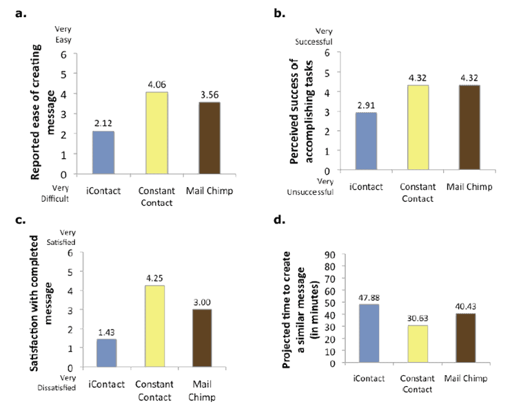
The reason my fellow researcher and I decided to conduct a competitive study at iContact several years ago was to prove to our leadership that the message-creation tool was not competitive and needed an overhaul.
It worked. The tool, which had not been on the product roadmap, was made the top priority once stakeholders saw how poorly the current version of it fared against two competitors: Constant Contact and MailChimp.
Building the case for our study
Our UX team had heard from the customer support team and read in online reviews that users had a lot of difficulty with several aspects of the message creation tool.
For example:
- It was difficult to upload and work with images.
- Customers often lost their work in the middle of creating messages.
- Finished messages that looked good to users looked completely different (read: bad) when they reached customers’ inboxes.;
These issues sounded critical, so we sought to better understand what was going on.
First, I conducted a competitive analysis, writing up how important features compared in iContact and its competitors. Second, I conducted an online survey to get quantitative data about the issues affecting customers and what they most wanted to see fixed. Finally, we conducted the competitive study.
Designing a study
If you think competitive testing could be useful to you, ask yourself a few questions:
- Which competitor products should I include? Is it possible to get access to them?
- What criteria do I want participants to have? If it makes sense for your study, it can work well to find participants who are not familiar with any of the products so they have no existing knowledge or biases.
- What tasks should participants perform? It’s easiest to compare performance if participants perform the same tasks on all the products. Be sure to switch the order in which participants use the products to avoid bias effect.
- What metrics should I capture during testing? The time spent on each task, whether participants were actually able to complete the tasks, and ease of use ratings are all good measures to track.
Conducting the study
When planning for the competitive study, we wanted participants who had experience sending email newsletters to audiences for their companies or volunteer organisations. Since we were recruiting through friends and family and Craigslist, we couldn’t be as specific as we liked about what tools they had used, but made sure they represented using a mix of our product, our competitors’ products, and email applications such as Outlook. We recruited 16 participants and gave them each a $100 gift card.
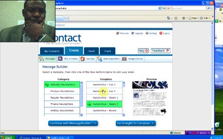
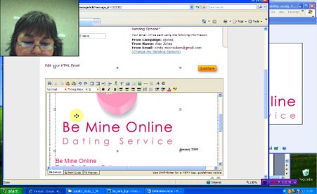
We selected five important tasks for an email marketing tool – including finding a template, editing an image and importing text from MS Word – and had each participant perform them in all three tools. (We did have to sign up for fake accounts in the two external tools)
The test took two hours per participant. We recorded the time it took each person to complete – or give up on – each task; which tasks they completed successfully; and their responses to a few rating questions – such as their satisfaction level with their completed messages and the ease of creating messages in each tool. One interesting finding was that our customers tended to choose us because we were least expensive, not because we were good.
Getting an actionable result
We analysed all the findings and wrote a report with the results of this study. As we had suspected, it showed that iContact’s tool fared poorly. The presentation to the leadership team really drove home the fact that change was imperative.

We started by giving the leaders in attendance seven minutes to work on a specific message in iContact’s tool, to familiarise them with the (frustrating) experience. After this exercise, they were engaged in the results and felt the users’ pain when we showed videos of participants suffering through losing messages after working so hard to create them.
Soon after our presentation, the leaders gave the go-ahead for a long-term effort to redesign the tool. This resulted in a much-improved interface that upon release immediately reduced customer service calls and increased conversions to iContact.
Your turn
As you’re coming up with ideas for researching your product, keep competitive testing in mind. It’s definitely doable and can give you great information about where you stand and how you should proceed with your designs.