This is a review of the online course How to Develop an Information Architecture using Card Sorting by Joji Mori. This is part of our series of reviews of online UX courses.
Read some of our other reviews or see our full list of online UX courses.
Course Information
- Course Name: How to Develop an Information Architecture using Card Sorting
- Author: Joji Mori
- Hosted by: udemy
- Length: 10 lectures (approx 1.5 hours of video content and additional downloadable resources)
- Intended Audience: Beginners to the field of practical UX, or anyone interested in learning manual or online card sorting techniques.
- What You’ll Learn: The entire card sorting process from beginning to end, including determining and labelling the cards, recruiting participants, moderating the process and analysing the results. Both manual and online techniques are covered.
- Assumed Knowledge: A very basic understanding of web structure, information architecture and UX jargon.
- Price at time of review: US $99
Review
As a relative newcomer to the field of UX, I wasn’t sure how equipped I was to take this course, but I needn’t have worried. From the moment I hit play I felt well looked after. The presenter has a likeable, direct nature and an informal, easy to understand way of explaining new terms and concepts. The opening lecture introduces the subject, explains the basic premise of a card sort and outlines what is included in the course.

I have reviewed a number of courses over the past months and one of the most common complaints that I have is the monotonous nature of the slides. I have no such complaint this time. The slides in this course are a varied and interesting compilation of explanatory points and diagrams, software demonstrations and face to face lectures. The course is not quite as slickly presented as some that I’ve taken, and occasional background noises like banging doors were sometimes distracting, but I didn’t find my mind wandering at any point, which is so often the case while undertaking self directed learning.

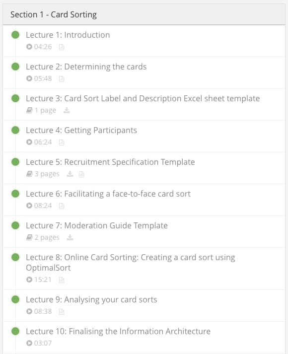
The course is broken up into short, easily digestable chunks, and includes a number of downloadable resources – a moderation guide, a recruitment template and a reporting template, to name a few – which are accompanied by clear demonstrations of how they can be utilised.
The introductory lecture promises that by the end of the course participants will be able to conduct either a manual or online card sort, analyse the data that is collected, and report the results back to the business, and it definitely delivers on that promise.
The Presenter
Joji Mori is a teacher, consultant, and specialist in information architecture, user experience & usability. Part of U1 Group, a dedicated team of UX professionals from Sydney and Melbourne, Joji has spent the last decade designing interactive technologies for desktop, web and mobile platforms, both commercially and as part academic research. He is passionate about good user experience and imparting his knowledge to others. You can find more information about Joji at jojimo.com.

The Udemy Experience
I have spoken at length about my appreciation of the udemy web interface in previous reviews. I have mentioned in the past that I find it intuitive and well suited to my learning style, however after taking this course I need to add a caveat to that – it depends on how well the interface is utilised by the presenter. In this case, rather than listing resources in the downloads section of the appropriate lecture, they have been set up as separate lectures, which I found very confusing. If the course is set to auto-play it doesn’t cope well when it gets to a lecture which isn’t actually a lecture! I also found many of the slides in this course to be very blurry* (see Fig 2.), which at times was frustrating.
* Note: It has since been pointed out to me that turning on the HD setting goes a long way to clearing up the blurriness of the slides!

Pros
- Clearly presented, well explained concepts;
- Delivers on all of the promises made;
- Good variation of slides, holding my attention at all times; and
- Excellent templates and resources are provided for download.
Cons
- Some slides are very blurry*;
- Downloads and lectures are not very well organised into the Udemy framework; and
- Occasional distracting noises can be heard.**
* It has since been pointed out to me that turning on the HD setting goes a long way to clearing up the blurriness of the slides!
** To their credit, U1 have been through and re-recorded the offending videos, which I think is commendable.
Summary
Overall, How to Develop an Information Architecture using Card Sorting is a great course. It promises that by the end, students will be able to organise, carry out and present both a manual and an online card sort with no prior experience, and I feel confident that I could do that after taking it. Joji Mori is an articulate teacher and the concepts and related terminology are clearly and simply explained. The slides aren’t as professional as those I have seen in other courses, but the material is comprehensive and easy to digest.
- Content (how useful, up to date, practical, and comprehensive): 9/10
- Delivery (presentation style, pace, clarity, authority): 8/10
- Production (video quality, audio quality, editing): 8/10
- User Interface (reliable infrastructure, usable interface, convenient): 7/10
- Overall rating: 8.5/10
Course Contents
- Introduction
- Determining the cards
- Getting participants
- Facilitating a face-to-face card sort
- Online card sorting using OptimalSort
- Analysing your card sorts
- Finalising your Information Architecture
- Evaluating an IA
- Reporting the results of a card sort
- Conclusion and recap
How to Develop an Information Architecture using Card Sorting is hosted at udemy. Note: This post contains affiliate links, so if you do decide to enrol in the course, we’ll receive a percentage of the sale, to help pay the hosting bills.


