I was keen to sketchnote Mike Rohde’s recent “Ask the UXperts” chat on sketching, but my desk was packed for an office relocation and my normal sketchnoting book was squirrelled away. Luckily, my trusty Moleskine and a stash of pens and markers were in my handbag.
I was ready to sketch.
Let me take you through some of my thought processes and tips for live sketching a presentation or conversation …
1. Decide upon a layout before you start.
During the introductory chatter, I settled on a portrait orientation for the sketch, which works well in my Moleskine. I started with the event title and quickly sketched a portrait of Mike, then resisted trying to ‘fix’ it before turning my attention to the conversation.

2. Google the presenter’s image in advance of the session.
A Q&A text-based chat is much easier to sketchnote than a conference keynote presentation. I was able to casually follow the chat and wait for questions and answers to slide down my screen. As a comment of interest came through I considered how to represent it on the page. Some images come quickly; some I ponder on; occasionally I’ll use my phone to find a reference image, although time doesn’t always allow this luxury. During pauses in the chat I fill out details and use a grey marker to add shadows and highlights to sketches.
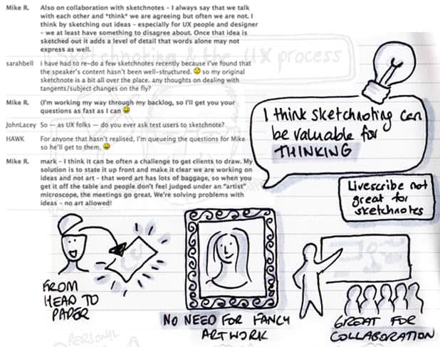
3. Don’t waste a second! Even when there is a lull in the conversation, you can still do filling in or checking Google for image inspiration.
Keeping an eye on the time, I paced my sketches so I didn’t overfill the page, with the knowledge that I could scroll back over the chat to fill in gaps if I didn’t fill the page enough. My layout ended up being a bit popcorn-style, with arbitrary pockets of sketches over the paper. Because of the casual Q&A format of the chat, there was no need for a logical flow so I simply started at the top and placed sketches and notes wherever I thought they looked nice. Once the chat concluded, I had filled my page nicely.
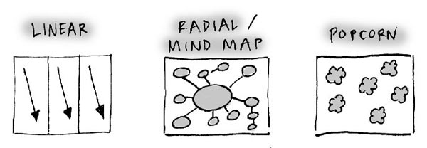
4. Pace your sketchnoting. Sometimes it’s difficult to know how much content you will be sketching, so go easy!
One of my challenges as a sketchnoter is accepting the sketchiness of my notes and avoiding too much detail. As the sketchnote was fairly spontaneous, it didn’t need any finishing touches and I tweeted it straight away. For a big conference presentation or TED talk I would spend some time afterwards filling in gaps that I couldn’t get to and adding highlights.
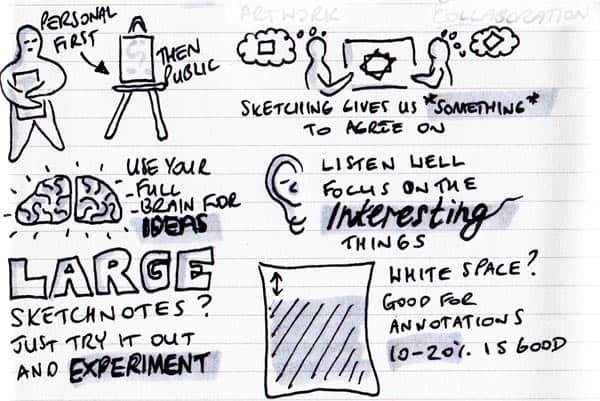
5. Don’t be too much of a perfectionist during the session. You can spend time afterwards tidying the sketch up, fill in gaps or add highlights.
Tuning into Mike Rohde’s chat was well worth it—it was well moderated and there was a mix of new and experienced sketchnoters. I already have a copy of Mike’s book and some sketchnoting experience (having taken a UX Mastery workshop in the past), but I was still able to take away a number of tips, not just from Mike but from other people in the chat. My key takeaway was to start experimenting with graphic facilitation and large scale sketchnotes. This was the best advice for anyone thinking about sketchnoting—give it a go and just experiment.
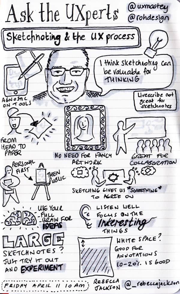
Like everything, if you want to be good at it, you need to practice, practice, practice! Flexing your visual literacy muscles is much like flexing your actual muscles—the more you use them, the stronger they get.
I hope that by breaking down the process I use, some of you will also be inspired to sketch more. I’d love to see your sketchnotes! Share them in the comments below, or on the UX Mastery forums.



Great read. Thanks.
Link to Mike Rohde’s (@rohdesign) book