One of the topics I often find myself discussing with other designers is the concept of delight in software. An interesting question that came up during one of these chats recently is:
Should we design something delightful, then make it usable? Or should we make it usable first, then add delight afterwards?
In my mind, the question draws immediate parallels with the old architectural adage; “Form should follow function”, so I tend to think that primary function and usability should come first.
There’s also merit however, in the opinion that by starting with an analytical, obvious solution you could be ignoring other, more creative, left-of-field alternatives. Perhaps we should start with a solution that is “fun” and more focussed on delight, then bring it back to something that works within the constraints in which we’re operating?
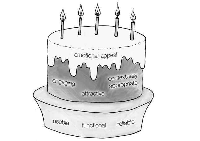
Regardless of the best approach, there’s no question that any successful solution must have as its foundation a functional, reliable, usable base. Assuming you have a usable product, and are looking to inject something intangible to make it more emotionally engaging, what are the sorts of things you can do and where should you start?
Below are 10 suggestions for how you might go about adding delight to your website or app.
1. Visual Polish
We all know that first impressions count! This immediate visual impact, which can be portrayed through a carefully crafted, beautiful user interface, is the most immediately obvious technique that springs to mind. Here are just a few examples of stunning visual design and attention to detail that leave a lasting impression, and go a long way to enhancing delight in each product.
a) Your Karma
The website for the Your Karma mobile wi-fi device is a current favourite of mine. The blend of great fonts, muted colour palette, smart graphics and subtle animation makes for a really nice UI.

b) Path
The Path mobile app UI is a great example of fantastic attention to detail. The graphical elements, fonts, colours and icons are not only pixel-perfect, but help to provide a better, more usable experience.

c) Rdio & The new Myspace
The Rdio and new MySpace apps display great examples of the new trend in UI design of flat colours, bright, clean colour palettes, simple fonts and sharp lines.


2. Microcopy
Those little snippets of helpful text here and there, which you find on buttons, 404 pages and the like? That’s microcopy. Often an afterthought that gets quickly added at the end of the development process, microcopy actually provides a really simple way to assist users as they interact with your site. It can also provide a nice opportunity to convey personality and add lovely little bits of subtle delight to your designs too …
a) Flickr
Quite a few sites offer a personalised message upon log-in, but Flickr take it one step further. Each time you visit, the site welcomes you in a different language, which adds a quirky, playful touch.

b) Clearleft’s 404 page
Rather than provide the usual Page Not Found message, Clearleft have used this page as an opportunity to reveal some of their personality, demonstrating that there are humans behind this site and they have a sense of humour.

c) Funny or Die email share
Funny or Die use amusing sarcasm in their form error message. The form will alert you if you forget to add an email address.

3. Getting Personal
We’ve all experienced that bizarre emotional connection that humans can have with an inanimate object. Perhaps you’ve given your car a name and can ‘see’ a face in the lights and front grille, for example. It’s completely irrational, but we humans are an emotional bunch and thrive off relationships (even if it is with a machine).
Injecting personality to your designs is a great way to play to this positive emotion, at the same time breaking the barriers that exist between man and machine. Here are a few examples that do this brilliantly…
a) MailChimp
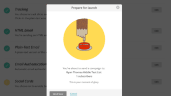
MailChimp make use of their illustrated monkey mascot—Freddie von Chimpenheimer IV—across their site to provide a light-hearted, fun personality.
Be sure to check out their video on how to hide the chimp (“party pooper” mode), which is in itself, a great example of injecting fun and delight to a product.

b) Gugafit
The illustrated characters, colour palette and choice of rounded fonts used across the Gugafit website work together brilliantly to generate a welcoming, warm, fun personality.

4. Purposeful Transitions
That satisfying, tactile click when you flick on a real-world light switch does more than simply lock the control in position; it also provides feedback to you, the user, that the interaction has been completed.
In the world of screen-based, software interfaces, this kind of feedback to indicate a successful interaction is even more important. There is often a lack of real, tactile feedback (especially when using touch devices), so we can only rely on clear, visual feedback.
Here are a few great examples where charming animation and/or transitions have been cleverly used with the dual purpose of providing useful, functional, visual feedback that also delights:
a) iPhone refresh email list
My favourite useful transition is the “pull-down-to-refresh-email-list” icon transition in the iPhone email application. It’s entirely functional—providing useful feedback as it searches for new emails. But it’s also so lovely and tactile—I just want to keep playing with it!

b) Scrolling transitions to anchor-linked content
Content that is linked on the same page via an anchor link usually just “jumps” to the relevant position by default (you can see it in action by clicking this link to return to the top of the page). It’s a little jolting, but if you add a layer of JavaScript to scroll to these links, like I’ve done on my personal site, then the result is a much nicer, less disorienting and much more pleasurable experience.

c) Animated dropdown menus (Nike)
This navigational dropdown menu on the Nike site that actually drop down, rather than abruptly appear, is another example of a functional, purposeful transition that can add a bit of delight to a website or app.

5. Mouse interactions
The point at which most interactions happen in a human-computer interface environment are usually instigated via a keyboard, mouse or touch-screen device. The unique gestures made possible, particularly within the desktop environment, using a mouse or trackpad, provide a great opportunity to delight through unique and interesting interactions and animations.
a) The Twelve Projects thumbnail hover effect
The Twelve have really put some great, creative work into their image rollover transitions in the Projects section of their site. The transitions are lovely and tactile, and it’s all responsive too!

b) Ben The Bodyguard scrolling site
Ben the Bodyguard is a really great example of an engaging, animated experience based very simply on the default page scroll mechanism.

c) Adidas Snowboarding parallax scrolling
The “parallax” effect achieved through a combination of natural page scrolling and JavaScript positioning is a popular trend at the moment. Understandably so, since it provides a lovely, immersive experience. The Adidas snowboarding site is an excellent, high-quality example.

6. Humour
Humour in design offers a great way to blur the lines between human and computer to provoke a positive emotional response. Just as the use of humour can help “break the ice” in a real human interaction, so too can the use of quirky, funny elements within a software interface. Here are a few great examples.
a) MailChimp links & comments
When you’re logged in to the MailChimp web app, the illustrated monkey appears in the top right corner, quoting lines and providing links to random YouTube videos, just for fun.

b) Envy Labs
Envy Labs‘ about page features a humorous, annotated set of images that pokes fun at the stereotypes associated with web designers and developers.

While not necessarily appropriate in all situations, humour is also a great way to lighten a sticky situation like a form validation error or a broken link. Here are a couple of good examples:
c) Yahoo! sign-up
When signing up for a Yahoo! account, if you put a future date in the date of birth field by mistake, they ask if you’re really from the future!

d) Nosh’s funny 404
Possibly the funniest 404 page ever made. Certainly a lot of work went into it, in any case!

7. Real world Inspiration
Otherwise known as skeuomorphism, the use of real-world metaphors in a two-dimensional, interface environment can add a recognisable element that is often already-known and therefore easy to understand, resulting in a pleasurable, familiar experience. This technique is particularly prevalent in software for mobile and tablet devices due to the tactile, gestural interactions that are used to interface with them.
Apple have received a lot of criticism for this approach, but if done well it can be effective in adding a delightful layer to an interface.
a) Page turns in Kindle apps & iBooks
Page turn/curl effects have become common within reading applications for navigating to the next page. The designers could easily have used more ‘digital’ controls such as arrow buttons or sliders, but the familiar page curl effect, coupled with a swipe gesture to ‘turn the page’ makes for a much nicer, more engaging experience.
b) Podcasts app for the iPhone
Apple have been accused of unnecessary skeuomorphism across their suite of applications before, and the new Podcasts app is another example of this. While not particularly necessary, the faux analogue tape reel is cute and adds a somewhat hidden delightful layer to the experience. This is a bit hidden actually, so could be considered an easter egg (next point) too.
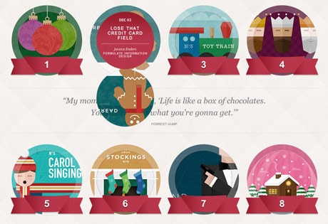
c) UXmas advent calendar flips
We’ve turned the effect off now, but while UXmas 2012 was running, we used this effect to mimic the advent calendar ‘doors’ opening.

8. Surprises (Easter Eggs)
Who doesn’t love a nice surprise? Gifts and ‘easter eggs’ don’t have to be reserved for children and the offline world. Quite a few websites and systems have intelligently hidden little surprises throughout their interfaces to provide a layer of fun and intrigue that ultimately delight…
a) Google Moon
They’ve removed it now (shame), but when Google Moon was first released, out if you zoomed-in all the way in to the surface of the moon it rendered as a piece of swiss cheese!

b) Supereight Studio R2D2
You might never have found it, even if you explored every inch of the site, but if you click Matt’s picture on the Supereight Studio about page you’ll see his photograph switches for a picture of R2D2. It serves no functional purpose, but there’s something lovely about finding it for the first time.

c) The hidden Apple icon in iBooks
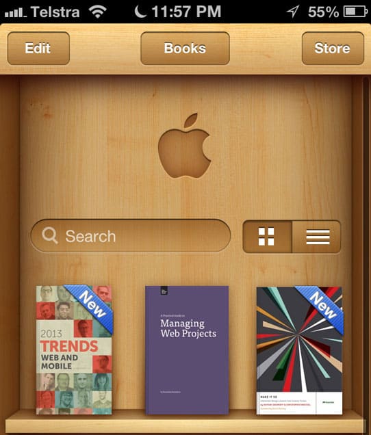
Another surprise detail that serves no purpose other than to delight is the ‘hidden’ apple icon that appears when you pull the bookshelf down in iBooks on an ios device. This forum post dating back to when this first appeared shows just how much of a positive impact these little nuances can have.

9. Invisibility
Invisibility is not just a power reserved for super heroes; it can be very effective in the digital world too. The saying goes “Good design is like air—you only notice it when it’s bad”, which normally describes the interface specifically but can also apply to the complete experience. The following are just a few examples of how delight can be achieved by the interface or product getting ‘out of the way’…
a) IA Writer
IA Writer‘s interface is simple an uncluttered, unlike other popular word processing software. The clean interface leaves you free to focus on the writing with no distracting buttons or features.

b) Gimmebar
Adding web sites or clippings to Gimmebar is a delightfully simple task that does not interrupt your web browsing experience.
10. Context & the multi-screen ecosystem experience
The explosion in numbers of mobile device use in recent years has made the importance of designing experiences based on the context in which the user is operating much more pertinent. While it’s dangerous to assume the content of a mobile user (often thought to be ‘on the go’ when in fact many browse using their phone when relaxing on the couch at home), the rise in “multi-screen ecosystem” experiences across multiple devices is yet another area where there’s opportunity to design useful functionality that delights.
a) Facebook‘s native mobile app
Facebook‘s suite of sites and apps work brilliantly well together, keeping your feed information simultaneously updated across multiple platforms. The mobile app is so good in fact, that I find the more focussed experience it provides better than the desktop experience!

Interestingly, it looks as though their upcoming redesign will provide a more consistent experience across all devices, based on a responsive design rather than through separate, device-specific applications.
b) Rdio
Rdio‘s desktop and mobile experiences are similar, but subtly different. They’re brilliant designed in terms of available features, functionality and UI nuances, according to which platform you’re using and the likely context in which you’re operating.

As a little side note, it’s also worth noting the way in which the mobile app alerts you to their being no network connection—the normally blue header bar simply turns grey. So simple!
c) Time Magazine’s responsive website
Time magazine‘s online offering is a great example of responsive website design; a technique that enables a single site to adapt its layout according to the screen resolution of the host device it’s being viewed on, providing a better, more delightful experience.

Summary
Functionality and usability should always be the priority in providing the foundations for any interface, but the addition of an additional layer of emotional design—one that evokes a response, connects with, and delights its audience—will always result in a superior experience.
Some of the techniques listed here can be easily “tacked on”, where others are only successful because they are more intrinsically linked to the core offering, and no doubt required much more careful consideration to implement.
Hopefully the examples here have provided you with some inspiration for adding surprise and delight to your own designs, helping differentiate them and really stand out from the crowd.
What other ideas do you have for adding delight to your designs? Share them in the comments!
Inspiration & Related Reading
- The (U)X-Factor (UXmas)
- How to improve your website to delight users (surpriseindustries.com)
- Oooh, that’s clever! (SlideShare presentation by Paul Annett)
- 15 websites with engaging experiences (dtelepathy.com)
- Redesigning With Personality (Smashing Magazine)
- Little Big Details
- The 4 Hs of Writing Error Messages (UXmas)
- Designing For Emotion (a book by Aaron Walter)


Hi Ben, thanks for this great article! I love the examples you’ve found. The related reading links are great too – I just wanted to add another one that I found today: Error messages are a great way to annoy the hell out of your customers! http://blog.kayako.com/error-messages-great-way-annoy-the-hell-of-your-customers/
Hey Susanna,
Thanks! Good link. Check out this article that my friend wrote about error messages too: http://uxmas.com/2012/the-4-hs-of-writing-error-messages
Ben.