
I define UX as finding the sweet spot between the needs of the users and the business, and designing a product that fits the gap.
This means we need to understand the impacts on the user of what we’re designing, and be able to justify and prioritise any changes based on the ease of delivery or better results for the business. It opens up a new world of sales-speak for us and ROI, KPIs and metrics become an important part of UX and its digital strategy.
A typical UX project might map user tasks as a task flow, or explain a user’s thoughts or feelings at certain points using scenarios, but we can get a much better picture if we put this all together on one page – we’ll get an end-to-end view of a users experience in context, which we can then use to understand, justify and prioritise our approach. This page is known as an ‘experience map’ or ‘customer journey map’.
What is an Experience Map?
Well, let’s first unpack some of the key benefits:
- It makes the customer experience understandable and addressable: so we can be coherent and consistent in the messages we need to get across.
- It helps us find critical ‘moments of truth’ for the user: so we can focus on these points to make significant improvements much more achievable.
- It unites any corporate silos and ignites a focus on the customer: it can be a shared langauge and focus point for communicating insights from different parts of the business.
Most importantly, it visibly connects business value and customer value. This is something that a lot of UXers struggle with, and in my blog post yesterday I explained why this is a critical factor we must get right if our discipline is to have a rosy future.
The grandfather of modern marketing, Peter Drucker, once said “the purpose of a business is to create and keep a customer” (i.e. to create value for our customers). A customer experience map helps reveal the touchpoints where this occurs. It allows us to see the easy wins and the longer term solutions required.
How do I create one?
Start by creating an inventory of all touchpoints a customer has with the product or service – both large and small. You can group them by channel (website, call centre, social media, etc) and give an indication of roughly where in the customer’s process they fit.
The key inputs for mapping the experience are the research activities you conduct, such as stakeholder interviews, customer surveys and contextual enquiries (primary research), and existing business documentation or industry reports (secondary research). Once you start to synthesise this research you can start matching your insights with the inventory.
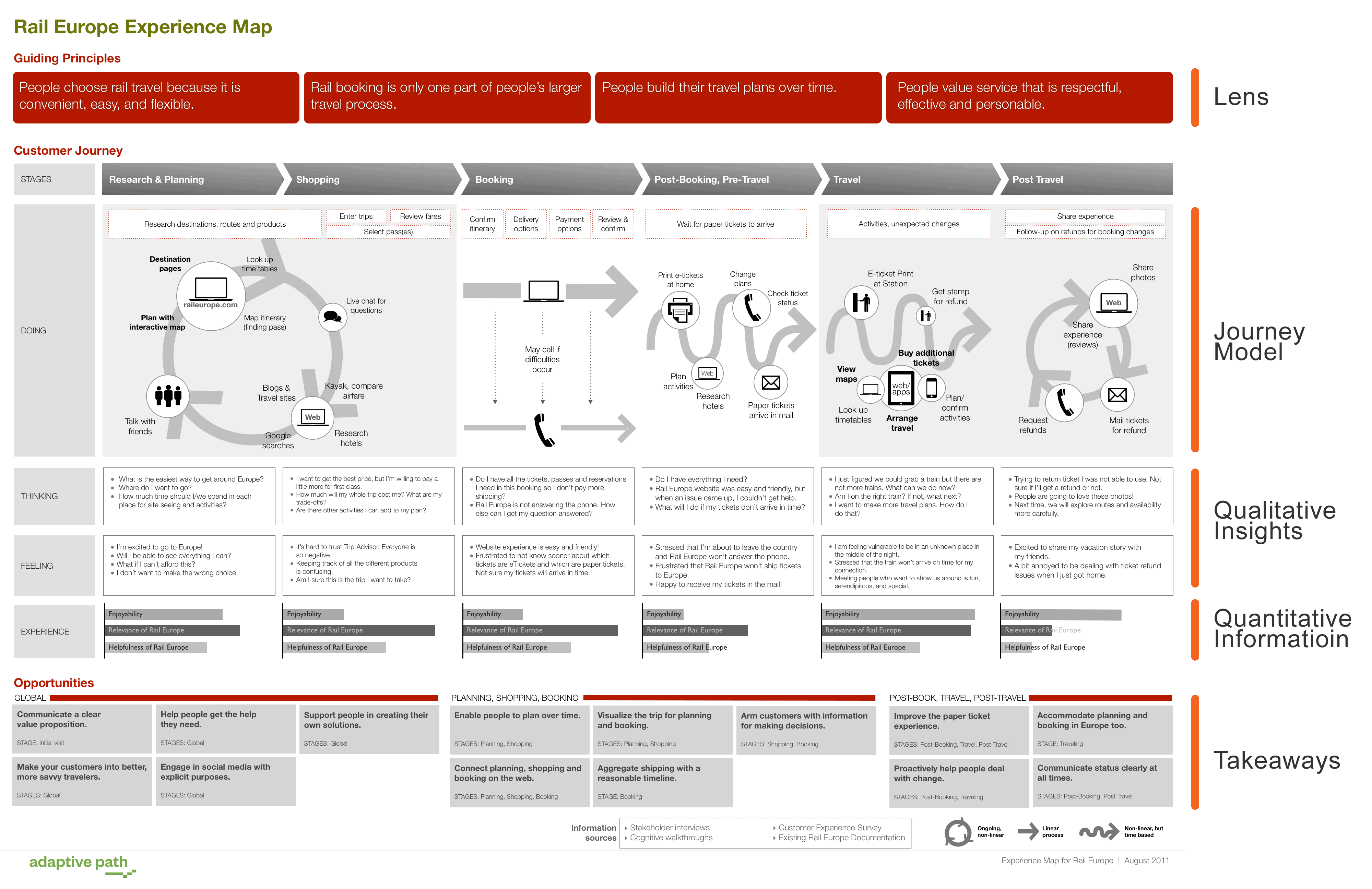
Chris Risdon from Adaptive Path suggests there are five dimensions to the map:
- The Lens – 3-5 key findings or guiding principles to keep in mind while considering the map. These might be things such as reasons why users choose this type of business over others (ie. using a bank over keeping cash stuffed in their mattress), bigger-picture thoughts such as “opening a bank account is only part of people’s larger financial savings process” or insights into how this is done “people build their plans over time”.
- The journey model – this will look different for every project, but should always illuminate the most important dimensions – transitions from phase to phase, switching between different channels. There is a bit of information design (a la Edward Tufte) to be done – how many people use certain channels, which part of the experience is broken, etc. The user’s actions need to connect to the system we’re designing – the touchpoints we’re orchestrating. Critical moments of truth will also often map to places where money flows in or out of an organisation.
- Qualitative insights – ‘doing’ (the journey model above) linked with at least 2 or 3 notes on ‘thinking’ (usually in question form, ie How much money is this going to cost? Can I use this? Will it work?) and ‘feeling’ (with responses such as frustration, satisfaction, sadness, and confusion).
- Quantitative information – should be included in the mix to help balance relative parts of the journey, ie. indicating that only 20% of user encounter this touchpoint, or an indication that the business is seen as irrelevant at certain stages of the customers journey. This can easily be shown as a horizontal bar chart, or as certain thicknesses of arrows in the journey model itself, so elements of the customer journey can be compared.
- The Takeaways – This is where you get to propose and recommend solutions to fill the gaps identified. They can be grouped by stages or as a ‘global’ view. They may come from your thinking peripheral to the customer’s actions, or to address their questions in thinking/feeling that the current system doesn’t currently do. It may link multiple stages for efficiency, or give users more control. It should show what you can do to improve the experience. For example: “Enable people to plan over time”, “Arm customers with information for making decisions” or “Make your customers into better, more savvy buyers”.
It’s also a good idea to include references to your information sources, whether they be your interviews, surveys and cognitive walkthroughs, or existing client documentation.
Finally, the map should stand on its own, without needing extensive explanation as it is circulated around the organisation.
So, what’s next?
Print it out. Email it around. Ask people to share it with others they work with. I usually try and have a large copy of several feet long stuck up on our design wall so it can be a shared reference point. It’s important not to treat the experience map as a deliverable. It’s a catalyst for change, and while it’s not a service blueprint it does help steer direction.
Now that you have a better handle on customers’ journeys across all touchpoints, you can more fully understand where to focus budget, design and technology resources. Derived from an overall “diagnostic” evaluation (of which the experience map is just one part) you can make a number of recommendations for focused initiatives.
Here are some links to further information you might find helpful while doing your own customer experience mapping:
- Anatomy of an Experience Map – Adaptive Path
- Customer Journey Map : Service Design Tools
- Mapping the Customer Journey (PDF) – Bruce Tempkin
- The Value of Customer Journey Maps – UX Matters
- Using Customer Journey Maps to Improve Customer Experience – Harvard Business Review
Any questions? Feel free to ask in the comments!


Is a User Experience Map really useful in a company?
how to make guiding principles ?
Very helpful summary of customer journey mapping and resources to follow up on ! Yes we use these maps in our B2B Industrial world and plan to make this more ‘standard’ in our innovation process
Is there any standard set of symbols/rules to be followed, when we do the map? I saw circles with arrows, multiple diversion etc in more than one place, used to show similar touchpoint.
Your help will be valuable. thank you.
Not really – the focus should be on communicating clearly with the documents audience, so use whatever symbols and semiotics are relevant and easily understood. Shean Malik looked at a few existing visual languages in his UX Matters article: http://www.uxmatters.com/mt/archives/2014/04/mapping-user-journeys-using-visual-languages.php
Which software did you use to create that beautiful map?
That would be a question for Chris Risdon who created it, but I suspect it was carefully crafted—with a lot of thought—using something like OmniGraffle?