A lively discussion happens whenever UX folk gather to discuss how a UI has been organized. We all have our opinions, but our reasons are often unclear.
Many of us start an analysis by pinpointing personas (roles) and then figuring out the tasks our target users want to complete in order to meet their goals. We spend a lot of time focusing on the tasks and writing them up in various ways, using use cases, stories for agile or storyboards. These stories help us keep the requirements in line, and are guidelines to test against during development.
But is this task-focused design approach the best way to help our users meet their goals?
There’s an alternative that can use our task-driven personas to provide a simpler navigation structure for users. Instead of tasks, it’s focused on objects (think nouns).
Object-focused design is an approach used by software development, and has a long and distinguished history. This basic and elegant UI design approach doesn’t seem to get the press that it deserves, so we’re presenting it again.
Tasks are Secondary
The original “object-oriented” methodology has been around since the 1950s, so it’s not a new concept. We’re very happy that Tom Dayton has brought this topic back to the forefront in an article entitled Object-Oriented GUIs are the Future.
Although the term “object-oriented” is primarily associated with software programming, Dayton’s definition reminds us of how it can be applied to a broader context:
“‘Object oriented’ in this sense has nothing to do with whether object-oriented programming is used. Instead, it means that the user interface as perceived by the user is oriented to the users’ domain objects rather than to the computer software applications.”
Pioneers in GUI design in the 1980s (I’ve listed some related reading at the end of this post) built upon research about the most intuitive paradigm—and hence, interaction—for users, which is noun-verb, not verb-noun (see Why Verbs are Hard to Learn [PDF] by Dedre Gentner).
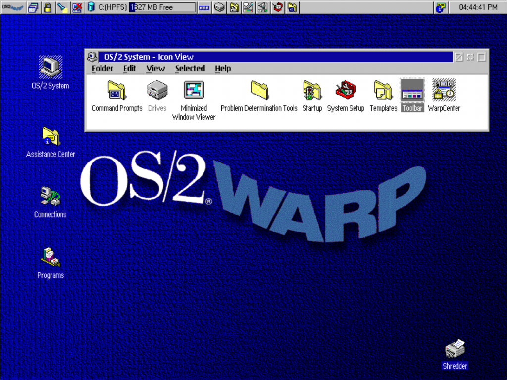
In fact, several early operating systems were designed from this concept and have evolved the thinking into some of the more intuitive GUIs in use today:
Dave Collins’s classic book, Designing Object Oriented Interfaces defines the following characteristics of object-oriented user interface design:
- Users perceive and act on objects
- Users can classify objects based on how they behave
- In the context of what users are trying to do, all the user interface objects fit together into a coherent overall representation
Huh?
Let’s look more closely. As users, it’s likely that we are first inclined to think about the object first, and secondarily – what we do with it. This is a major distinction.
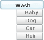
Here’s an illustration of the difference. When a user wakes up in the morning and starts to organize the day, which mental model is more likely?
Although in this case the verb connected with all nouns is “wash,” we’d venture that users are thinking noun-verb, not verb-noun.
For a quick real-world example, look at some travel sites. We looked at the classics: Orbitz, Kayak, Expedia, Travelocity, Priceline—every one of these sites includes the objects flights, car/rail, hotels and deals.
Design with Objects
What does this mean for us as UX designers? Well, for more intuitive designs, try keeping these rules in mind:
- Navigation is centered around objects—nouns, not verbs
- Objects are always the primary representations in the UI
- Actions (verbs) performed on the objects comprise the tasks
- Tasks are secondarily represented by actions on objects
In summary, using tasks as a basis for interface design adds another layer for users to work through. So keep it simple, and use an object-focused UI instead.
What do you think? Do the most usable sites use an object-oriented approach? Please share your thoughts in the comments.
Related resources:
- Book: Designing for the User with Ovid: Bridging User Interface Design and Software Engineering by Dave Roberts, Dick Berry, Scott Isensee, John Mullaly
- Book: Object Modeling and User Interface Design: Designing Interactive Systems, Mark Van Harmelen
- Wikipedia: Object Oriented User Interfaces


One of our IA’s gives you questions to ask yourself before making a decision between task vs topic based navigation http://blog.navigationarts.com/task-based-or-topic-based-navigation/
I agree, but many task based designs are actually subsets of topic based designs; if you can pull a design together based on objects, the site will be more flexible as user requirements may shift.
Great article, very helpful and makes sense.
Thanks! Someone recently asked me if these object-based rules apply for responsive design – even more so, with so little space on those screens.
BTW I’m working on something about how task-based works with this methodology and hope to post in about a month.
I think OOD of GUIs dates back to IBM Research presented at the ’97 SIGCHI conference, “OVID: object view and interaction design” (Richard Berry, IBM Corporation, Austin TX, Scott Isensee, IBM Corporation, Austin TX, Dave Roberts IBM United Kingdom Limited, Warwick, England–· “Proceeding
CHI EA ’97 CHI ’97 Extended Abstracts on Human Factors in Computing Systems”)
The concept was to create a library of functional objects that are dynamically and contextually aggregated into views rather than static, predefined pages. Object-oriented GUI design is if anything more relevant today because of use of interaction libraries, dynamic HTM, responsive design and importantly use with CQRS systems using Event Sourcing. Utilizing re-usable GUI objects increases development speed, simplifies UI design and lowers the Users learning curve. OO GUI Design is awfully good with Agile because you need only to build once and then invoke the object whenever you need it, Another plus for Agile is if downstream you discover a change is needed in a behavior, updating the behavior of the object distributes the change throughout the application. In 2000 I was lead IA (UX) on a proof of concept project for IBM that developed an OOD web application with a Websphere backend We created pages that were dynamic views of content and function objects the appearance and behavior of which were driven by User role, industry segment, view type, log-in status, company, company size and location. The ease of refactoring an interaction pattern was key to the iterative project model.
Getting back to CQRS the aggregation of views translates well to data projectors. The bottom line is that object-oriented GUI design is becoming more relevant to day than ever.
Sorry that I just read this!
You are correct – the work you mention done is the keystone for all of this. Without that work we wouldn’t have this great methodology.
Ditto.
Believe this applies to learning objects as well.
OO UI style predates the OVID method. The same IBMers who created the OVID design method, created the IBM CUA style that was the first really complete OO UI style. (It was brilliant, so it’s definitely worth buying a used copy of that out of print book, IBM, “Object-Oriented Interface Design: IBM Common User Access Guidelines,” 1992.)
We at Bellcore based our Bellcore (regional US telecom) style mostly on that CUA style, integrating guidelines from Windows and CDE/Motif, and covering more topics (McFarland, Dayton, with others, “Design Guide for Multiplatform Graphical User Interfaces,” 1995).
Simultaneously we created The Bridge design method for designing in accordance with the Multiplatform (or most any other OO) style. The same IBMers who created the CUA style were inspired by taking one of my conference tutorials on The Bridge, to create their own method–OVID.
You have broken links.
Thanks for letting us know, Tom. The OpenMCT URL re-linked to the same article on Tom Dayton’s Presto Innovation site.
Nice article. I am pursuing a course on OOUX by Sophia V. Prater. This article reinforces my belief in the concept. However following images are not displayed in the article.
1.Early objects interface: IBM’s 0S/2
2.Task-focussed navigation
3.Object-focused navigation
Please fix the broken links to the imgaes.
Thanks Shivanand. Images updated and relinked. :)
The earliest really complete OO style UI was from the same IBM folks who later created the OVID method. That style was developed and published from around 1988 through 1992, exemplified by the UX platform in the IBM OS/2 operating system, and ultimately documented in the book “Object-Oriented Interface Design: IBM Common User Access Guidelines” (1992). You can get used copies for about 20 US dollars from used book sellers online. Definitely this should be in everyone’s library!
We used that CUA style as the foundation of our Bellcore (regional US telecom companies) “Design Guide for Multiplatform Graphical User Interfaces” (editions from 1994 through 1995), by McFarland and Dayton, with others, which extended the CUA style and also made our style compatible with MS Windows and CDE/Motif as well. We got bits of OO style into the CDE/Motif style guide, and I got a little into the “Java Look and Feel Design Guidelines.” Later I got a significant amount of OO style into the Sun Web Applications Design Guidelines.
At NASA Ames Research Center and Johnson Space Center (plus a bit of funding from JPL) we created an entire platform for supporting purely object-oriented style user interfaces, called Mission Control Technologies. Sadly, after that project ended, the name was repurposed to market a browser-contained thing that bears only superficial resemblance to the original desktop MCT. Here is a short video overview of the original, desktop (Java), really OO style UX: https://youtu.be/HC-UpPNhjR4. Here is background on the project: https://youtu.be/lMXogZ0p2xk
You can get the original, desktop, truly OO UI style MCT code (it’s open source) from here: https://github.com/nasa/mct
It includes a generator of fake telemetry so that there are data displayed in alphanumerics and plots, but that fake telemetry generator does not work with current versions of Java. MCT works fine with current Java versions, but if you want to see the fake data inside it as a demo, you must install Java 8 on your computer. (If that doesn’t work, try Java 7.)
Warning: There is a completely different, browser-contained project with the same name OpenMCT, but it is only superficially similar to this original, desktop one.
The OVID design method that Everyl mentioned was created by the same IBM folks who earlier created the CUA OO style. They created that OVID method after being inspired by our The Bridge method that we Bellcore folk taught at conferences for years. The Bridge method is described in this book chapter: Dayton, McFarland, and Kramer, 1998, “Bridging User Needs To OO GUI Prototype Via Task Object Design,” in L. Wood (Ed.), “User Interface Design: Bridging the Gap From Requirements to Design (pp. 15-56). Boca Raton, FL: CRC Press [ISBN # 0-8493-3125-0]
Short videos of some participatory design sessions using The Bridge among other methods, are these videos we made at NASA:
– CRF – Participatory Design: https://youtu.be/4npftEf3_n4
– Participatory Methods Overview: https://youtu.be/iDFlY7Grx-8
– 10 minutes long, including participatory requirements creation and management: https://youtu.be/ZAFCAY7M1_E
Thank you. With the consumerization of enterprise and robust professional apps has come the general assumption that all apps should be task-flow verb-centric interaction. But that isn’t always the case. What should be noun-verb vs. verb-noun should be conscious decision. However, many UX (and especially UI) designers entering the field during the past decade may not really even be aware of this decision or that object-verb is a thing, even though they themselves use OO apps such as the Adobe suite. Bringing this up as a reminder is important, especially as apps used by everyone become more complex and versatile in the future.