In the stiff competitive digital space shaping a successful brand identity is never an easy task. A brand in the digital space is primarily loved for the user experience it delivers and how it satisfies its target audience’s desires. The user experience (UX) design plays a crucial role in engaging and retaining customers.
Creating a smooth and frictionless experience that requires little effort to get things done is the key to success for apps and online platforms. In shaping this UX design, even small and often overlooked design attributes matter a lot. The little animation that shows when something is loading or the small icons to express your reactions to content or similar interactive elements can be small. Still, together, they make a massive impact on the user experience (UX) design.
When you develop your website from scratch, you need to focus on every tiny detail to ensure ease of use and smooth user interactions. Microinteractions are one of the small but highly impactful design decisions.
Let us see how micro-interactions work and how they can optimise the UX design.
What Are Microinteractions?
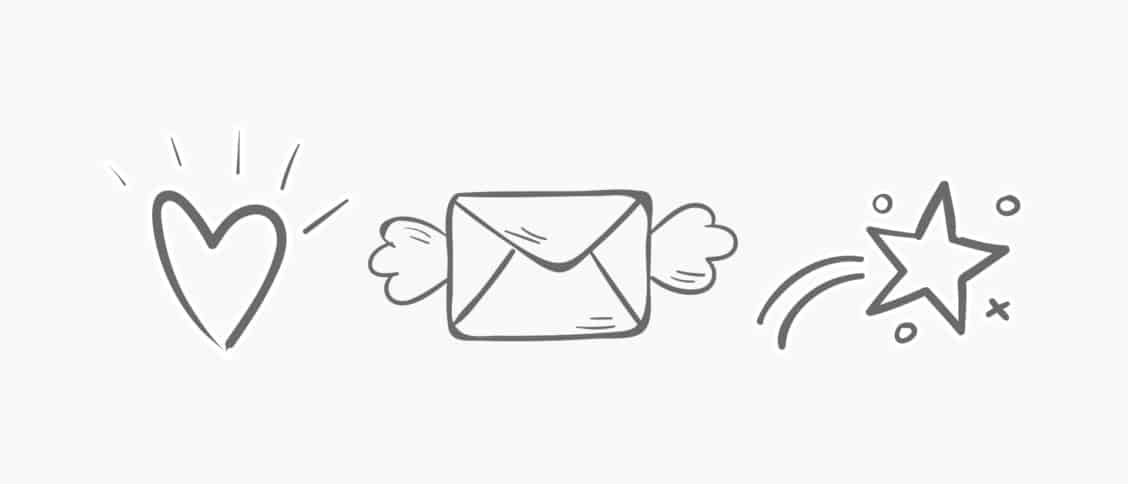
Small design elements that improve user experience with natural interactions are called microinteractions. The “likes” and reaction symbols we tap on to express our emotion for content is the perfect example of a microinteraction. The little fingerprint button that appears on the screen to put your thumb on is another example.
These small interactive design elements help connect the user interface with the user experience of a website or app. They can be found everywhere, constantly delivering meaningful gestures and interactive ways to help users engage with a digital platform.
Why Is Optimising Microinteractions So Important?
When an increasing number of business brands are trying to establish strong connections with their customers, these small design elements in an interactive manner can positively improve their experience and help them feel at ease.
They are so subtle and non-descript in appearance that users are often not able to recall them particularly. But they work like small bridges to make transitions from one screen to the other smooth and seamless. Today’s digital space is unthinkable without these microinteractions.
No wonder every app or website now focuses on effective ways to improve and enhance microinteractions for delivering a superior user experience. Yes, the dull buttons and screen animation referring to specific actions can be enhanced to make users feel more at ease, most often without their knowledge.
Some of the key benefits of improving microinteractions are:
- Helping users engage with a product in a more intuitive and frictionless manner.
- Providing users instant feedback corresponding to all the actions undertaken by them.
- Improving user engagement through delight.
- Providing users more sense of control and autonomy.
- Offering a detailed visualisation of background operations to help them take corrective actions.
How Is Microinteraction Constructed? What Are the Key Parts?
Microinteractions consist of four different parts as Triggers, Rules, Feedback and Loops and Modes.
- Triggers are the particular contexts for initiating a microinteraction. Now they can be initiated by the users or the systems. By detecting certain contextual clues, users can initiate an action, or the system can decide to initiate an action based on a set of qualifications.
- The Rules determine the things that take place following the triggering of microinteraction.
- Feedback is the part to allow people to get an idea of what’s happening in the background of a microinteraction. All the on-screen visuals or sounds that make users know about the undergoing microinteraction is called feedback.
- Loops and Modes are the conditional rules that determine how microinteractions will work in a changed condition.
Most Time-Tested Principles to Make Use of Microinteractions
Over the years, microinteractions are have been utilised by digital apps for helping users experience a smooth transition from one activity to the other. These small design elements over time evolved and accommodated more effective ways to engage users. Some principles of microinteraction design stood out as most effective. Let’s have a look at them.
Prioritising User Satisfaction
The principal aim of any design is to put users at ease and make them easily engaged. The same principle should be followed for microinteraction design as well. It is not just the smart look and feel that matters, the more important is how the microinteraction ensures enhanced ease of use. This is why it is essential to put every microinteraction under A/B testing.
Design It Simple
Microinteractions are subtle, and they don’t attract user attention. They remain inconspicuous while subtly enhancing the ease of use for the audience. This is why you should design them simple and do away with all complications.
Let It Not Distract Attention From the Content

Just as good typefaces enhance our readability while not grabbing any particular attention to the font type and size, microinteractions in UX design help users with optimum ease of use while not driving any attention to these interactive design elements. Any microinteraction that distracts user attention from the content undermines this principle.
Give Utmost Priority to Relevance
Any microinteraction which is not fully functional is not necessary. Just ask yourself how much relevant the microinteraction is for optimising the ease of use. Don’t incorporate microinteractions just for the sake of design. Microinteractions are functional design elements and not ornamental ones.
Balance Familiarity and Innovation
Since most users are familiar with different microinteractions, you can easily achieve the desired results by incorporating them into your app. But there is still room for innovative ways to tweak such interactions and make users feel delighted with them.
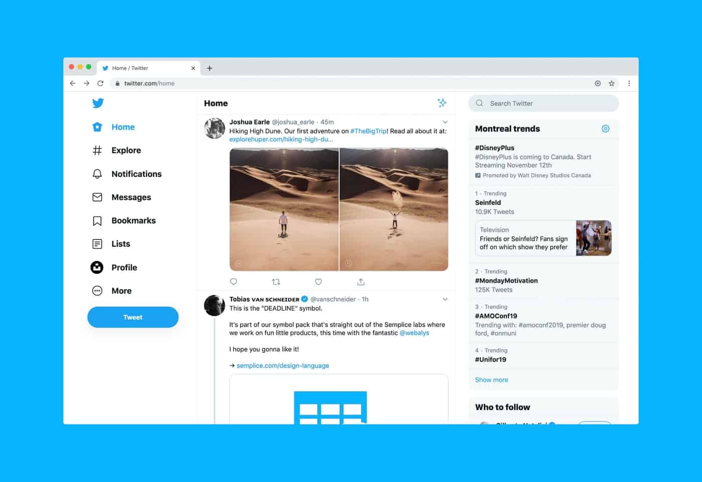
The way Twitter uses microinteractions is an excellent example of innovative tweaks in microinteractions. But in all circumstances, you need to keep your focus fixed on optimising the ease of use more than anything else.
Testing Small Animations
Despite appearing small, subtle and insignificant, microinteractions have a far-reaching impact on any digital interface. If you incorporate a new microinteraction in your web interface, it can instantly impact the user experience. Sometimes, new microinteractions can only add to the confusion of your audience.
As with every design decision, test these small design elements. Test the small animations and make sure they give users the right feel as you have intended. Create a prototype of the microinteraction and test them thoroughly to ensure effective output. Remember, the users will not comment on these small animations; they only enhance the overall ease of use.
Microinteractions Should Be Devoid of Cognitive Load
Microinteractions focus on a single and particular action or a specific task, and they use just one animated character to create the visual feedback. So, additional graphic elements and more animated characters will only cause unnecessary cognitive load and distractions, negatively affecting the effectiveness of the microinteraction.
To get clear of the cognitive load, follow the UI design principle consistently across microinteractions as well. Do not allow the microinteraction to stand apart from the overall design aesthetics and flow. To help users actively with something beneficial and relevant, you can incorporate small animated tooltips providing visual clues on completing specific tasks.
Conclusion
Employ microinteractions judiciously to enhance the user’s experience. Microinteractions can evolve further to incorporate new design elements, but they cannot do away with the grounding principle of prioritising ease of use.
Image Credits
Hero image created with the help of the fine folks contributing at the Noun Project under the Creative Commons License: BomSymbols, Valeriy and Knockout Prezo.