As designers, we know that our decisions have a real impact on how people use products. On the downside, poor design decisions have the potential to cause annoyance, cost users a bit of cash, or at worst, have more catastrophic results. Figuring out the intent behind designs, however, can be more tricky.
We came across this recently at work, when our general manager Damian unboxed a new 12” Macbook. We quickly noticed a problem: the new Macbook only had one port, with no adapter in sight. How was he going to charge his phone, or charge his new Magic Mouse, or connect his keyboard or monitor?
He was faced with a choice to either buy the $129 Apple adapter to use his screen and keyboard, or change the way he works. Resigned, Damian ordered the adapter.
This is just one example of the far-reaching impact that small design decisions can have on a user, whether intended or not.
I’m not sure about the intent behind the decision for just one port. Was it made with good intent – perhaps to progress an ‘all wireless’ ecosystem that Apple is planning?
Or was it made with consciously bad intent – to push for an upswing in accessory sales?
Without inside knowledge, we can’t know if this particular example from Apple example is intentional trickery. But there are plenty of examples where designs have indeed been created intentionally to deceive, known as dark patterns.
In this article, I’ll explain dark patterns, the psychology behind them, and how you can use smart (but not deceptive) techniques instead.
What are dark patterns?
In the online world, designs that are intentionally created to trick and deceive users are called dark patterns. Designers have crafted these ingenious, yet ethically questionable patterns to trick users into doing something they don’t want to do.
To create dark patterns, designers rely heavily on a good understanding of cognitive science and human behaviours. These are used to benefit the company behind them, to achieve goals like increasing sales and improving numbers of sign-ups.
It’s worth mentioning that I’m not talking about Anti-patterns here. They are just design mistakes that might have a negative impact on the user experience, or break conventions. Here’s an example.
I’ve become interested in dark patterns of late, and more specifically, the convergence of human psychology and cognitive science.
At a high-level, you can think of dark patterns akin to the tricks of a dodgy car salesman. These tricks are even easier to pull off in the digital space – you can’t look under a website to see a tell-tale puddle of oil on the ground to identify a dark pattern.
Dark patterns in action
All across the web, you’ll find dark patterns being used through practices like friend spamming, disguised ads, hidden costs, and more. Luckily, the UX industry is fighting back against dodgy practices through websites like darkpatterns.org, which is dedicated to educating designers and calling out questionable digital practices. It currently lists 14 ‘types’ of dark pattern to watch for.
Here are a couple of examples to be wary of.
Trick questions
Here’s a recent example that was featured in The Age a couple of months ago. 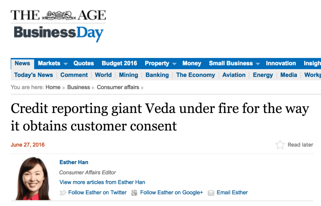
The article refers to “Simon”, who is extremely careful with his personal information, and is happy with his one bank. Simon was surprised when a rival bank, ANZ, sent a personalised letter to his home, inviting him to become a “platinum member”.
After digging and hassling on the phone, an ANZ representative finally revealed that they had received his details from Veda, who are Australia’s largest credit reporting agency.
It turns out that a few weeks earlier, Simon had been to the Veda website to fill out a form to obtain a personal credit report.
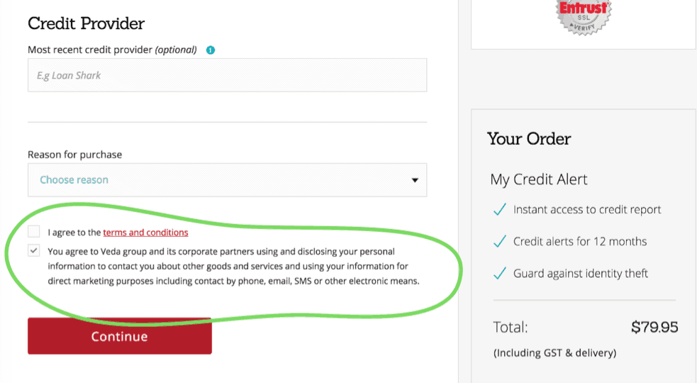
At the end of the form, Veda provides a pre-ticked checkbox that gives consent to Veda and its “corporate partners” to use his personal data for marketing purposes.
It’s a cheap trick, but it’s not an accident. The designers are playing to the fact that people tend to scan pages and don’t really read things properly. Especially when it comes to terms and conditions at the end of a long form.
The inclusion of a big, red button helps to distract the user away from the offending text even more.
Bait and switch
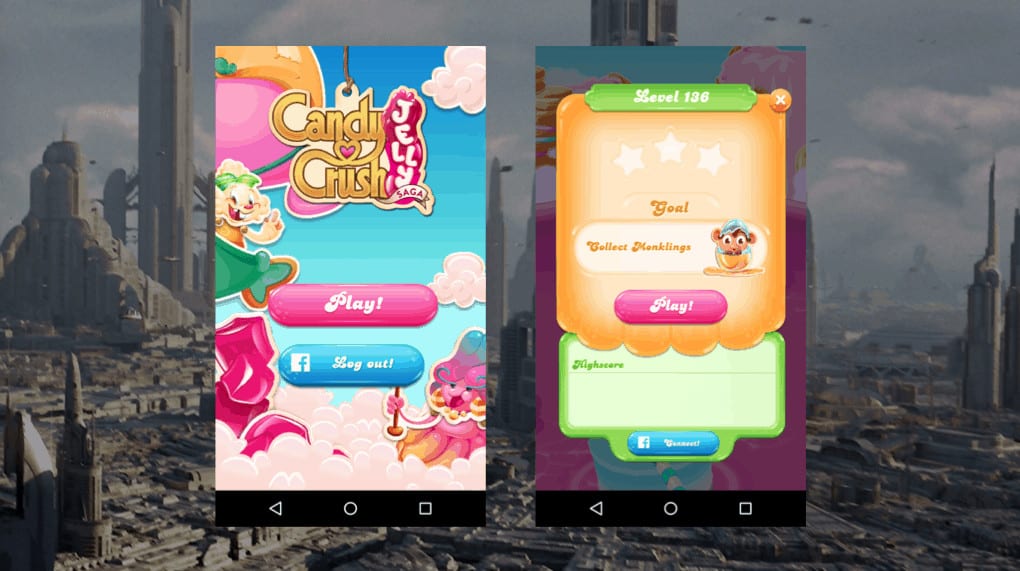
Candy Crush fans have probably fallen victim to the bait and switch, another common dark pattern.
As you start playing, the game conditions you to hit the big button in the centre of the screen for all key actions. You hit play to start a game, and play – in the same position – to start a new level. You hit the retry button – still in the same position – to start a level again if you lose.
And if you’re out of moves and not looking closely, you could easily hit this button.
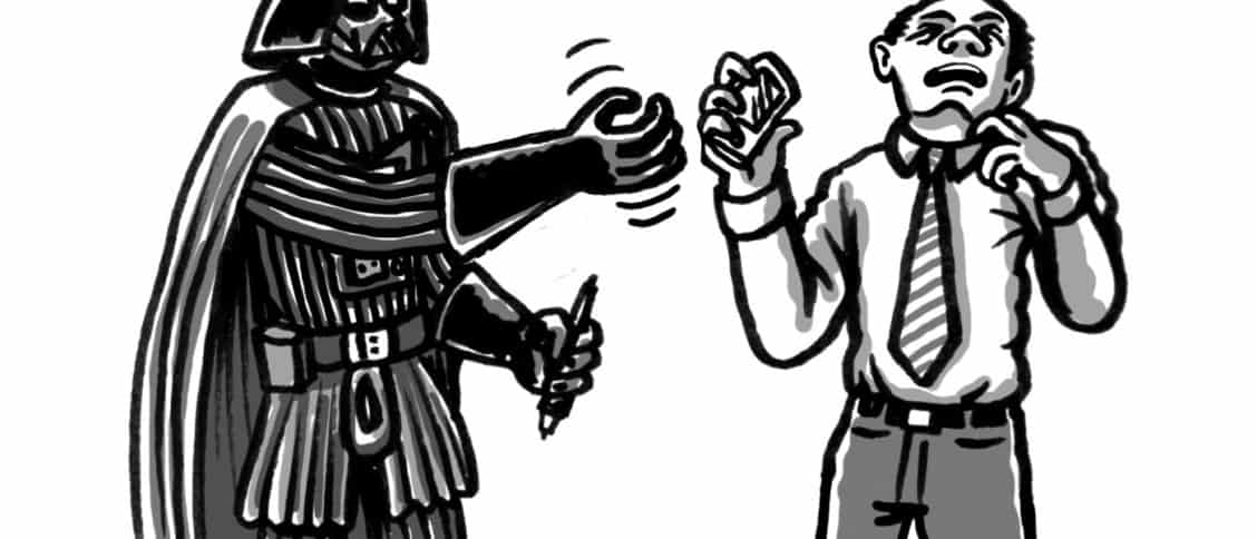
The difference is, it now has a different function. The UI baits you into thinking you know what the action will be, then sneakily switches this in to make you spend virtual currency, taking you one step closer to an in-app purchase.
The designer has taken advantage of human neuroscience here. By conditioning users to continually hit the call-to-action in the centre of the screen, the user’s mind recognises the pattern and over time diverts conscious attention away from reading the label.
Turning to persuasion over dark patterns
Why do people resort to dark patterns and underhanded trickery? It’s often when business needs are placed too far above user needs and design expertise. Perhaps when people are asked to do something unethical to please their boss, or to meet a particular KPI. It can be difficult for designers to push back on these priorities, forcing a moral and ethical dilemma.
This got me thinking. Is there another, more ethical way to achieve the same kinds of results? How can we, as designers persuade people to do stuff without trickery?
It turns out that we can use the same principles of psychology that dark patterns employ to persuade users instead, and to invoke positive behaviour changes.
It’s important to note that we’re talking about ethical use of persuasive techniques here – and not leveraging cognitive science against users to achieve business goals. Persuasive design, when used responsibly, can leverage a good understanding of cognitive science to add value to a user’s experience, and increase user engagement.
Above all else, it is our responsibility to ensure users retain their right of choice.
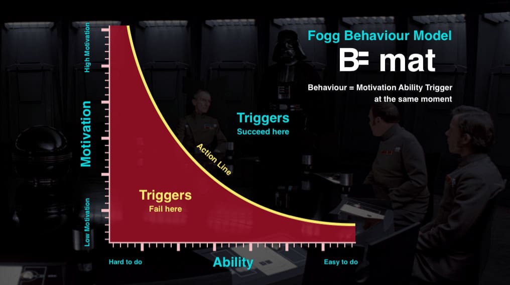
The Fogg Behaviour Model by Stanford University’s BJ Fogg, says that for a behaviour to occur, there needs to be a sufficient level of both motivation and ability.
So if you want to persuade someone to do something with your product, you need to first make them want to do it, then second, make it easy for them. Let’s take a look at how we can use motivation and ability in design.
Ability
As a designer, it’s typical for us to focus on ability first. That’s the part we usually have more control of. There are 6 basic elements of ability:
- Time
- Money
- Effort
- Cognitive load
- Social acceptance
- Routine
If you can influence these aspects, your user is far more likely to do the intended behaviour.
This might sound complex, but it isn’t always hard to make something easier, and it doesn’t even have to be a huge change to achieve a significant result. In fact, you’re probably already doing these sorts of things as a matter of best practice in making designs usable.
A great example is the $300 Million button story. In this well-known case study told by Jared Spool, he explains how simply changing the label on a single button increased an online retailer’s profit by $300 million in a single year.
There’s a little more to this story. The change removed the barrier of having to create an account before making a purchase. It’s a great example of how making a simple change to improve a user’s ability can have an enormous positive impact.
Persuasive techniques can be used for bad, too. Cash back on purchases are one way the ethical line gets blurred. When you have to jump through hoops to get your refund (filling in a long form, photocopying the receipt and mailing it), then the ‘ability’ to complete the cash-back is low. In this case, it’s likely that some buyers won’t bother to complete the action – which is exactly what the retailer wants. It hardly seems worth it for a $200 refund for a $1700 purchase, for example.
This isn’t a mistake – it’s designed to maximise purchases and minimise rebates through cognitive science.
Motivation
In the cash back example, you start to see how motivation part comes into play. It might be easier for a designer to control the ‘ability’, but we can also influence motivation with a good understanding of human psychology.
People’s key motivators include:
- Desire for completion and order
- Delight and emotional connection
- Variable rewards
Understanding what motivates people is the powerful bit, and if you think back to those dark pattern examples now, you’ll realise that although they’re outrageously dodgy practices, it’s not just about the interfaces, but the way those interfaces are put together in response to a good understanding of human behaviour.
Fitbit, for example, is very effective in tapping into people’s desire for completion and order. Staying focussed on being active and keeping fit is a hard behaviour to crack. It’s very easy to put off heading out for a run and just sit on the couch instead.
Fitbit knows this. By adding little achievements that need to be completed, like measuring 10,000 steps, they appeal to our natural tendency as humans to want to ‘complete’ the step goal.
These are powerful techniques. And the great thing about persuasive design is that its influence has the potential to do more than simply help us get people to use our product.
Design is more than aesthetics and usability
Us designers wield enormous power, but it’s easy to forget that when we’re deep at the coal face, buried in research findings and wireframes. Take a moment now and again to remember that it’s not just about aesthetics and usability. We help shape the lives of people everywhere, and our decisions can have significant impacts on the way we as a society behave.
Design is an evolutionary discipline. We don’t invent, we learn from the past. Designers practising the craft now are setting the example for the future generations.
Don’t always take the cheap, easy, dark patterns option. Understand that we do have great power and can use cognitive science to influence and persuade, but respect that power and use it for good, not evil. Think responsibly.
And as for Damian, he bought the expensive adapter for his new laptop. And it doesn’t even accommodate all the cables he needs!




Forcing users to buy an extra product is actually what Apple wants users to do.
Hey Mara,
Thanks for your comment.
You’re right – that is the intention – the point of this article is to question whether that’s ok, and whether we should accept this kind of behaviour.
Hi. Good read, I like the sense of responsibility. It seems like most of currently successful companies do use dark patterns, so users are more likely to be controlled by it, while new websites/apps/tools might grow and be designed in a way you propose in the article. This might me good way, however my question is how can we, designers & customers, force shady/dark patterns to not only get negative attention, but how to erase these from our lives?