Amy Nelson and Meena Tharmarajah, part of the ABC design team behind the successful ‘Play School Art Maker’ app for the iPad, took some time to chat about the unique problems they faced in designing a user interface for pre-schoolers.
Why don’t you start by telling us a little bit about yourself?
Amy: I work for ABC Innovation. I’ve worked at the ABC for nearly 11 years – I started here as a designer, developer, and moved into being a producer. Most recently as a senior producer I worked on Play School Art Maker for the iPad, and the Bluebird AR Interactive Drama, which we launched a couple of years ago.
Meena: I’m also within ABC innovation, and I’m a user experience designer. I actually started out as a graphic designer in print, but there’s something about the print process that just didn’t gel with me – I think it might be to do with having a mistake printed 50,000 times and not being able to change it!
I convinced a web design company to take me on, and then went from company to company, building up a body of work in web, and then interactive TV. I worked out that I really wanted to do work with a public broadcaster, because it seemed at that time (around 2000) that most of the interesting digital work was coming from them. I managed to get the job at the ABC and I’ve been here ever since.
Meena: As Amy mentioned, I’ve worked with her on the Play School Art Maker project. The other really notable project was Gallipoli: The First Day, which I happened to pitch. So it’s been really great working here at the ABC.

It’s fantastic that you’ve made that transition from print to online successfully.
Meena: I guess I have… I can’t believe the web design company took me on! I didn’t have any experience but I think that the principles of good design transcend formats.
Could you explain for us who the distinction between a producer and a user experience designer?
Amy: I was responsible for project managing the production, but I’m a bit of a creative producer, because I ended up doing some art direction as well, and directed the sound design, and did some writing. I’m more of a multi-skilled, multi-disciplined kind of producer. But not all the producers will work here necessarily work that way – it’s just something that I actually really like to do!
I’ve got quite a strong multimedia background and studied at film school, did sound production, and then moved into media design. That’s just something that I really like doing and I’m lucky that I’ve been able to do that.
Meena: On Play School Art Maker, everyone chipped in on everything, so we weren’t really locked into our roles… we all dabbled in lots of different areas, which I think was to the benefit of the project. In terms of UX design, we really focus on the audience experience and the journeys and interactions that the audience is likely to encounter within a particular app (in this case), or website, or any digital offering… or anything with an interface that the audience can see.
As the UX designer I am not optioned on a project from beginning to end, but a producer will be. For me the role of the producer is really to guard the integrity of the project.
So you can have technical producers, but you can also have producers like Amy, who are amazingly creative and really give input into the user experience design, and in fact all aspects of the design of a project.
We’ve talked a little bit about the Play School Art Maker app. I’m familiar with it because my two-year-old loves it, but can one of you give a bit of background to the app for someone who hasn’t looked at it – what it is and how it came about?
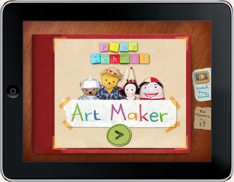
Amy: The app is an iPad offering that is very much a digital sticker book, and a bit of a scrapbook. It allows kids to freely make art pictures, animations and story slideshows, and they can also play puzzles as well.
The idea is that it’s tying in with the ABC’s very well-known children’s preschool television series called Play School. That show is very much about imagination and creativity through open play. I think it originated in the UK, but for people who haven’t seen the show, it’s very much about helping kids understand their place in the real world. There’s lots of storytelling; there are two presenters who talk directly to the camera, and when they’re watching it, kids feel like they’re getting very special treatment directly from the two presenters.
It’s very personal – they read storybooks in the old-fashioned way; they do a lot of songs; they do art and craft; and then they have video segments where they go out in the real world and give kids a sense of how some of the things they’re exploring actually relate to their real world.
For example, a show might have a theme that’s all about different modes of transport, or going to the beach. So all the content for that show will focus on that one theme. So this app, because it’s something they can do, and art and craft is such a big part of the show, we thought it would be fun to focus in on that discipline, and allow kids to have a lot of freedom with making their own pictures, stories, and slideshows. That’s essentially the crux of the app.
It’s fair to say that Play School is an institution in Australian children’s television programming – I think it’s been around since 1966, is that right?
Amy: It celebrated its 45th anniversary just last year. That was one of the reasons how the app came about, actually, to help celebrate that anniversary.
Did you feel like you had big boots to fill?
Amy: Ha ha, absolutely. We were really very conscious that we’d been given quite a big task. This is the first kids iPad app that the ABC had produced.
So we had that to deal with, and ABC Kids as a brand is very strong on its own. But the fact that Play School was chosen to be the property that we would make the app for was another big thing for us – to make sure that we got right. So we worked very, very closely with the producers and director of the show, and made sure that we were really in tune with the core values and all the things that the show is so well known for. They were the things that had to shine through in the app.
It was a big challenge, but it was really fun.
How many people were involved in making the app?
Amy: From the ABC we had four: myself as producer, Meena as UX designer, Tali Gal-on, a designer, and Jake MacMullin, our tech lead. Then we had an external production company called Secret Lab, who did all of the actual development of the app.
We also had two sound designers from Sabertooth Sound, Luke and Wes. We had an early childhood learning advisor on the project too, her name is Kate Highfield. That was our core team… it was quite small.

How did you guys just decide upon an effective workflow to make sure that everything was done efficiently? Communication was obviously paramount to the process?
Amy: We had a very iterative working model on this project because none of us had actually made iPad apps for kids before except for Jake. He’d done a couple little experiments with some puzzle apps, and I think Secret Lab had done a couple of smaller things too. But no one had made a really rich app for kids before. So the first task as making sure we were really au fait with how kids were using iPads. We started researching this 18 months ago so obviously things are very different now, and the saturation of iPads in Australia is higher than it was then. But we needed to get a really good handle anyway on how the Play School demographic was using the device. The demographic is two to six-year-olds broadly, but the core audience is three to five-year-olds.
Amy: Meena’s got two young children who happened to fall almost exactly within that core demographic….
I was going to ask how you do user testing with toddlers… I’ve had some experience in trying to research for a product for a younger audience. With parental consent it can get very difficult, so it sounds very convenient that you had some subjects in your household!
Meena: It was convenient that I had two little guinea pigs at home! I was taking work home with me all the time and checking it with them—particular my son who was right in the middle. He was four years old.
I’m sure it didn’t feel like work.
Meena: No, it was really interesting and because we were at home and my kids hadn’t had access to an iPad (they’d had limited exposure to my iPhone, but I didn’t really have that many kids apps on my phone at that point) I got to see their exploration of the iPad as well, which was really kind of a unique experience.
But at a certain point, particularly when we were testing the prototype, I just couldn’t test with my kids anymore, partly because my son just didn’t want to deal with a broken app. He got sick of it. So we got a group of kids together in the demographic, and on the advice of Kate Highfield, we actually visited them in their homes and tested with the prototype, and we went back to them multiple times. That was basically the way in which we tested the prototype.
One thing I’m really curious to hear about is some of the unique interaction hurdles that toddlers and preschoolers face that you might have encountered.
Meena: There are a couple. One that seems really obvious in hindsight is that they’ve got quite, in relation to an adult, they’ve got short arms and narrow shoulders. So they tend to start kind of hugging the iPad or inadvertently draping their arms or hands on the edges of the screen, so they start tapping buttons without meaning to.
What we did was we ended up creating a kid safe area (a frame within the screen) and we weren’t allowed to put any buttons outside of that area, that were going to take kids away from the screen that they were on. That was really interesting, developing that kind of kid safe area.
The other thing was with the jigsaws, we noticed that their little hands were a factor. Kids actually have an advantage I think, because they’ve got little fingers, they can pick up smaller things. But as they were dragging items along the screen, the younger kids would kind of get tired and have to rest.
With a real shape, they can pick it up again. But in a lot of other apps we saw they’d let go, and then the piece would bounce back to the original position, which was really frustrating for them.
The final thing we encountered within the Art Maker was that kids often using both hands and all their fingers to move items around. That would activate the iOS5 multi-touch feature, which meant they would suddenly find themselves in a completely different app.
We actually couldn’t kill that feature, but what we could do was, when they exited the app and went back in, they could choose whether they wanted to continue with the artwork they were playing with or just start again.
I’ve had the same experience with my little ones using my iPad, and there’s not much you can do about it. It’s frustrating for them.
Meena: I know. It was frustrating. Personally, I have multi-touch turned off on my iPad, so that doesn’t happen.
Amy: There are a few other things as well. Meena and I did some initial research just to see what leading kids apps were on the market, and look at what we thought they were doing well and what they were doing badly. And then we observed just a small group of kids using some of those apps, to see what their reaction was and to see how they were using them. That was really useful because as I say, it was our first time creating an iPad app for them.
I had experience with making games and interactive media for kids on the desktop web, but I needed to understand on an iPad, why is it different to making a website? We needed to get our head around who our competitors were too, and why they were succeeding because we needed to work out a way to make sure we’d be really visible in the market. There are just so many apps already out there for kids – hundreds and thousands of them, I think. It’s hard to find the gold.
So we had some key takeaways. One of them was that the most successful apps are single proposition apps – single value propositions. For example, the ‘Toca Tea Party’ had just been released at the time of our research, and that is a very simple, straight-forward kind of interaction design and concept. It’s a little tea party interface for you and your toys, and that’s all it is.
There were other similar apps here that are doing really well, and it was the same thing again. It’s great just to have one activity that kids are focusing on in your apps. Originally we thought we’d maybe do an app that had five or six mini-activities all-in-one, that’s traditionally how we build kids’ websites too. But we soon moved away from that and instead of having a Play School app that might have a make-and-do game, plus a music game, plus a story … we would just focus on one type of game.
What other tips would you give designers who are thinking of creating mobile apps for a younger demographic?
Amy: In terms of interaction design another big thing was to make this appeal to two- to six-year-olds. Obviously a two-year-old is very different to a six-year-old, so having different levels of complexity in the activities in the app was really important. Some of the puzzles in the app are really, really easy, but there are different grades of difficulty with those. That I think is one of the reasons why the puzzles are probably really popular.
Another thing is that you need to find ways to offer revelation and surprise. It’s fine for the game and the core interaction to be familiar every time you come in. But if the content can offer revelation and surprise in some way so that every time you play, you get a slightly different experience, then that is a really good thing.

What’s an example of that in the Art Maker app?
Amy: Well I guess a really simple example is that we’ve got two Play School presenters voicing the app. When you do a puzzle you get praised by one of the presenters, so we recorded I think 10 to 20 different praises, with each of the presenters, and made sure when you got praised it wasn’t too repetitive, and you wouldn’t know what Alex Papps, for example, might say next time you finished a puzzle.
Meena: I think more intrinsically, that surprise and revelation – those things are really about exploration, and with the Art Maker we’ve got several themes and many, many items that you can add to those themes. A kid can come up with millions of combinations of those, create their own stories, and to me that’s exploratory – finding different mash ups of all those items.
You do get surprising connections that happen. My son was in the ‘space’ theme and he was able to put in planet earth and found a scouring pad and he crashed it into the earth, and he said, “Hey mum, the meteorite’s hitting the earth. All the dinosaurs are dead now.” Kids are so surprising and unexpected to adults, with these amazing combinations.
One criticism I’ve heard of the iPad as a tool, from a computer boffin is that it’s a tool that encourages consumption and not creation. What would you say to that?
Meena: I would say to the person…that they are probably a consumer and not a creator. It is a tool, and a tool is only as good as the person that’s using it. That word, consumption, to describe the viewing and radio content, sort of infers that that’s a bad thing. I don’t think that there’s anything wrong with consuming content and not being a creator – I actually think that the iPad allows us to peruse that content in a much more personal way than the TV. I think it’s a bit more like a book, so that means you get a much more personal experience with that content when you’re looking at it on an iPad, I think.
You can already see that there’s a rise in long-form content, and I think that’s going to be a really great for the ABC.
Amy: I’d like to add that one of the really pleasant surprises for us with the Art Maker is that some preschools have been using it in their classes. So it’s kind of interesting because at first glance you’d think, ‘oh, it’s pretty much an entertainment proposition’. Play School certainly pitches itself as an entertainment program first and foremost, but there have been educational benefits that have come out of the arts. And we’ve also had reports of young students in China, who are learning English as a second language, and they’ve been using the Art Maker to help learn English.
We’ve also had stories of children who might have low-level autism or learning difficulties with speech patterns and language, who again are using the Art Maker to make really amazing stories that they voice themselves, and story slideshows with multiple pictures and animation.
So I agree with Meena, but I also think that if you come up with a really clever, well-targeted creation tool, it will resonate. It’s up to us, the industry, to be really good at making tools that empower people to create, and not necessarily have as many options to create as they might on other platforms like a traditional desktop.
Touch screens make creation a lot easier for other kinds of audiences as well. It’s much easier for kids to use iPads than it is for them to use a mouse and a desktop computer. It’s not that they can’t use desktops obviously, but they’re using iPads as young as 18 months old and interacting with them, and children with disabilities or at the other end of the spectrum, older audiences, are also using iPads more than they would use traditional desktop computers. So I think the challenge is on for us to be creating really good tools that let people be creative with new technology.
It must have been really rewarding to have that kind of feedback come in.
Amy: It was really lovely and they were nice surprises. We obviously weren’t setting out to reach all of those needs, and the fact that we’ve had that feedback is a nice tribute to the effort that’s gone into crafting the app.


