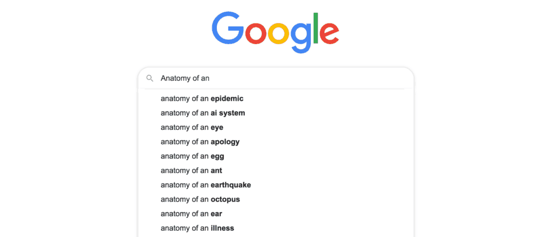
Google launched auto-suggest (a.k.a. Google Suggest) as a Google Labs project in 2004, saying it “…provides you with search suggestions, in real time, while you type”.
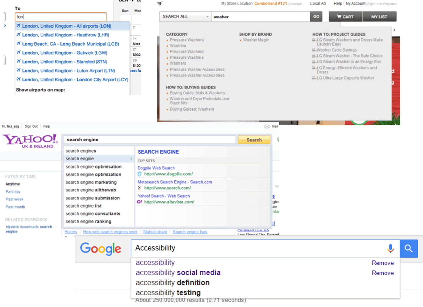
These days auto-suggest is everywhere, from social media sites like Twitter and Facebook, to shopping sites like eBay and Amazon, and even in occupation validation for credit card applications.
At its core, an auto-suggest is a form made of two components:
- a text field (typically <input type=”text”>)
- a customised select list based on what’s in the text field
With plugins available for all the latest frameworks and libraries, adding an auto-suggest to your site is relatively easy.
But what about accessibility? I’ve reviewed auto-suggest components from many of the major frameworks, and most of them have one thing in common: they’re not properly accessible.
Some go part of the way and make sure suggestions can be used with the keyboard, but most fall over when a selection is made, because focus ends up in a random spot on the page. This cases confusion and frustration for keyboard and screen reader users.
Screen readers are another area where these auto-suggests often fall short. Unless the number of available suggestions is announced to screen reader users, they don’t know they’re there. So, to screen reader users, these auto-suggest components are just input fields.
So how do you make an auto-suggest accessible?
These are my requirements to make an auto-suggest accessible. I’ve included code snippets throughout and linked to a working codepen at the end of the post.
Requirement #1 – Visible focus
A visible focus indicator (e.g. dotted outline, blinking cursor) enables keyboard users to understand where the keyboard focus is. Focus Visible is also a Web Content Accessibility Guidelines 2.0 (WCAG) requirement (success criteria 2.4.7).
Note: if you’re using <input type=”text”> for the input field and you haven’t removed the focus outlines provided by browsers, visible focus should already work. You’ll need to add visible focus highlighting for scrolling up and down the list options with keyboard (as shown in the codepen).
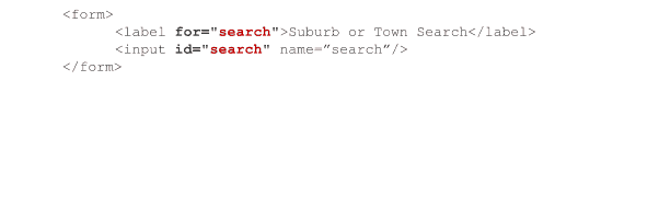
Requirement #2 – Link a label to the input field
All form fields need a label to tell the user what input they’re expected to provide.
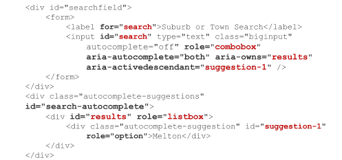
For our auto-suggest, this means defining a <label> element linked to the <input> field by its for attribute.
Example:
Onward!
When defining requirements for the suggestions list, we need to consider a few things:
- When do the suggestions appear?
- Where do the suggestions appear?
- How does the user select a suggestion?
- How does the user close the list?
Answering these will give us the requirements for our suggestions list.
Requirement #3 – If there are no suggestions, don’t show the list
The list should only show if there are suggestions related to the user’s input. If there aren’t any suggestions, don’t show the list.
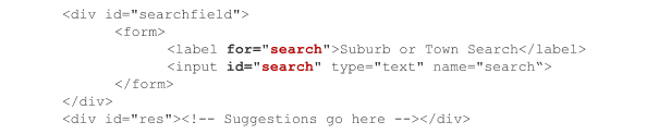
Requirement #4 – If there are suggestions, show them directly below the input field
If we have suggestions related to what’s in an input field, it makes sense to display those suggestions close to that input field. Accepted practice is to display suggestions directly under the input field, so there’s our requirement.
But hang on! This “list location” requirement is about the on-screen list location AND the position of the list code in the page source. It makes sense to put the suggestions list near the input field on screen, but it’s just as important to put the suggestions list near the input field in the code for easy access for screen reader users.
Putting the suggestions list directly below the input field, on screen and in code, works best for everyone.
Example:
Requirement #5 – The auto-select must be keyboard-compatible
This is a critical for people who can’t use a mouse, such as those with a visual impairment, hand tremors or repetitive strain injury (RSI). Keyboard compatibility is also a WCAG 2.0 level A requirement (success criteria 2.1.1 Keyboard).
Requirement #5a – Up and Down arrows move through the suggestion list items, highlighting the current item
The user shouldn’t Tab through the suggestion list because that takes focus away from the input field. No input focus means users can’t keep typing to refine the suggestions. Arrow keys to the rescue!
Requirement #5b – Enter selects the highlighted suggestion and closes the list
The Enter key should close the list and populate the input field with the selected suggestion list item. Focus stays in the input field.
Requirement #5c – If the suggestion list is visible, Esc closes the list
If none of the suggestions suit then keyboard users can press Esc to close the list without changing the content of the input field. Focus stays in the input field.
The auto-select must be compatible with screen readers
We must tell screen reader users that the input field is an auto-suggest and that, depending on their input, there may be suggestions available.
To do this we’ll use Accessible Rich Internet Applications (ARIA), a W3C technical specification. It defines HTML attributes to improve website code semantics and provide information to assistive technologies (e.g. screen readers) about non-native HTML components like our auto-suggest.
A short segue – when and how to use ARIA
ARIA is powerful, and it can help you make your websites and web applications more accessible. However, it is NOT the solution to all your accessibility issues.
In fact, the first rule of ARIA is:
“If you can use a native HTML element or attribute with the semantics and behaviour you require already built in, instead of re-purposing an element and adding an ARIA role, state or property to make it accessible, then do so.” – Using ARIA, W3C (https://www.w3.org/TR/aria-in-html/)
ARIA is like gap filler, it helps to patch things up a bit. But it doesn’t give you all the goodness that native HTML does.
For example, unlike a <button>, a <div role=”button”> doesn’t receive keyboard focus, doesn’t send Space and Enter keyboard events to the click handler, and doesn’t have visible focus. Browsers don’t know that a <div role=”button”> is meant to act like a <button>, the role attribute is just a descriptor used by assistive technology.
I’ve used <div>, an element type with no native semantics, for the suggestions list and its list items to satisfy the second rule of ARIA use:
“Do not change native semantics, unless you really have to.” – Using ARIA, W3C.
Requirement #6 – Make the auto-select work with screen readers
Requirement #6a – Add ARIA markup to the input field
Add role=”combobox” to the <input> field to tell screen reader users that the input field is an auto-suggest.
Add aria-autocomplete=”both” to the <input> field to tell screen reader users they can select from the suggestion list or type their own input.
Add aria-owns to the <input> field to link the suggestion list to the input field.
Finally, add aria-activedescendant to the <input> element and populate it with the id of the currently highlighted list item. The aria-activedescendant value changes as the user presses the Up and Down arrows.
Example:
Read more about ARIA:
- Roles: https://www.w3.org/TR/wai-aria/roles
- States and properties: https://www.w3.org/TR/wai-aria/states_and_properties
Requirement #6b – Add ARIA markup to the suggestion list container
Add role=“listbox“ to the suggestion list <div> to tell screen reader users it contains a list of selectable items.
Requirement #6c – Add ARIA markup to individual suggestion items
Add role=“option“ to each suggestion item, along with a unique id. That id is used by the aria-activedescendant attribute of the <input> element, whose value changes as users move through the list items with the arrow keys.
Requirement #6d – aria-activedescendant should match the currently selected option
As users move through the list items with the arrow keys, update the value of the aria-activedescendant attribute of the <input> element to contain the id of the currently highlighted list item.
Requirement #6e – Announce the number of available suggestions to screen reader users
Whenever the content changes of an element that has the aria-live attribute declared, screen readers automatically announce that content. Like a public address system, live regions enable us to make announcements such as “list status” changes as our user types in our auto-suggest input field.
Aria-live regions are polite, assertive, or off, determining when the user hears the announcement:
- Polite = the screen reader will finish what it’s saying before announcing the live region content
- Assertive = the screen reader will interrupt what it’s saying to announce the live region content
- Off = the screen reader won’t announce the content unless the user focusses on that region
With the auto-suggest, the change in the number of suggestions should announce immediately, so this aria-live region is assertive.
Example:
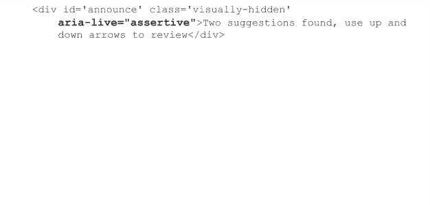
The content of this <div>, which isn’t visible on screen, updates every time the list length changes to trigger the screen reader announcement.
Conclusion
So there you have it. Fulfilling these requirements should make your auto-suggest widget more accessible.
My auto-suggest code, including commented JavaScript for the event handlers, ARIA attribute updates and list population: codepen.io/ademcifcioglu/pen/xdOyXv


Would you be interested in seeing an example with other approach ? You might have a look at this : https://a11y.nicolas-hoffmann.net/autocomplet-list/
What about those of us who use speech recognition software, such as Dragon NaturallySpeaking? What testing have you done in that regard?
Cheers,
Gary
hi Adam,
Great step buy step article. Only comment I would have is please review Bryan’s article on role=’combobox’ here, and note about the issue with using aria-owns.
http://www.ssbbartgroup.com/blog/differences-aria-1-0-1-1-changes-rolecombobox/
Regards,
Mark
Hi,
I am recently facing one issue with long list of options in the drop down. Client is asking for scroll bar in autocomplete-suggestions drop down box. any one implemented this feature in this control. Please give some thoughts on thi feature.