- Design the whole interaction, not just the transitions
The popularity of touch devices and the user interface innovations that have occurred on these platforms in the last few years has provided UX designers with a wealth of new inspiration for page transitions, scrolling animations, button transitions and every manner of flashy effects.In light of this, we should be wary of losing focus on the wider experience we’re designing for and be careful not to miss a potentially innovative approach to a design problem. While tempting to pick and choose from what’s available in a pre-built library, it’s important to remain focussed on the flow of a user through the site or app and not the effects with which this flow is implemented.A site that is delightful trumps a site that is ‘merely’ usable.
Learn more: Give Your Website Soul with Emotionally Intelligent Interactions | Smashing Magazine
- Focus on the product, not the deliverable
A UX process is thought intensive, and unless you’re using a particularly lean process you’ll be documenting things as you go along, or at least communicating findings to stakeholders with diagrams and presentations.With so many different techniques available to UX practitioners don’t get stuck on designing the project documents, and don’t sacrifice another round of iterating just because you need time to retrospectively update the wireframes.An accurate snapshot is nice, but a working product is better.
- Don’t let user testing become your crutch
User testing is a core user-centred design technique, and deservedly so, but it is an evaluative technique that judges quality or value and is therefore not always the best way to generate an understanding.Instead it might be useful to explore alternate early-phase ‘generative’ techniques that give you empathy with the users such as visual diaries, contextual inquiries or mental models. They will inform you about why a user has a certain goal.Knowing the reason behind a user’s goals can empower you to truly innovate, rather than relying on user-testing to help correct the design afterwards.
Learn more: Finding Empathy Through Generative Research | JohnnyHolland.org
- Choose quality over quantity
User research may result in one of two types of data:
- Quantitative: Survey results, A/B test data and conversion rates – measurable data that indicates where, when or how much.
- Qualitative: Observations of user test participants, quotes from contextual interviews – data that helps us understand the why.
When hard pressed and needing to choose one or the other, having an understanding of why users do something is more valuable than having measurements that may or may not be relevant to the issue involved.
- Use more than one research method
Each research method has its own advantages and disadvantages, and relying on only one will make your research one-dimensional.Try to triangulate research so that complimentary methods can be used to confirm data accuracy and relevance. The accuracy of each method can be validated to a certain extent by its overlap with the others and you’ll end up with a wider and more precise view.
Learn more: Practical Triangulation | JohnnyHolland.org
- Be transparent
Create a design wall. Volunteer your progress, your findings and your planned steps. Make it easy for stakeholders and other project members to access videos of user testing sessions, usability reviews, interview transcripts and other material that informs your findings.Be strategic when choosing participants, perhaps invite members of the branding, marketing and business-as-usual teams to be participants in a user testing session. They may not be quite within the demographic, but they can help to evangelise a user-centered approach moving forward, and it certainly helps with relationship building.
- Be visual wherever possible in your project documents
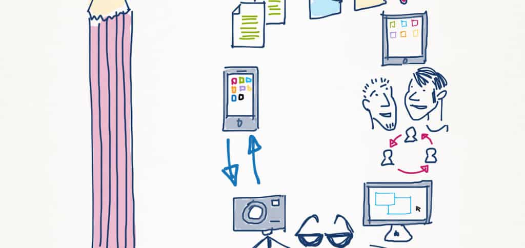
It helps you give form to your ideas. You don’t need to be an artist to draw – anyone can draw using a set of templates to illustrate ideas.Sketching isn’t all about the end result either – you can explore and iterate quickly to learn a lot while sketching – and keeping things sketchy stops you confusing your thoughts with a deliverable.In the end, you will gain a deeper understanding of the problem you are trying to solve, and a head-start on implementing a great design!
Learn more: 50 Sketching Resources for User Experience Designers | InspireUX.com
- UX works best when it is participatory
Users, stakeholders and colleagues all collectively have more brains and perspectives than a single UX designer, and this is a great asset to take advantage of.It helps to get as much information from people as possible, so that you as designer can be a channel for user needs. This could mean co-designing with a user, planning in an open-session with stakeholders, or buying your developer a double-shot hazelnut mochaccino and pulling up a chair at the same desk. Whatever it looks like, collaboration can help you make the most of these relationships to create something amazing together.
Learn more: Making Emotional Connections Through Participatory Design | BoxesAndArrows.com
- Be creative with your wireframes
Once you’ve got the expected content, design hierarchy and functional requirements sketched in, don’t forget to look for the potential to solve visual design problems in a way that is cohesive with the intentions of the project.This can help an initial functional vision carry through to visual design without the need for a re-interpretation. In this way wireframes can help develop the interface’s inherent engagement with the users from an early stage.
- Tell stories to hear stories
Helping interview participants to talk openly and share what they are thinking is a necessary skill for UX researchers to learn.They may have only met you five minutes earlier, so asking them to give you an insight to their thinking involves an element of trust on their part, and a bit of stimulation on yours. Avoid rapid-fire questions as they tend to result in monosyllabic answers. If the dialogue is dying down, recount something that happened to yourself.People tend to respond to stories by entering into conversation.
Each UX practitioner will have preferred tools and techniques depending on their area of specialization, but the above points can be applied to most projects to help create a better result.
That’s only 10, and there are plenty more! What other secrets have you learned along the way?


All very sound advice! #9 is borderline however :) As we find our wireframes too often turn into actual design unless we are strict with our wireframe style of solid blocks and simple lines, no color, no graphics etc.
Also finding it useful to create a data prototype prior to any visuals what-so-ever. Get the data requirements down first, then dive into it.
Kudos and thanks again.
Hi Sean, that’s a good point, thanks! I agree we need to remember wireframes are most useful as a ‘framework for a conversation’ between the stakeholders, audience and designer. Keeping the wires simple is fundamental to that process, and apps like Balsamiq Mockups can help intentionally create a sketchy look so there is less emphasis on design that might be too distracting for a client or stakeholder (or UX designer!) early in the process.
On one project I made the mistake of focussing on content/hierarchy/functional details for too long and then found it harder to back-pedal as we got closer to working on final look-and-feel. I had put too much emphasis on wireframing and interface design as separate processes, whereas there is much more crossover than I realised at the time, and a broad spectrum from data requirements, through pilot sketches, rounds of wireframes and up to setting and solving smaller design problems that are well into the realm of interface design.
How do you go about creating your data prototypes?