Wireframing is an essential skill for UX Designers and other experience design participants. Yes, wireframing is a skill, not just a technique. It can be done well or poorly and the result can have a huge impact on the outcome of the final product.
Fortunately, like all skills, it can be learned and honed. This tutorial will point you in the right direction.
What is wireframing?
Wireframing, in the context of user experience design, is the act of creating user interface wireframes.
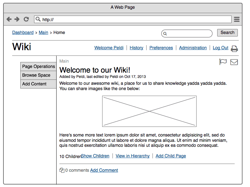
Michael Angeles, on his design blog “Konigi,” has one of the best descriptions of a wireframe out there (emphasis mine):
“A wireframe is a schematic or other low-fidelity rendering of a computer interface, intended to primarily demonstrate functionality, features, content, and user flow without explicitly specifying the visual design of a product….
“Wireframes are usually rendered in software, but are also created as works on paper or on other ephemeral materials, e.g. white boards. Wireframes are meant to be used as rough representations of interface ideas that can be quickly discarded and iterated upon until design solutions are selected.”
Wireframing is not the same as prototyping
Wireframing as a practice has more in common with sketching than prototyping, especially in the first phase (which I’ll describe below). A prototype, on the other hand, while also not a customer-facing product, is intended to demonstrate realistic interface designs and interactions, often for usability testing and/or client presentations.
Unlike wireframes, prototypes often look and feel like the final product, even when they are not fully functional or built with code that will eventually be used in the product. (“Click-through” wireframes can be used as early-stage prototypes, but that is not their main purpose.)
The article “Why wireframes are essential for web design” likens wireframing to writing an outline in a document. The author reasons: “You’re starting to make design decisions and get a feel for how this site will come together before committing serious time to building anything.”
These concepts are important to keep in mind while creating wireframes.
The two phases of wireframing
Defining wireframing as simply the process of creating a wireframe sells it short. As UX designers know, it’s not the tool that people want, it’s what it does for them that matters.
A wireframe is a tool. Successful wireframing is the practice of using wireframes to solve real problems.
The first problem that wireframing can answer is “what are some ways our product can help our customers accomplish their goals?” (Note that this is an open-ended question, which is preferred, as opposed to something more constraining, like “I need to design the export to PDF feature.”)
The second problem that wireframing addresses is “how do I know this solution will work?” This is where the ability of wireframing to elicit helpful feedback and diagnose problems early really shines.
These problems can be divided up into two distinct phases: the ideation phase and the validation phase.
The ideation phase
The first problem, trying to figure out how your product can help customers accomplish their goals, is addressed in the creative ideation phase of the wireframing process. This is where you generate as many ideas as possible in order to iterate toward better and better solutions.
The ideation phase is one of the few places where quantity matters as much (or more than) quality. The ability to generate multiple ideas and variations on a single idea allows you to see the faults and highlights of each. The more designs you put down on the page, the more individual ideas you have to choose from. The root of “creative,” after all, is “create”; that’s the strategy here.
A helpful way to think about this phase is to flip convention around. Focusing on creating only good ideas may restrict you; instead, try to create as many bad ideas as possible. This will remove the creative block and free you up to just produce. You won’t get to “aha!” without going through “oh, no!”
An ideation phase walkthrough
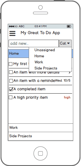
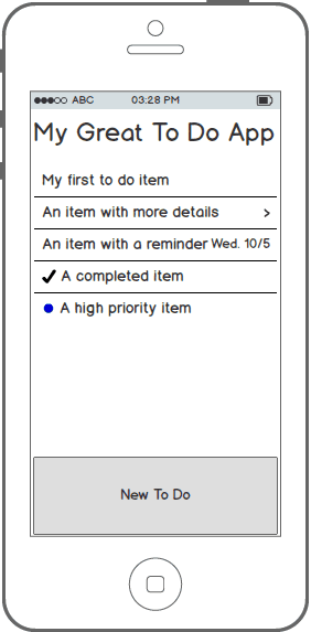
A good way to demonstrate what this phase looks like is to show an example. Here is a series of wireframes that I created in about 25 minutes using Balsamiq Mockups (sped up 4x). I gave myself the challenge to design a to-do list app for a mobile device (quite original, I know).
https://www.youtube.com/watch?v=TB8N9MX8iVs
Caveat: I did no preparation beforehand (not recommended) and don’t consider it “finished” even by ideation phase standards, but it should give an idea of the process I follow.
Here are a few screenshots from the video:
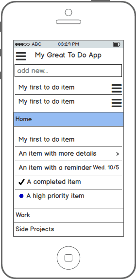
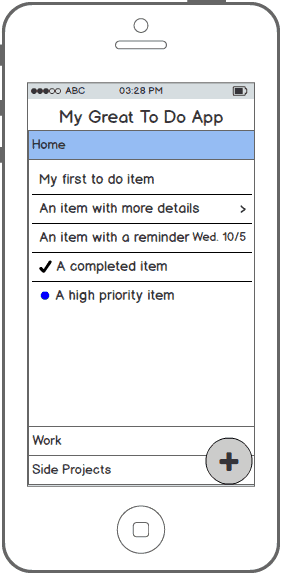
The last design, taking parts from all the previous ideas.
Tips for the ideation phase
- Don’t refine or dive too deep too quickly. Get messy. Add, add, add. Subtract later.
- Don’t judge your ideas before putting them on the page. Create first, reflect later.
- Learn to think separately about structure, layout, content, and functionality (see “How to Create Wireframes That Wow” for more info)
- Practice working with different levels of detail until you find “just the right amount of detail, and no more.”
Read more practical tips for “UX sketching” that also apply to wireframing.
The validation phase
The second problem, determining whether your proposed solution will be successful, resides in the validation phase of the wireframing process.
The ideation phase includes a small-scale, internal validation phase, where you, the designer, attempt to validate your solutions on your own. But, whatever your role, you are lacking at least some information and knowledge required to build the best solution. You may be missing essential information about your customer, or the limitations of the technology, or some market segment data. In any case, to refine and optimise your solution, you need involvement from other stakeholders.
Showing your wireframes allows others to help validate and improve your ideas.
The validation phase shouldn’t be thought of as the place to get “sign off” or approval to start building right away. If you’ve done it right, your wireframes should invite conversation. If they look too polished and “final” you may not get very helpful feedback. Wireframes should communicate “here’s what I’m thinking…” when you show them, not “this is what we’re going to build.”
Assume that the people who you are showing your wireframes to have knowledge that can help you make them better. Your job is to get it out of them.
You don’t need to show all your ideas during the validation phase. Here’s where you can narrow down and focus on the better ones. That said, it’s perfectly acceptable to show variations on an idea or even different directions completely. This reinforces the point that wireframes are a conversation starter, not a finished product. You may want to keep a few alternate ideas in your back pocket anyway in case your preferred ones don’t go over well.
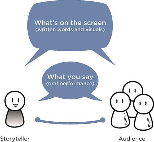
In this phase, it’s important to think of your wireframes as communication artifacts. Their job is to help other people understand your ideas. Visuals are very effective for conveying ideas, which is the true power of wireframes.
Tips for the validation phase
- Show a variety of ideas. This helps move the conversation forward (e.g., “I like A more than B”) and also proves that you put thought into them.
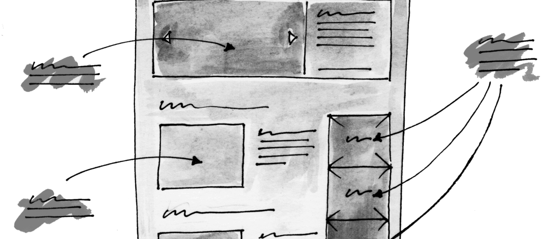
- Prepare your wireframes for viewing. Take some time to clean them up a bit. Examples: Link them together to help tell the story; Use a more professional “skin” (depending on the audience).
- Use a presentation mode (or similar) to show only the wireframes without the editor around them.
- Don’t let the wireframe do all the talking. Supplement missing details with your own words rather than trying to let the wireframe tell the whole story.
- Add annotations as needed for later viewing and sharing (which can be turned off for presenting in some programs).
You can find more suggestions in “Tips for Presenting Your Wireframes.”
Learning from the process
At the beginning of this article, I said that wireframing was a skill that could be improved over time. There are two ways to do this that go hand-in-hand.
The first is practice. The more you do it, the better you’ll get. Practice helps you reduce your ineffective effort and increase your fruitful work.
The second and most important way to improve in both phases is to consciously integrate comments from the validation phase and feed it back into your ideation phase next time. You’ll learn a lot about how to make your ideas clearer by showing them to others and getting their feedback, and you should put it to good use.
As you practice, try to apply the same loop of iterating and improving your design ideas to your wireframing process as a whole. Just as your design will improve by going through these phases, your wireframing skills will too! Keep the circle of feedback and refinement going.
What’s the best advice you’ve heard for creating wireframes? Let us know in the comments!



I am starting my journey to Wireframing and Prototyping and this was really helpful. Thank you :)
Best explanations ever! Well done sir!
Amazingly helpful… written a complicated points in a very simple manner to undersrand…. thanks heaps!
Never think that your first wireframe is the last one. It will be very bed UX. If you are going to finalize your first wireframe it means you have already an image in your mind, it can be a big failure beacuse here you have no new ideation, no mistakes, no creativity. Wireframe means do mistakes again and again at very first stage so that we dont want face this problems in the design or development phase.
Thx for the new information that I didn’t know about wireframing.