We have a lot of discussions about UX portfolios in the UX Mastery community.
They range from debates over whether or not portfolios are important, to requests for feedback on portfolios-in-progress, and most frequently – how to find appropriate projects when you’re yet to get a job.
The general consensus is that a portfolio does help in the quest for that elusive first (and even second or third) job, but it’s important to remember that the purpose of the document isn’t to demonstrate your amazing visual design skills – the UX portfolio is all about documenting your process.
Building a portfolio can be daunting if you’re relatively new on the UX scene, so a while back I went hunting for examples that I think are inspiring for one reason or another. Some of those sites are now gone, so I’ve recently been on a new hunt – here are some updated examples that I love.
Every one of these UX portfolios does something very well, and it’s definitely an inspiring collection.
Here they are, in no particular order. Enjoy.
1. Bret Victor
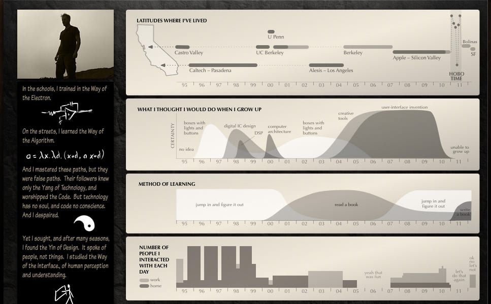
This is a truly beautiful piece of the internet. Bret is a storyteller and a self-professed “purveyor of impossible dreams” and those traits are communicated perfectly through his portfolio. The site feels like a game, full of little gems of enjoyable reading, but most importantly, he communicates his design process in a comprehensive and easy to follow way.
2. Simon Pan
I love the simplicity of the design of this site, but more importantly look at these case studies! Simon’s portfolio takes the most comprehensively catalogued case studies award, hands down. Add to that some beautiful imagery and he’s onto a winning formula. I read this portfolio from end to end, just for pure enjoyment. It’s no wonder he’s been snapped up by Uber.
3. Frances Tung
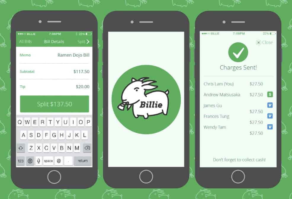
Frances’ fun, magazine/blog style approach to her portfolio adds delight to the experience, but it’s the way she crafts her case-studies as stories that had me hooked. Her processes are laid out clearly and are well supported by imagery, and she injects just the right amount of personality into the portfolio.
4. Justin Edmund
Justin’s portfolio is clean and unassuming. It isn’t flashy because it’s all about showcasing his work. Case studies are carefully mapped out from inception, through philosophy and research, to execution. The process that Justin follows is described in depth and is backed up with great examples of imagery, giving a clear insight into the way he works.
5. Yitong Zhang
What makes Yitong’s portfolio unique is the way he tells a story. From his personal journey to his work, the communication is structured and easy to follow. When it comes to documenting his projects, I particularly like the way he progresses in a linear fashion from the initial challenge, through his process, culminating finally in learnings.
6. Anthony Anderson
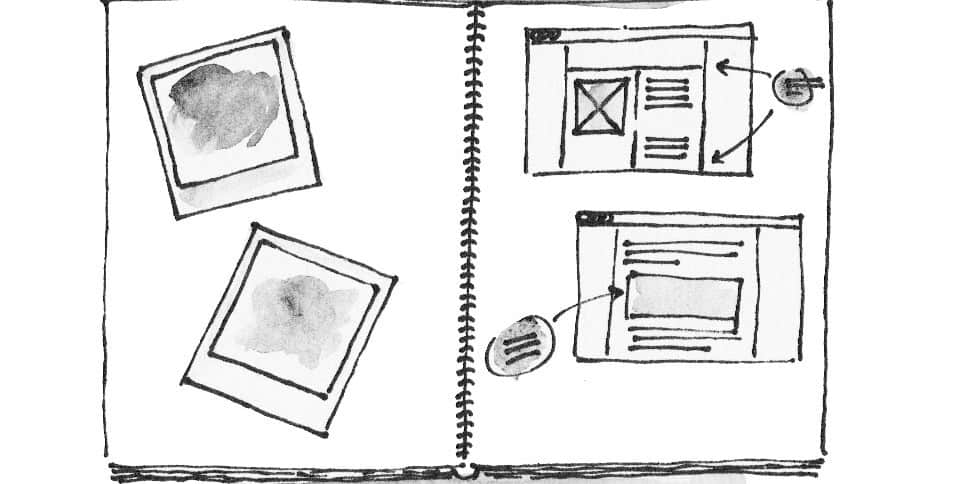
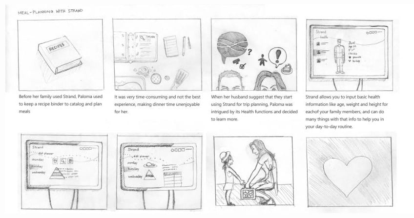
Another example of an interesting portfolio, and this is how you document a UX process. Anthony’s site is a little confusing and hard to navigate at times, but once you get down to the documentation of his case studies, it’s pure gold. I particularly love the cute way the processes are annotated.
7. John Ellison
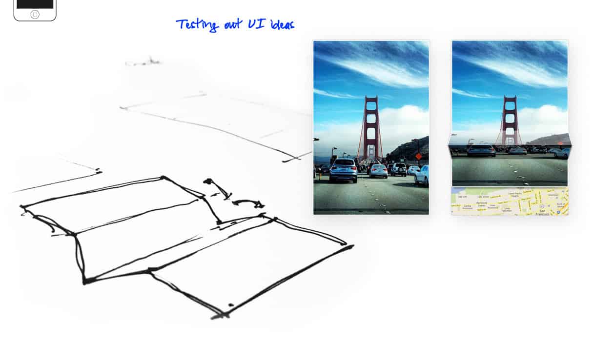
John does a fantastic job of clearly documenting the problems, the processes and the outcomes in his portfolio. Quantifying specific outcomes adds weight and value to the projects, and the detail that he goes into with each case study is epic. When I wrote this article the first time I felt that the only thing lacking was some sketches, which have now been added.
8. Gregor Kalfas
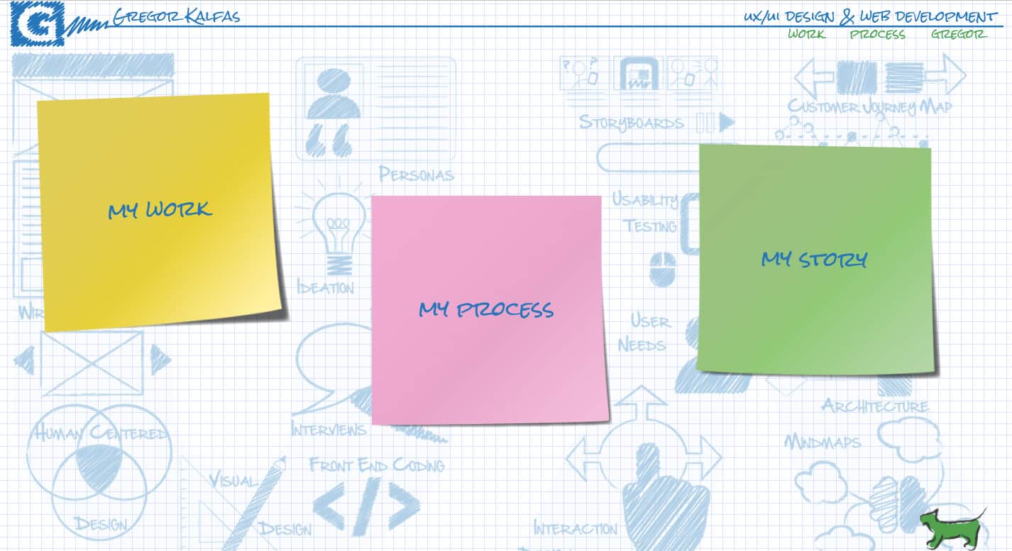
This particular example is close to my heart because Gregor is a member of our UX Mastery community and his portfolio came to my attention when he asked for a review. It’s fair to say, there isn’t much to criticise! Exploring this site is like spending time at a fun park – it’s absolutely delightful.
9. Christina Richardson
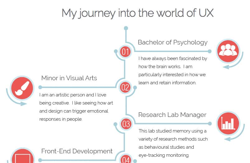
Christina’s portfolio is another that I came across by way of a community review request. I was immediately endeared by the way she tells her personal story just as one would document a design process. It’s the little things that make it stand out from the crowd.
So there you go. I hope this has left you feeling inspired.
If you’re struggling to find appropriate projects to include in your portfolio, or you need some tips about making yours stand out from the crowd, join our upcoming session on creating persuasive portfolios.



Wow- They are inspiring! I’ve been looking for something like this for a while! Thanks for posting Hawk! :)
No problem Ashlea, I enjoyed doing the research.
Thanks for this Hawk! I agree with Ash, I’ve been looking for something like this too. It’s definitely nice to have an overview of things that work and can be improved upon, and having different examples in the same location.
I found this very helpful :). Specially seeing the variety, and uniqueness to each person’s personality!
I was amazed with all the different styles. Getting personality in there is the key, because I imagine an employer going through the process of looking at a pile of portfolios needs something that sticks in the mind.
Really nice roundup. I love seeing people’s workflows and wireframes. Thank you for putting this together!
No problem Jennifer, I hope you found something inspirational in there.
Hey Sarah
Thanks for including me on this list! A great article, always nice to hear that people appreciate the effort involved and the actual process.
More updates coming soon…
You’re welcome. Excellent, I’d love to see your process for other projects.
Check out my quick update – http://an.thony.co.uk/google.html
A sneak peek into the world of a Google Design test. From awhile back but still worth a look.
Thank you for the research and post. It is indeed inspiring and so is your transformation from code{r} to current profession. I would like to read about your personal experiences in this transformation in upcoming blog posts.
Cheers.
Hey Miral,
You’re welcome. Thanks for your comment.
If you’re interested in my journey (and others) we chat about that sort of thing a lot on our forums. Are you a member? http://community.uxmastery.com/
These were dauntingly good! I’m going to have to work REALLY hard and long to match them…however, I do wish people would get their portfolios proofread. Too many grammatical and spelling errors for this ex-editor!
Inspiring.. found a interesting link.
uxbrain.com
Here’s how I resolved describing myself in portfolio: http://www.podorsky.cz
Look at this one http://www.uxconsult.com any feedback would be great.
Hey Nicolas,
Great job. I love the level of detail that you go into, esp in describing your process.
these are by far the most useless and outdated portfolios that I have seen
If there are others that you think are less useless and outdated, then by all means let us know and we’ll take a look.
Hi Hawk,
Thanks for the review! I agree that Anthony Anderson did a great job outlining his UX process here: http://an.thony.co.uk/process.html. My only concern is that the page is one big image. This means that the page is not responsive. Do you think that is a problem for a portfolio? I’m not sure if that is something I should be worried about for my own. Thanks!
Hi Christina,
In the case of a portfolio, I don’t think it’s a huge deal. Most employers aren’t likely to be doing portfolio research on their phones (although that is a personal opinion and not based on fact). If it’s possible to avoid I would, but I don’t think it’s worth stressing over too much.
When you’re done with your portfolio, if you’d like some feedback, join us at community.uxmastery.com – we frequently help people out with reviews. :)
Hello, Thanks for posting.
A few sites are down now, so I wanted to offer that up for iteration :)
Great inspiration on the ones that are up!
Thanks Doug – it’s been a while since I came back to this one so I appreciate the nudge. :)
Hi Sarah, thank you so much for featuring my portfolio! My friend found it here and it was a pleasant surprise to see my work amongst some fantastic portfolios from other designers! :)
You’re welcome Frances. Love your work. :)
Hi Sarah
I don’t want to spoil the party, but while these portfolios are nice looking and you do allude to the need to narrate, in some way, what you did in a job, the focus seems to be on the attractiveness of the portfolio rather than its substance. As an employer, I may be beguiled by such a beautiful thing or I might ask: ‘great, but can you deal with difficult management, where is the evidence of extensive research, did you encounter significant problems in the project and how did you overcome them? As an employer, I can see this person can produce UX artefacts, but can they produce the goods? Maybe employers are still in awe of UX despite, as I’ve found, they are still not always sure what it actually does.
Portfolios remain important throughout your UX working life, by-the-way. I’ve been doing UX for twelve years and a friend in the US twenty years. Both of us have portfolios. The issue vexing me right now is how to sell the story of experience, about doing difficult research and conveying these achievements. UX is rapidly off-loading ‘lean’ as a mantra it seems as yet more UX artefacts, sometimes of dubious value, are added to the pot. Yet the most successful contract I did involved a team of just six people doing rapid (but extensive) research, conceptual design and testing without doing embellished UX. A final thought: UX should be considered the meeting of the analytical and design. Research is analysed and from which comes tested conceptual designs. This may be heretical, but as UX spins faster and faster and more ‘UX things’ are invented so the suspicion grows that it is self-inflating and reducing it’s ROI – a big selling point of UX. UX should strive to remain as simple as possible.
I completely agree with you. I’m just starting out as a UX/UI designer and I will definitely be taking inspiration from the beautiful portfolios Sarah has so kindly shared with us. However, I will make sure to address the issues you’ve brought up. Designers should absulutely be able to provide eveidence of their research and clearly explain the thought process behind every problem-solving decision undertaken. Great insight, Stuart!
Check this one: http://maciejkarpinski.com/
These portfolios are truly splendid! I would also recommend looking at works of these agencies, really inspiring:
http://turumburum.com/cases
https://area17.com/work
http://hellomonday.com/projects
Wow, I love all of these portfolios but Frances Tung’s is definitely my favorite!