


The sketchnotes I created for the recent UX Australia and Swipe conferences have generated a lot of interest, and I’ve received a number of questions via email and Twitter about how I go about creating them. While it isn’t strictly related to UX Design, Jared Spool counts sketching as one of 5 indispensable skills that user experience designers should focus on, so it’s certainly a skill you should consider developing.
With this in mind, I thought I’d break down the approach I take, and list some tips for others interested in getting started with sketchnoting.
Want to Take your Sketchnoting to the Next Level?
Why not sign up for a UX Mastery workshop? There are two coming up in July/August:
What is Sketchnoting?
The term sketchnoting describes the style of visual note-taking that has become popular at tech conferences in the past few years. Mike Rohde has been the most vocal champion (he has a book coming out on the topic soon), and Eva-Lotta Lamm has been a prolific creator of the art form of late (she’s published a couple of books as well!).
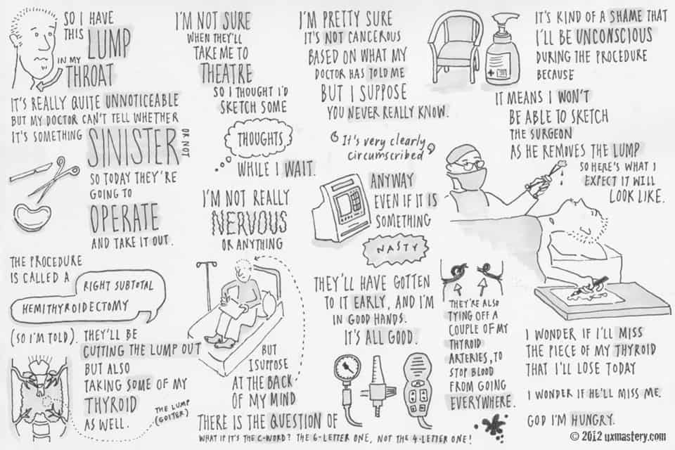
While sketchnoting is usually practiced by attendees at conferences, it can be fun to create them in other situations, too. For example, I recently had a short stint in hospital, and captured my thoughts about surgery as a sketchnote before going into theatre:
Regardless of the circumstance, the skills for creating a sketchnote can be broken down into four basic categories:
- planning
- listening
- processing, and
- drawing.
In this article, I’ll list 20 tips for how to hone your skills in each of these categories.
Planning
For the most part, I don’t really do any preparation before starting a sketchnote. However, there are a few tasks you can do in advance so that you’re best equipped on the day:
1. Tool Up
While it’s not essential to use an expensive art pen and a trendy moleskine notebook to create beautiful sketchnotes, you don’t want to start off on the back foot. Spend a few bucks on the minimum amount of stationery that gives you the best chance at creating something you’re proud of, but doesn’t weigh you down. I recommend:
- A blank notebook large enough so that you won’t feel restricted by space (I use a Derwent A4 Visual Art Diary, with 110 GSM pages)
- A reasonable quality black felt tip pen that you’re confident won’t run out on you half way through (psst: buy a second while you’re at it, in case it does!). You may want to experiment with different tip diameters—I usually use a 0.5 Mitsubishi Uni Pin.

- This last point is a controversial inclusion, but I’d suggest also buying yourself some correction fluid. Purists might suggest that tarnishing your page with liquid paper defeats the purpose, and mistakes are part of the learning process. That’s all well and good, but if you make a minor mistake, I think it’s totally fair game to white it out before presenting it to the world. It’s not ideal, and I avoid it when possible, but a small blob of correction fluid will always look better than an ugly crossed-out mistake, in my opinion.

Note: I have tried a few times to sketchnote using my iPad and the tablet pen that I use with it. There are a couple of great sketching apps for that device like excel flowcharts. (We use Wacom’s Bamboo Paper app for many of the feature images on this site), but none of them give me the flexibility and ability to see the big picture that I need when sketchnoting. Also, correction fluid can damage the screen!
2. Practice On A Recording
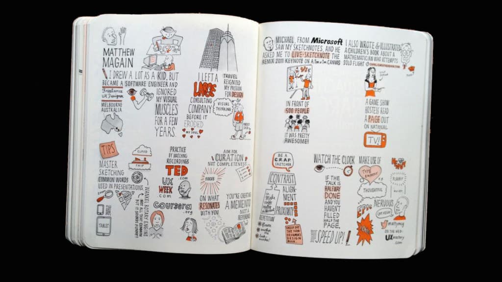
Perhaps this is obvious, but if there’s a conference coming up and you’re thinking about sketchnoting some of the sessions, why not get some practice in beforehand? We live in an amazing age, where presentations on sites like Coursera and TED.com are available online for free. Instead of watching yet another Big Bang Theory, plug your laptop into the big screen TV, load up some inspiring presentations, and get sketching!
3. Master Sketching Common Objects
It’s useful to have a cache of objects in your repertoire, ready to pull out as needed. In particular, if you attend tech conferences, there are certain words that will crop up time and again (think “ship”, “cloud”, “user”, “link”). Practice visual representations of these words in advance, so you don’t get flustered trying to draw them for the first time in the middle of a talk. Here are some suggestions:
- Basic shapes: stars, squares, rectangles, triangles, circles,
- Basic objects: ship, home, fish, user, cloud, link, hand, mouse, book, newspaper, magazine, tree, envelope, brick, brain, magnifying glass, pencil, paper, scissors, knife, fork, spoon, iPhone, iPad, desktop, laptop, web browser, cursor
- Basic maps: a screenshot of Google Maps, a quick world map
- Famous brands & logos: Apple, Google, Microsoft, Yahoo, IBM…

Google Images is a great resource for finding inspiration to model your sketches on.
4. Give Yourself A Headstart
For most of the presentations I attend, I like to begin the sketchnote with a caricature of the speaker, as well as the name of the talk, the name of the presenter, and possibly the organisation that he or she represents. You don’t need to follow this format (capturing the likeness of someone’s face is something I still find very difficult to do!). However, if you do, there’s no need to wait for the talk to begin to sketch this information—that stuff is always in the conference schedule, along with a photo of the presenter that you could use as your base for your caricature!)
So while other people are changing rooms and the presenter is being introduced, I like to make a start on my sketch, so that I’m not playing catch-up with meta-data once the presentation has begun.

Listening
Here are a few tips for capturing key points from the talk.
5. Choose Your Seat Carefully
Most people attending a conference presentation don’t really care where they sit—as long as they’re able to see the projector and the presenter’s face. They may be influenced by where their friends are sitting, or may position themselves at the back in case they decide to bail on the talk halfway through.
This means that, for the most part, you should have almost free range to choose a strategic vantage point to obtain the best sketchnote. More often than not, this means sitting in the front row, so you have no visual obstacles. However that’s not always the case—at a recent conference I attended, there were a few round tables at the back. Being able to rest my notebook on a table, rather than on my lap, meant I had a much steadier hand. I think my sketches are better as a result.
6. Look For Easy Wins
I find the easiest presentations to capture in sketchnote form are ones that have very visual slides—graphics, charts, and pictures of LOLcats are all memorable and fairly obvious material to capture on your page. Sure, you can always add ideas of your own, but there’s generally less thought required—the presenter has done a lot of the work in translating words to pictures for you, so make the most of that!
It can be difficult to capture an entire chart on paper—especially if the presenter doesn’t leave the slide up for long enough—so be sure to jot down the axes and key points quickly. Then if the slide disappears, you’ll have already captured the essence of the chart and can round it out later.
7. Latch Onto Quotes
Quotes—whether they be key phrases you hear the presenter say, or quotes by other people that the presenter uses in his talk—are often poignant summaries of a topic, and you should listen carefully for them. When you hear one that resonates or beautifully summarises the point being made, jot it down and wrap it in some fancy talking marks or a speech balloon.

Processing
It takes some practice to be able to truly listen to someone talk while thinking about another topic at the same time. Some might suggest this multi-tasking skill is unique to women, but I know for a fact that there are men who are able to listen to their girlfriend or wife talk while simultaneously choosing which footy team to bet on in the coming weekend, so this is not a skill that is limited to one gender.
Jokes aside, listening and thinking in parallel is something many of us do all the time, and you can tap into this skill while sketchnoting. Here are some tips:
8. Take Advantage Of Down Time
Most talks will have intense moments where the audience’s attention is completely focussed, followed by slower sections in between. This light and shade is the mark of a good presentation, but it’s also a boon for you, as it can provide you with some sketching time.
If you hear something amazing during an intense moment, and don’t want to turn away, don’t! (or jot down the one phrase that summarises the moment). Then, when the moment has passed, you can tune out a little and start to embellish those words (using fancy typography, an accompanying graphic, or additional comments).
9. Pace Yourself
A lot of people are stunned at how I’m able to judge the amount of space it takes to capture the essence of a presentation on a page. I have a secret weapon here—it’s called maths. Yes, I’ll keep an eye on the clock, and if I haven’t filled over half the page by the time that the presentation is halfway complete, then I’ll start getting busy: writing larger, sketching images that might have been playing around in my head, and sifting through what I’ve heard to distil whether any of it is worth writing down or capturing visually using an icon or image that might suit. Likewise, if I’ve burned through page real estate too quickly, I’ll slow down and be more discerning about which snippets of the remaining talk will fill out the remaining space on the page.
10. Curate
It can be tempting to try and capture everything about the presentation. Instead, think of yourself as an art curator whose job it is to sort through the noise, and select a few standout masterpieces to include in your exhibition. Your sketchnote should not serve as a comprehensive reference—it’s a moment in time that reflects the takeaways that you found important.
11. Let It Flow
Don’t confine yourself to a four-column layout, or always move in a strictly left-right fashion. The page is your canvas, and while there’s nothing wrong with creating a very logical, sequential layout, you might try mixing it up on occasion—start in the centre of the page, or move around organically; write sideways, upside down, or in a loop-the-loop when you feel like it. Don’t fret about whether it will look any good, just let the sketch flow.
Additionally, if the presenter hits a technical hurdle, makes an unintended joke, becomes flustered by a heckler, or is interrupted by a security alarm, weave that into your sketch as well! Sometimes the best aspects of a sketchnote are the fortuitous, unplanned activities that accompany the official slide set.
Drawing
Ultimately, the words and pictures you form on the page is what makes your sketchnote. Here are some tips for making them look awesome.
12. Be A C.R.A.P. Sketcher
In The Non-Designer’s Design Book, Robin Williams introduces the concept of C.R.A.P. design. Of course, she’s not suggesting you should arrange your elements on the page in a way that looks terrible, but that you make use of:
- Contrast: This could involve using light and dark colours, combining a straight, rigid typeface with a cursive script, or applying heavy and light shapes.
- Repetition: Litter the same visual cues throughout the design, such as drop caps, bullets, or some little cartoon frog that appears regularly
- Alignment: Line things up on purpose, rather than having them almost match. It looks smarter and makes text easier to read.
- Proximity: Group related objects or concepts on the page. If two concepts are completely unrelated, draw them on opposite ends of the canvas.
These four principles will get you a long way to creating a sketchnote that is pleasing to look out, rather than one that looks like a collection of random scrawls.
13. Use Consistent Type
When I say “type”, I really just mean “make your handwriting neat and the same.” This may be counter intuitive if you have messy handwriting, but the best tip I can give is to slow down when you construct each word. Be patient about crafting each of the letter forms one by one, rather than your usual scrawl. Most conference presentations are 50 minutes long—that’s a lot of time to fill an A4 or letter-sized page, so you don’t need to hurry.

I’ve begun utilising a very tall, narrow typeface lately, mostly because I like the look of it, but also because it allows me to fit more words on one line. It also contrasts well with fancier, more decorative typefaces that I might want to use for contrast, such as a cursive script or a heavy, blocky heading.
14. Employ Type Empathy
Type empathy is a term I first heard back in design school. It occurs when the meaning of a word is accurately reflected by its typeface. Here are some examples:

I’m sure you can think of other examples. It can be really fun to invent empathic typefaces on the fly! If you hear a word that prompts a specific image in your head, see if you can work that image into the type somehow. If that sounds too hard, you could always just keep an eye out for one of the above words (or a synonym) and just copy what I’ve done here!
15. Draw Beautiful Ampersands
The ampersand is a much-loved character by graphic designers. Depending on the typeface, it can be a simple, understated connector or an elaborate, eccentric statement all of its own. Here are a few different types of ampersands for you to practice with. Being able to whip one of these out instead of your usual handwriting can really make a heading stand out.

16. Use Creative Containers
Speech bubbles, thought clouds, sound effect containers, dotted-line rules, double-border rectangles: there are a ton of simple containers that you can add to your sketch to chunk text in a way that is visually interesting. Here are a few of my favourites:

17. Use Creative Connectors
While containers are useful for isolating chunks of text, connectors are used to group those chunks together. Arrows are the most common connectors that I use in my sketchnotes, but there’s no reason you couldn’t include a range of swirly flourishes and other intricate shapes throughout your sketch. In fact, it might be a good idea to keep a separate “doodle” page, where you can experiment and invent new shapes to be brought across into future sketchnotes.

18. Apply Shading & Colour
That Copic grey marker I mentioned at the start of this list is how I add depth to my black and white sketches. You can use it to:
- create shading on one side of an object
- add a shadow on the ground below an object
- highlight text
- colour in containers, for visual contrast
- the list goes on…
Some sketchnoters also like to include a single colour, to highlight text, draw attention to parts of a sketch or make key concepts lift from the page. The key to colour is not overdoing it—when in doubt, I’d suggest keeping it black and white.

Here’s another dirty secret of mine: the sketchnotes I created at a recent conference all had the grey marker effects applied on the plane home from the conference. I don’t subscribe to any kind of purist mentality that “the sketch must be completed during the presentation” . It only took a few minutes to add grey shades to those sketches, and I think the extra depth that it brings to the sketch is terrific.
19. Find Your Own Style
I’ve given some template approaches in this post which I hope will give you a good framework to build upon, but over time your sketchnotes will develop their own unique personality. Be proud of your sketches, refer to them regularly, and you’ll see an original style evolve.
20. Share Your Work
In general, people love seeing how other people think, and a sketchnote is a good approximation of how you have processed a presentation. Be sure to share your sketch online, either via a blog, a service like Flickr, or by emailing your masterpieces to the Sketchnote Army blog. You’ll find most people will be supportive of your efforts, and you’ll gain confidence from any feedback you receive.
In addition, a sketchnote (either a digital copy or the original piece of paper) is always a wonderful, unique way of thanking a presenter for the time they have put into their presentation.
I hope you’ve found these tips useful, and I look forward to seeing your creations online! Be sure to check out Mike Rohde’s book, The Sketchnote Handbook, which features a two-page spread by yours truly!
If you liked this post, feel free to share it on Twitter or Facebook.