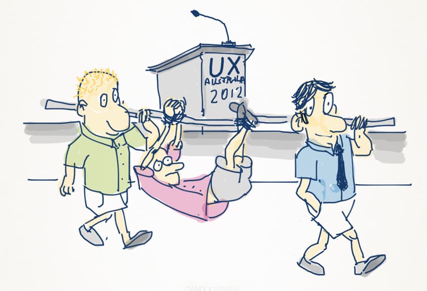
Luke & Matt travelled up to sunny Brisbane, Australia at the end of August to attend UX Australia 2012, a 4-day event covering core user experience design topics such as digital strategy, user-centred design, interaction design, mobile design, cross-channel design, service design and content. With over 400 attendees, 25 speakers and 18 ten-minute talks, there were a lot of juicy topics to get our brains into.
There was no official theme, but this year did have a few threads related to ‘being human’. A fairly general drift, but important given the focus of UX on real users and how we interact with technology with potentially large consequences.
We didn’t get to all of the talks as there were multiple tracks, but here are 20 of the thought-seeds that have stayed with us for the last two weeks:
-
Meeting people in person always trumps online
One of the biggest buzzes we get is from seeing the people we’re in phone or email contact with during the year. There are a lot of people working on interesting projects, having stimulating ideas or simply being inspiring people, and UX Australia is a great opportunity to catch up with people to compare notes and make new friends. -
Design is a serious responsibility
It translates values into tangible experiences. Our designs can communicate, form communities, shift power and create opportunities. “If the work we do makes a particular alternate future more likely, that means directly affecting other folks choices. We have made a choice about what others ‘ought’ to do”. Now that Bill Derouchey has benevolently decreed that we’ll all live to 90, we’d better use compassion and curiosity to make a difference by tackling the Big Problems rather than simply filling in time and making money.
(Lightbulb moment thanks to: Timothy Horton, Stephen Cox, Tref Gare, Bill Derouchey, Joe Lamantia and many others) -
Asking ‘why?’ is one of our most powerful tools
While the pace of technology makes it hard to predict some things, we can still ask ‘why?’ questions to get meaningful answers. This brings our focus back to the people and contexts we’re designing for. ‘Why’ is tied to ‘who’ and thus to our belief systems, so asking ‘why?’ can make people uneasy and defensive. However, in the words of the Dalai Lama, “If you can approach others with the thought of compassion, they will reduce their fear and allow openness with other people.”
(Lightbulb moment thanks to: Bill Derouchey) -
Remember that technology isn’t always the answer
And it can’t solve all our problems. One example of an idea-driven solution that has outlasted technologically-driven ones is the Plimsoll line, the painted circle with a line through it that persists on ships today. It was technologically simple to implement, but a revolutionary change that had sweeping implications for saving sailors lives, on business and shipping insurance.
(Lightbulb thanks to Tristan Cooke) -
How you play with the people you play with will make or break the things that you make
When tooling around with technology there is a danger of losing sight of the warmware (humans). The ‘bubbles’ we live in restrict us from dealing with the world at a profound level, so to overcome this we can unplug, do things by hand, talk, step out of our comfort zone – the soft skills essential for engaging our clients, relating with users, or motivating our teams. And remember those nipples! They are the eyes of your body (“look” at the other person, don’t slump). =)
(Thanks to Tref Gare for one of the most enaging and low tech presentations this year.) -
Don’t forget to talk to the people your users talk to
Just as ex-customers will have some painful lessons for us to learn, the influencers and gatekeepers of the people we’re designing for can help us identify what people value that we don’t provide, and thus also play an important role in identifying and building the solution.
(Lightbulb moment thanks to Steve Baty) -
Digital natives don’t need skeuomorphism like early adopters did.
Microsoft is working on a new design language for developers codenamed ‘Metro’, where the content IS the interface, information is beautiful, brands are a conversation and animation is a first-class design citizen. It’s more than just a visual style, it is authentically digital because it doesn’t have to refer to other forms for value and meaning to be imparted.
(Lightbulb moment thanks to Shane Morris) -
UX is moving in-da-house
There is a general trend for organisations to welcome UX as an in-house process rather than engaging an external agency. This suggests a growing awareness of UX generally, but also that user needs are being considered as a core input by businesses and their products and that they’re either dedicating a person to oversee this across the organisation, or encouraging their teams to take on user-centred design principles during their workflow by hiring people with these skills.
(Thanks to Donna Spencer) -
Designing accessibile products is more important than you might think
Ruth Ellison, Lisa Herrod and others have been evangelising universal design for years, and are teaching us that the distinction between having or not having a disability is not binary – we’re all on the spectrum somewhere. An estimated population breakdown:- 16% have dyslexia (that’s 3.6 million Australians)
- 1 in 45 has an Aquired Brain Injury
- 46% have poor or very poor literacy skills in one or more areas
- 15.2% are from a non-English speaking background
- 18.5% have some form of physical disability
- 8% men and 0.4% of women have a form of colour blindness
- the percentage of over 65-year-olds is increasing.
(Thanks for the encouragement from Ruth Ellison, Kim Chatterjee and Lisa Herrod)
-
Learning from Architecture and Industrial Design
The ‘Iron Chef’ of Ideation, Design Studio methodology can quickly produce wireframes while getting buy-in from the team and stakeholders through quick iterations of ‘Generate’, ‘Present’ and ‘Refine’.
(Cheers to Daniel Naumann for the overview) -
Physical space has a influence on your design work
Design walls are a way of opening conversations and increasing design transparency, whereas ‘Lockdowns’ (putting people in a room with limited time and asking them to ‘get things done’) can be used to focus a team’s energy, and often becomes a ‘grunt pit of hammering out work’, but may also be seen by those outside the room as ‘an Ivory Tower of design direction’. The secret is to use lockdowns when an idea needs articulation, and not to be too precious about allowing other team members to suggest changes once the lockdown is over.
(Cheers to Judd Garratt & Jurgen Spangi for sharing their experiences.) -
The latest mobile stats
- 57% of Australians have smartphones
- 15% of Australian households have tablets
- 30.5% of mobile OSs are iOS
- 56.9% are Android-based.
(Thanks Frankie Madden!)
-
Being bored can be good for you
Those of us with access to screens and connectivity rarely switch off, log off or spend down-time anymore. However, being bored is a moment of time where our brains can reset and allow for new and innovative ideas to flow through. Boredom, it turns out, is an endlessly fascinating subject … and good for us!
(Thanks to Stephen Cox) -
We can only describe concepts we have language for
Language shapes and even determines what we think. A study comparing children from northern Namibia with young English children suggests that colour words in a given language and culture shape human perception of colour – essentially that we can only see colours that we have words to describe. This in turn supports the idea that our observations are not pure, they are shaped by our concepts. It turns out colour words are more than a clever way to sell crayons.
(Stephen Cox packed such a lot into his talk!) -
There is a language for design discovery
Discovery is an interaction, something seen, found, learned or solved. Insight is a valuable change in perspective or understanding that enables or guides further action. In this coming Age of Insight, ‘discovery’ is not only the purview of specialised Data Scientists who create exotic visualisations of massive data sets, it is a fundamental category of human activity that is essential to everyday interactions between people, resources, and environments.
(Thanks to Joe Lamantia for laying out such a comprehensive concept.) -
‘Attitude Adjuster’ cards are fun conversation starters
These cards can help you “Advocate for Adjustment of Accessibility Attitudes in Apathetic Anthropods”. They help to provide insight into reasoning and attitudes behind people’s thinking when you’re trying to encourage accessibility as part of an organisation’s culture. There are 7 Attitude cards and 21 Attitude Adjusters cards, which are strategies that could work to combat or to support specific Attitudes to bring about culture change. They can be downloaded for free to print or use yourself, or you can buy a pack from Stamford Interactive.
(Kudos to Stamford Interactive) -
The biggest competitors for consultants are their clients
In our work, the biggest contest is played between consultants and their clients, rather than a third-party. As an external party being invited in, we’re complementing in-house teams that may be demotivated or dysfunctional. Sharing can be tricky and there are high pressures and often large stakes. These ‘weaknesses’ can be corrected by building trust and using the outside perspective to re-frame problems and articulate a solution, and by taking things a step at a time.
(Lightbulb moment thanks to Walt Buchan) -
The ability to take data and visualize it will be an important skill in the future
To be able to understand it, to process it, to extract value from it, to visualize it, to communicate it—that’s going to be a hugely important skill in the next decades, not only at the professional level but even at the educational level for primary students, for high school kids, for university graduates. Instead of what/where/when, we should ask what the user is doing while they are discovering. This enables us to generate a more accurate understanding of needs.
(Lightbulb moment thanks to: Joe Lamantia) -
Be extreme, be bold, think big
By definition innovation is a rebellion or an insurrection. It can be incremental or disruptive. Our aim should be to solve the problem by grabbing an opportunity without limiting ourselves artifically. Whether it be Nike encouraging running groups to help people get out of bed or HyperCubus asking what camping would be like if you could take a hotel room with you. Decision-making without design will tend only to be short term, so the best way to predict the future is to design it.
(Thanks to Steve Baty and Tim Horton) -
Next time?
The next UX Australia conference will be in Melbourne at the end of August, 2013. Check http://www.uxaustralia.com.au/ or subscribe to their fortnightly newsletter.
A big thanks to Donna, Steve and Danielle for organizing an event that ran so smoothly and provided such a lot of value. We’ll be there next year with bells on, but in the meantime you can:
- View Matt’s fantastic sketchnotes: http://uxmastery.com/sketchnotes-from-ux-australia-2012/
- Read the talk summaries themselves (some with slides already up): http://www.uxaustralia.com.au/uxaustralia-2012/program/main-conference
- Read Ruth Ellison’s reflections: http://www.ruthellison.com/2012/09/ux-australia-2012-reflections/ (Ruth’s server has been having some problems lately)
- Gary Barber’s sketchnotes: http://www.flickr.com/photos/cannedtuna/sets/72157631417112010/with/7940905436/
We didn’t make it to all of the sessions, and certainly weren’t privy to all the conversations in between them. Were you there? What did you see and hear that made an impact for you at the conference?

