


A few times a year my family and I make an interstate trip to visit my parents.
One of the activities in which I take much delight during these visits (aside from my mother’s cooking and seeing my parents dote on their grandchildren) is rifling through the old boxes that I never got around to taking with me when I first moved out of home years ago.
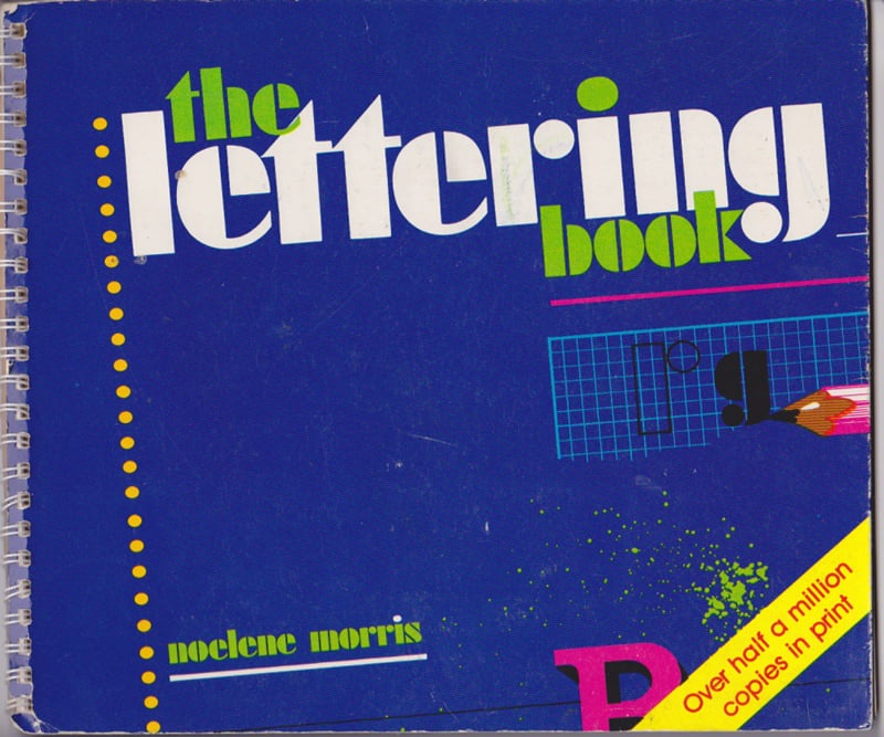
It was during one of these recent trips that I stumbled upon a gem of a book from my childhood: The Lettering Book, by Noelene Morris.
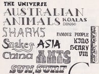
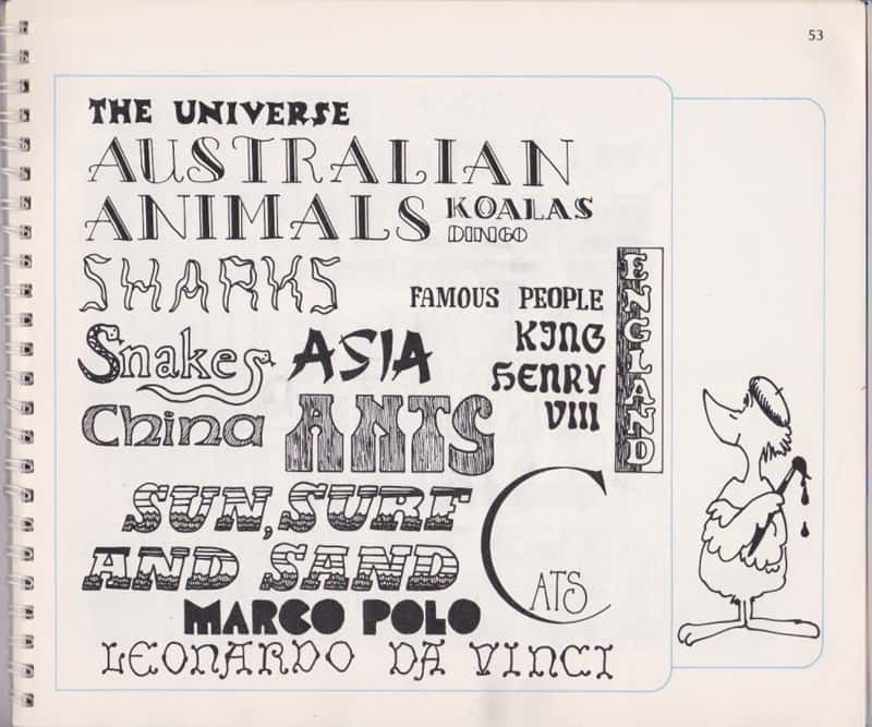
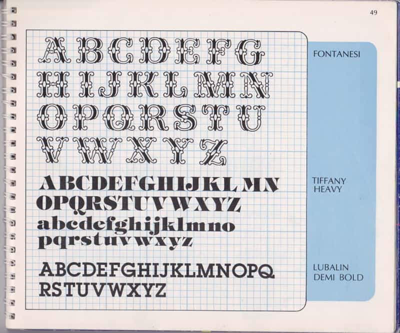
As I flicked through it, I realised that this dog-eared children’s masterpiece was almost entirely responsible for igniting my interest in design and typography. While Bringhurst and other typography texts have their place on my bookshelf today, this practical, fun approach to typography is a fantastic way to get kids excited about typefaces and applying care to letterforms. I can remember spending hours copying many of the typefaces by hand, and inventing my own letterforms that had variety, personality and type empathy.
First published in 1982 in a spiral-bound cover, and republished as recently as 2006, there are still copies available online.
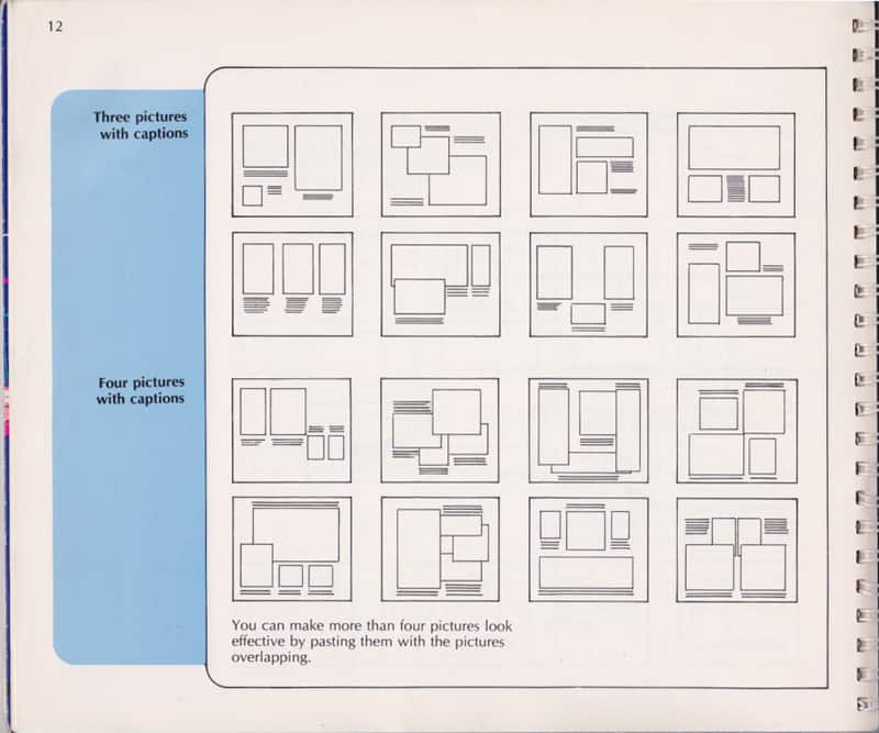
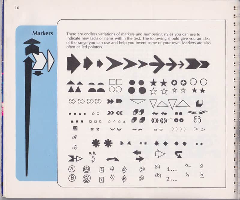
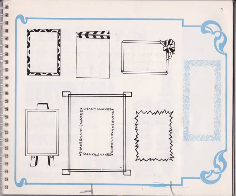
There are good reasons for its longevity. The Lettering Book is more than just “typography for kids.” As well as the basics of typography—serif, sans serif, slab serif, decorative, and other type families—there are pages dedicated to page layout, connectors, containers, alignment and more. Given the number of time it was reprinted, I’d wager this book is responsible for an entire generation of kids excited about typography and design.
And what a perfect primer for sketchnoting! I’ve always enjoyed experimenting with different graphic elements on a page, but this is probably where much of my inspiration first came from.
For fear of sounding old, I wonder if today’s kids share the joy of creating their own typefaces on the headings of their school pages … I suspect not. You don’t learn the intricacies of creating letter shapes by typing an assignment up on the computer and choosing a single dropdown from Microsoft Word!
I grabbed the book from my parents’ bookshelf to bring home to Melbourne, hoping it might instil in my daughters the same sense of appreciation for design and type. And if it doesn’t, I’m sure it will still serve as a valuable reference (perhaps when preparing for one of the workshops that I’m teaching soon!)
Did you grow up copying typefaces from The Lettering Book? I’d love to hear from you!