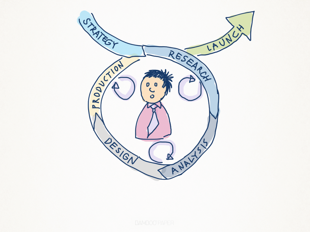
We’ve discussed on this website before the importance of following a UX process in order to achieve a consistent outcome that delights our users and delivers them a memorable experience. But what does that process actually look like?
The answer to this question is, of course, it depends—at least when you get into the nitty gritty. However, on the surface every UX process consists of the same high-level phases:
Strategy → Research → Analysis → Design → Production
Agencies may choose different labels for these phases, or they may make a bigger deal of the concept/ideation that occurs somewhere between Analysis and Design, but in general every UX process can be represented as above.
What really differentiates user-centered design from a more traditional waterfall model of software design is the user feedback loop, which informs each phase of the project.
This feedback loop is established through the use of a range of techniques that have become the staple for UX Designers. There are a ton of them, and knowing when to use which techniques during which phase of a project comes with experience. Personally, I find experimenting with new techniques and tweaking old favourites is part of the fun of being a UX Designer.
Introducing the UX Mastery Techniques Bank
We think we’ve captured a good number of UX Techniques on the UX Mastery Techniques Bank, which we’ve added to the website’s primary navigation menu for easy reference. This is a page that we’ve been wanting to pull together for a while. We’ve currently listed over 20, and we’ll be adding more over time. Each entry includes a description of the technique, the stage of a project it should be applied, and some brief information on how to apply it.
- Visit the UX Mastery Techniques Bank.
You can sort techniques by different columns, or use the handy Filter function to narrow down to what you’re looking for. And we welcome submissions—if there’s a technique that you think should be added, we’d love to hear from you!
A UX Process For Success
To complement the Techniques Bank, we’ve also added a new UX Process page, which lays out the user-centred approach that we recommend and use on software projects.
Each phase contains links to techniques that are relevant to each phase of the process. In the future we intend to make the integration between the UX Process page and the Techniques Bank more seamless, but for now we hope you find them useful!
- Check out our UX Process Overview.
A UX Process Diagram … Or Three
Finally, there have been a number of attempts over the years to capture this iterative model in graphic format. Below is a collection of our favourite infographics for communicating the UX process.
What do you think of our UX Process page and Techniques Bank? Let us know in the comments.

