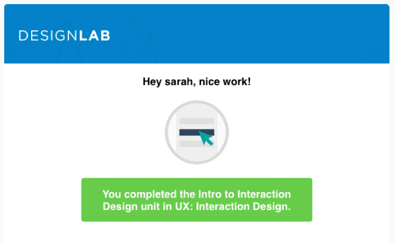
This is a review of the online course Interaction Design by Designlab.
This is part of our series of reviews of online UX courses. Read some of our other reviews or see our full list of online UX courses. Note: this review contains affiliate links; if you sign up, we may receive a percentage of the signup fee.
Course Information
- Course Name: Interaction Design
- Creator: Designlab
- Length: 10 hours per week for 4 weeks (plus 4 Skype sessions with a mentor)
- Intended Audience: Anyone looking to develop better communication of and confidence in their interaction design work, as well as people looking to develop their ability to understand and work with product designers.
- What You’ll Learn: A strong foundation in interface and interaction design. During the course students develop a portfolio of work that demonstrates an understanding of core principles — like information architecture, interaction states, system feedback and consistency. Project work includes the creation of user flow diagrams, wireframes and sitemaps.
- Assumed Knowledge: Some basic knowledge of UX principals would be useful, but the course is intuitive enough for an absolute beginner to benefit from it. A basic knowledge of Photoshop (or similar) is useful to complete some of the assignments.
- Price: US $299 for the 4-week course
Review
This course is not like any UX course that I have taken to date – and I have taken a few. The first and most obvious difference was the fact that this isn’t quite as much of a ‘take on demand’ course as the ones that I have experienced previously. Designlab courses have a fixed start date, an end date, and a number of assignments and mentor sessions booked in along the way. In short, you have to make sure you take it at a time when you can block out the required ~10 hours per week. I was a bit blasé about that side of things and ended up feeling like a naughty school kid that was getting behind with my homework!
Time commitment aside, this course really kicks ass. My first impression of the interface was excellent. It is slick, attractive and intuitive. I came across a few annoying bugs further down the line, but as far as first impressions go, Designlab gets 10/10.
The curriculum began innocently enough – in fact it lulled me into something of a false sense of security. A lecture that was slated to take 45 minutes took more like 10 (although to be honest, I’d much prefer an overestimated timeframe than the other way around), so I zipped through the first module and assignments feeling pretty proud of myself. The course centres around a project to research and design an online grocery store app. At the end of each set of lectures, another assignment related to the project is completed.
My first Skype session with my mentor solidified my positive outlook. Charlene was relaxed, up-beat and positive about my assignments. She offered as much help as I wanted without being pushy.
Then I started my Week 2 module and things got a little hairy. The level of complexity and the time commitment required for the assignments ramped up dramatically. To be fair, that was communicated fairly clearly, but the aforementioned looseness around time frames had set my expectations low. At this point I also started to find some of the instructions confusing and ambiguous. Luckily, students have full access to a support chat-room, and to the assignment work of other students, so you’re definitely not left floating in the dark.
By the end of the course I felt like I’d been through all the steps required to research and design a successful application, although the experience was punctuated along the way by minor spelling and grammatical errors, some UI frustrations (not being able to upload certain file types, an image creation tool that I couldn’t figure out) and slightly ambiguous instructions which needed clarification.
Pros
- The lectures are concise, well explained and easy to follow;
- The course is broken up into bite sized chunks that are easy to pick up again after a few days off;
- The assignments iteratively build on one another to result in a finished product, following a real life process; and
- The weekly mentor sessions keep you on track and motivated.
Cons
- There are a few bugs in parts of the UI, which were frustrating at times;
- Instructions for some of the assignments were slightly ambiguous, leaving me a bit confused; and
- The workload and complexity of assignments ramped up exponentially after Week 1.
Summary
Overall, I was very impressed by this course. The information was imparted clearly, the lectures were bite-sized and well illustrated, my mentor was an absolute star, and as promised in the marketing material I came away with what could fairly be described as “an interaction design toolkit for evaluating and improving the usability of my products, along with examples of my process and work that I can speak to and draw on in related projects”.
I think that if some time is committed to cleaning up the minor spelling mistakes and interface bugs, and more attention is given to the assignment briefs, then this course would really nail it. Nice work Designlab.
- Content (how useful, up to date, practical, and comprehensive): 9/10
- Delivery (presentation style, pace, clarity, authority): 7/10
- Production (video quality, audio quality, editing): 8/10
- Overall rating: 8.5/10
Course Contents
- Week 1
- Intro to Interaction Design
- Usability and Heuristics
- Week 2
- Design Patterns
- Week 3
- Content Strategy
- Information Architecture
- Week 4
- User Flows
- Sketching and Wireframes

