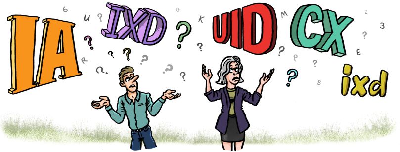
In the world of tech you’ll be hard pressed to find terms that aren’t abbreviated or just plain befuddling to outsiders. If you’re sick of not being able to understand what on earth those clever nerds are talking about, you’re about to be enlightened. Here’s a little list I made for your convenience including a few of the lesser understood terms around content in User Experience Design:
User Experience (UX)
UX describes the interaction of a user with a product or service – how easy it is to use, how helpful and how enjoyable it is.
Good UX:
- Is intuitive (the user almost instinctively knows how to use the item)
- Serves its purpose with ease
- Is a pleasure to use.
User testing
UXers run “experiments” on the above criteria to see how well users are engaging with their product or service. They’re prodding for unbiased feedback that will help them find any kinks or areas to make improvements on.
Information Experience (IX)
Providing users with the right information at the right time so that they can achieve their goals. For example, you might need to explain a technical concept to your users for them to complete a setup – a video or an engaging info graphic could make this information easier to digest and help your user complete their task.
Content Design
Content design refers to the creative genius behind the words on a website, social media, interface, blog etc. It’s about discovering your audience, what they want to know and how to speak their language.
Content Strategy
Now that you know your audience and what you’re going to say, you need to think about how you’re going to manage your communications – what platforms, what messages, what incentives and how often.
Content Hierarchy
People (even you and me, yes) whiz through online content. We get bored, plain and simple. That’s why organising the points in your copy from most important to least is vital. Structure your content so that your users can find what they came for pronto.
Information Architecture (IA)
The structure of a website – the arrangement of its web pages for the most logical and useful navigation. Think about how you’ll group pages, under which primary pages information will fall under and whether this will make sense for your user.
A/B Testing
Testing two versions of the same content to see which one users react to best. Test A goes out to one set of random users and test B goes out to another. The results can show user preferences and behaviours that will help inform your content down the track.
Wireframe
A skeleton, or a rough sketch of the individual pages and screens of an online product. This helps with layout, design and content placement.
User Interface (UI)
What the user sees and what they can interact with on a website, app, software product etc. Product designers, UI writers and developers work together to create a layout and design that’s easy to understand, informative and a breeze to navigate through. Think of elements like dashboards, fonts, colour schemes, error messages, buttons, even cursors!
Front End
The part of a website or online product that a user can see and interact with. Web developers code these interfaces into reality.
Back End
The applications, web servers, databases and other “behind the scenes” work that make your online application work.
Sitemap
An outline of a website’s pages and its features to see whether users will be able to navigate through it logically.
User Flow
The journey of a user through your online platform from the start of their interaction to the completion of an action or goal. Good user flows should be smooth, logical and intuitive.
Feel confident whipping out your Handy Dandy Tech Glossary at a barbecue or at your next networking event. With these terms under your belt, you might just be mistaken for a Silicon Valley local!

