
This guest post is from Danielle Arad, of WalkMe.com.
Displaying a large feed of data—links, articles, search results or images, for instance—in a user-friendly manner can be hard. In the past this design problem would be addressed by using the reliable pattern of pagination. However, in the last couple of years, many websites have opted to implement infinite scrolling instead. Infinite scrolling is a technique whereby the next “page” of data is automatically loaded as soon as the user scrolls to the bottom of the page.
In some cases, this approach works really well; in others, however, it can be disastrous. Here are some of the pros and cons of using infinite scrolling:
The Pros
- Efficient use of screen real estate. No more clumsy pagination links or buttons.
- More intuitive for touch devices. Swiping upwards to scroll down is a well-established convention in the touch environment, and requires less precision than tapping on links or buttons.
- Higher engagement. Related to the above point is the fact that users are potentially more likely to explore your content if it’s easier for them to do so, regardless of the device they’re on. If you’ve ever lost track of time perusing a stream of Twitter or Facebook updates, you’ll know what I mean by this.
The Cons
- Limited use cases. Infinite scrolling is only appropriate on certain types of sites, and for certain types of content. For instance, an ecommerce site listing its products would be a poor candidate for infinite scrolling, as the user is most likely going to want to click reliably between lists and detail pages.
- Additional complexity. While some JavaScript libraries are popping up to make things easier, you’re going to need some custom scripting if you want any custom behavior, and you’ll need to test that your fallback version works OK for users who don’t have JavaScript. Better to not implement it all than do a poor job of it.
- Additional demands of the client. Because infinite scrolling requires JavaScript, you run the risk of alienating users of devices such as gaming handhelds, consoles, set top boxes or other devices that may be running a browser that has limited scripting capabilities.
- Goodbye, footer. You can’t have both infinite scrolling and a footer—it’s one or the other. If that footer is important to you (or more importantly, to your users), you may want to consider a more conventional pattern. Don’t tease your user with a footer, only to make it impossible to click on because new content is loaded every time it’s flashed in front of their eyes (LinkedIn and Facebook, I’m looking at you … !)
- SEO. While Google have indicated that their algorithm takes into account pages that contain multiple versions (i.e. a view-all version as well as page-1, page-2, and so on), not testing for this means you run the risk of suffering in search results.
- Less page impressions. While not a negative factor for the user in any way, if your business model hinges on maximizing page impressions in order to display banner advertisements, infinite scrolling is not a design pattern that will help your cause.
With these points in mind, let’s take a look at two sites where I believe infinite scrolling works well.
Twitter uses infinite scrolling to display its stream of updates from more than 200 million active users. One reason why it’s a good fit is that the items being displayed are short, so they fit entirely within their container without needing to be contracted. Additionally, contextual actions such as Reply, Delete and Favorite are all made available when the user hovers over that container, so there’s little need for a user to navigate back to a tweet once they’ve moved away.

Tumblr
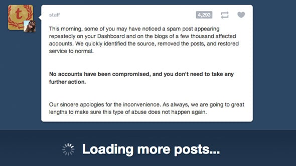
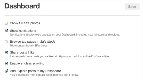
Tumblr does a great job of merging blog, forum and social network into one living, breathing community. By default, a user’s Tumblr feed uses infinite scrolling, but Tumblr have taken the extraordinarily considerate step of allowing users to disable this feature in the settings page of their app. This is a reflection of the diverse range of content that is published on Tumblr—and the different preferences of their user base.
Now, let’s look at a couple of examples where infinite scrolling is a poor fit, and what we can learn from them.
Bing Image Search
Like Google, Bing utilizes infinite scrolling on its search results page for images and video. However, the Bing implementation introduces a major usability flaw: if a user clicks through to view a larger version of one of the images, and then clicks the Back button, the user’s position in the list of results is not maintained. Instead, the user needs to scroll down again in order to reload the additional content. If you’re performing research that requires you to review a large number of images, this “feature” would wear pretty thin.
YouTube
While I love the design of YouTube overall, I find it frustrating that the YouTube team is perpetually tinkering with the site’s design. I sympathise with the need to evolve, but it irked me when they recently threw pagination out the window on their home page, and replaced it with an infinite scrolling hybrid approach. As with Bing, the items in the scroll area are thumbnails from videos that are hosted on a separate page. Should a user wish to return to this list after watching one of the videos, they have to contend with the scrolling yet again. What’s worse, the infinite scrolling isn’t automatic on channels. Instead, a “Load more suggestions” button must be clicked again and again—thus defeating the point of having infinite scrolling in the first place.

Best Practices
So, what can we learn from all this? I’ve gathered a few tips to help you a) make the right decision whether to implement infinite scrolling on your site, and b) do so in a way that avoids some of the problems described above.
- Have a fallback. Make sure your JavaScript degrades gracefully, so that you’re not alienating users who, for whatever reason, aren’t viewing your site in a modern browser.
- Make it configurable. If possible, consider allowing your users to choose whether they want to use infinite scrolling or not. They’ll thank you for it (if not by actually thanking you, by remaining loyal to your product).
- Give visual indication that you’re loading more content. Subtle animations such as the rotating wheel or other forms of progress bar tell the user “I’m loading some more content for you.” Without this visual feedback, your users are likely to become confused as to why the page suddenly got longer.
- Return users to their place in the list. Don’t make your users lose their place in the list of items just because they used the Back button. If maintaining this position is not feasible, it’s probably a sign that infinite scrolling is a poor fit.
- Test it. Do some user testing of your infinite scrolling design, and be sure to include a range of devices in your tests.
Conclusion
Infinite scrolling as a design pattern is here to stay in one form or another. While it makes sense in many cases—particularly on mobile and touch devices—getting the usability of this technique right is non-trivial. However, by learning from the mistakes of others, and following the above best practices, infinite scrolling can become a feature to help convert one-time visitors into loyal customers.


Automatic higher engagement assumption is dangerous as guys at Etsy recently found out (http://danwin.com/2013/01/infinite-scroll-fail-etsy/). A/B testing pagination vs. infinite scrolling not only showed that their users not only prefer limited results per page, but also that the speed at which they were rendered resulted in no impact.
Major if not the biggest con would is decreased sense of orientation in navigation as infinite scrolling makes it much harder to return to results, in comparison to pagination of course. That’s why it works well for information consumption but not so well for commerce and task based solutions.
You’re absolutely right about testing, it’s the key to learning, even if through mistakes. I recommend everyone check out the Designing for Continuous Experimentation (http://mcfunley.com/design-for-continuous-experimentation) where the guys at Etsy elaborate their practices and the infinite scrolling test.
Thanks Petar. Danielle actually linked to the etsy article at the top of the post. Thanks for elaborating though, it is an important point.
Oops – no title attribute on those links, that’s my excuse :)
I had never even thought of my infinite scrolling preference until reading this article. For me, it depends on the device I’m using. I really love a website footer when I’m at my desktop, and love infinite scrolling on my phone. It will be interesting to see where the trend lands once the app system finishes integrating.
One of the best implementations of infinite scrolling that I’ve seen is OKCupid. They have figured out a way around Con #1,”…the user is most likely going to want to click reliably between lists and detail pages.”
When you click from the list to a detail and then go back to the list, the person who’s detail you were just looking at is at the top of the list. It works if you use the browser’s back button too. Above that is a button to load the previous results in batches, basically allowing you to basically scroll back up the list. So they allow you to easily and reliably move from list to detail and back while also retaining the ability to scroll up and down the list without loosing your place or relying on pagination.
Unfortunately, I have no idea how they pull it off.
Awesome stuff Greg. Thanks for the heads up!
Great one! However – You can make both a footer and an infinite scroller very easily…
An interesting point Assaf—yes, you could fix a footer to the bottom, which is what I assume you’re suggesting? You run the risk of it becoming pretty annoying. I can’t speak for all “users” but I’m pretty precious about that part of the screen being invaded and would find it distracting. Do you have any examples where it’s been done?