At the recent Web Directions South 2012 conference in Sydney (yes, I’m still buzzing) there was a lot of discussion about the future of interface design – from the current frenzy for responsive websites as well as the coming-soon gestural abilities just around the corner from mainstream use (a la Minority Report).
It struck me that we still don’t do enough talking about the range of senses in a user’s experience – we tend to focus on the visuals and as a result lose sight of the bigger picture of designing a cohesive experience. We should design for the experience, not the ‘thing’. So let’s step back (way back) and take a look at things from a distance.
With a lot of people moving into UX from other fields like design and filmmaking, it’s a given that our skills will be strong in areas of visual design. And that’s a good thing – when the visual sense is part of the experience mix, it’s often dominant over other senses (get your geek on about it at the Max Plank Institute for Biological Cybernetics). Having said that, visual design doesn’t give us enough control on its own to make a difference when it really matters.
“Customer experience is now the only sustainable source of competitive advantage for companies”
– Harley Manning & Kerry Bodine
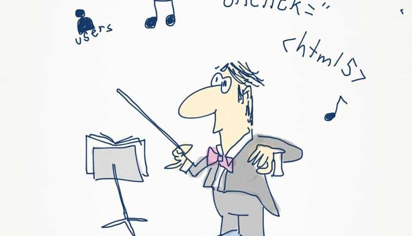
It’s really important for us to remember that the visuals are only one of the senses that make up a website experience, and the web interface is only one touchpoint of many in a customer’s experience of a business. As Chris Risdon, Lead Experience Designer at Adaptive Path, once said: “Touchpoints should be orchestrated.” So, if we’re conducting an orchestra, some good questions for UXers might be: what are all of our other instruments doing? How and when are they doing it? Why?
“User experience design is the art of setting the stage for good experiences to happen – creating spaces to find the delightful, useful and good”
– Helge Fredheim
Where’s the ‘sense’ in that?
Putting our cognitive psychology hat on for a moment, we easily remember that the five traditional senses are:
- Sight
- Hearing
- Taste
- Smell
- Touch
The cinemas are a bit ahead of us web-types when it comes to creating an immersive experience with smell-o-vision, but we’re well on the way to having sight and sound and (some) touch included in our UX thinking. Well done on those three. Now what about the remaining fifteen senses?
What other fifteen senses?!
There are some difficulties in defining what exactly a sense is, but our bodies do have the ability to detect stimuli beyond the traditional senses listed above – things like temperature, pain, time, balance, acceleration, awareness of our body position, and ten other types of internal sensory receptors that give us feedback about various chemical levels and what our internal organs are up to.
In every ‘sense’ of the word
While we might influence a user’s esophagal sensory receptors to make them gag, or stimulate their chemoreceptor trigger zone (that’s really getting into Total Recall stuff) to play with their mind, many of these senses still have dubious usefulness to us until we get to technological singularity. And we don’t yet live in The Matrix (or do we?) so the overlap of physiology with web design isn’t very big unless we consider that carrying a smartphone defines us as cyborgs.
There are, however, a couple of senses in this list of twenty or so that we should keep in our toolbox when designing for user experiences. Where this stuff crosses over into UX is usually ‘post-sensory’ – where the cognitive functions of our brain recognise and interpret patterns provided by the senses. And if we can’t directly affect a user’s sense, we can still have some fun by evoking a reaction in the user by association.
Making ‘sense’ of chaos
Senses allow us to perceive things. Our brain kicks in to cognitively process the input, resulting in how we feel about something, which in turn drives us to a certain action. Designing for the senses at the beginning allows experiences to emerge.
Jesse James Garratt described a ‘UX stack’ in his book The Elements of User Experience (well worth the read) that provides us with a good idea of the conceptual layers between foundational user needs and the eventual interface – and how we can relate them to each other – no matter what senses we’ll be appealing to. This is a fundamental part of working in UX: understanding the users and the context and designing something that is useful, usable and delightful. In this sense, ‘usable’ also means web accessibility, which can be improved for those with visual disabilities if we don’t limit ourselves to visual design. But it’s more than that. As Jared Spool said in his opening keynote at UX Australia 2010: “Saying a website is ‘usable’ is like saying dinner was ‘edible’.”
The view from 10,000 feet
So, when you’re next briefed on a UX project, by all means get that interface design jazzed up, user-friendly and ready to party. But don’t forget the potential contribution of the other senses, and of course the goals of the big picture experience you’re being asked to design for, beyond just what is immediately visible on screen.
To go with our UX symphony/Jazz soiree/dinner metaphor, I was thinking of having a ‘web tasting’ night – you know, like a wine tasting tour but for website experiences? Hands up in the comments if you’d like to come along. Mmm, I’m getting a barnyard of Metro, with a hint of complex phone support and an oaked finish …
Homework: Use the comments to let me know a few good websites you’ve discovered that push the boundaries on sensory appeal or user input.

Here’s a good one to start us off: a HTML5 sensory experiment crafted by Cirque du Soleil and Subatomic Systems: http://www.movikantirevo.com (and the technical case study to go with it ).
The Silverback website was one of the first websites to create a parallax effect using CSS (when the browser is resized), and was much lauded for it at the time. Not really an innovative input method, but gives a nice sense of depth and element of surprise. :)